
Table component overview: turning the tables on data visibility
The table component is one of the most versatile tools in Klips. Learn four best practices, including simplicity, mini charts, results rows, and hidden columns, to create effective tables that help teams spot trends and make faster decisions.
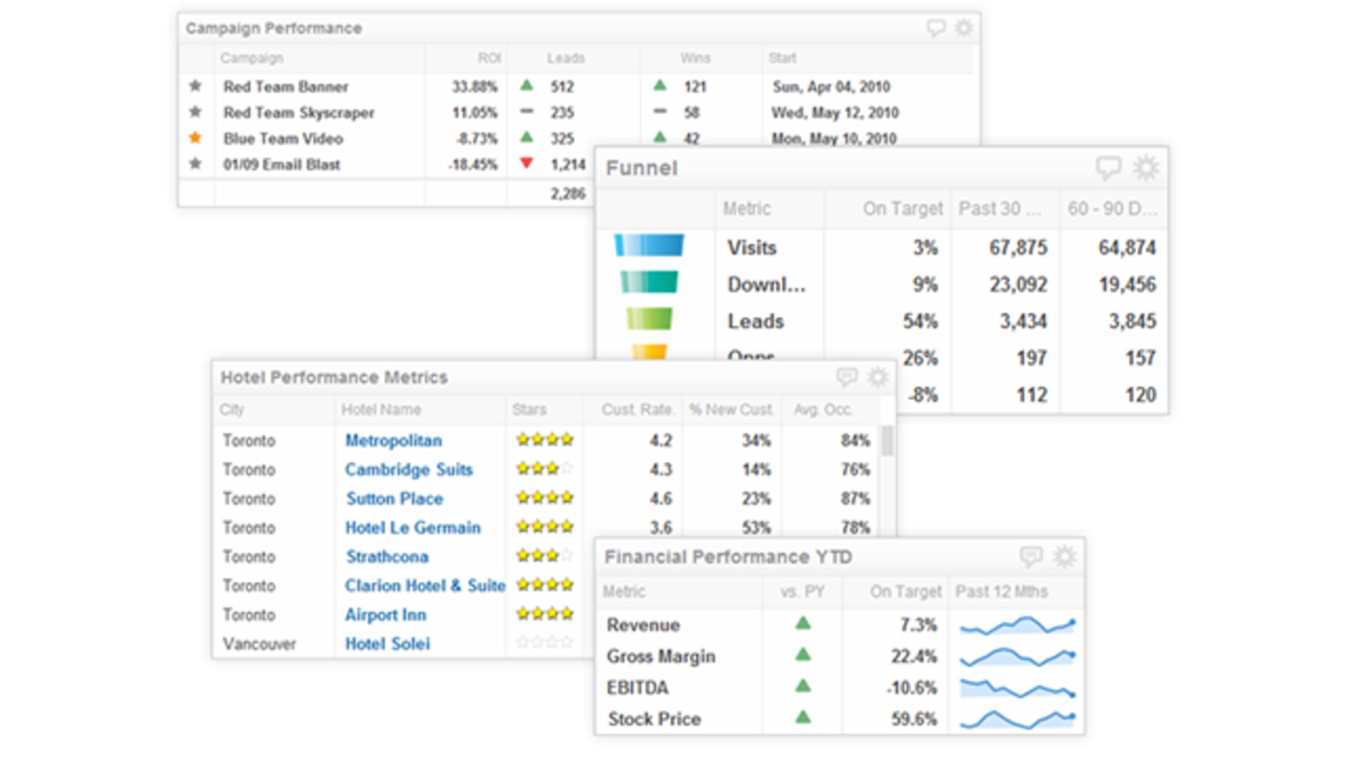
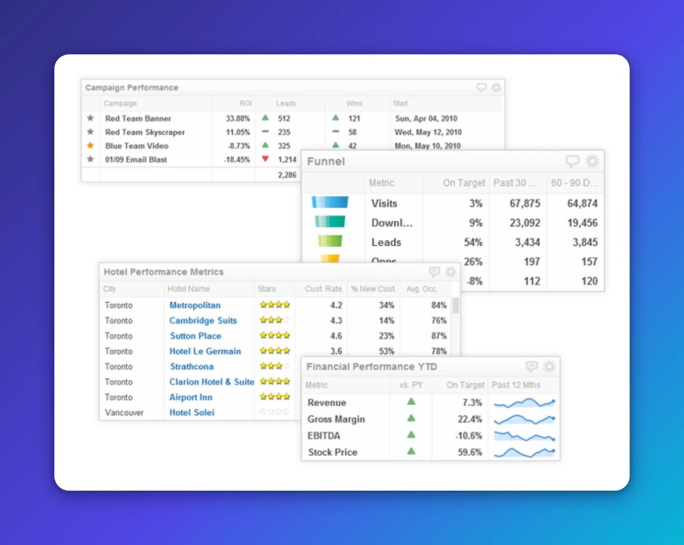
The table component is one of the most versatile tools in Klips. It displays bar and line charts, sparklines, bullet charts, currencies, numbers, text, hyperlinks, and images, all in a single view.
Tables are built for situations where a number alone doesn't tell the whole story. You might want to show year-to-date sales figures alongside a sparkline of the past 12 months, compared against the previous year's revenue. That combination helps you spot a trend, confirm a direction, and decide what to do next, without digging through separate reports or pasting figures into a spreadsheet.
Key features
- Results row with custom formula support
- Column borders, width, and alignment controls
- Full conditional indicator support
- Text, numbers, images, links, or mini charts (sparklines, bullet charts)
- Column sorting and reordering
- Text style, colour, and line wrap
Best practices for the table component
Four guidelines to help you build tables that give your team clear, reliable answers.
1. Simplicity
A powerful table earns trust by being easy to read. Large tables are sometimes unavoidable, but size is no excuse to sacrifice clarity. The golden rule of data visualization still applies: every element should earn its place.
When you design a table, ask yourself: Can a colleague understand what they're looking at in five seconds? If not, simplify. Use descriptive column headers, format numbers consistently, and cut any column that doesn't directly support the decision your team needs to make. Stephen Few's work on data visualization reinforces this principle.
2. Mini charts
Mini charts, including sparklines, spark bars, and win/loss charts, are among the most useful features in the table component. A sparkline answers "How is this trending?" A win/loss chart answers "Is this above or below the threshold?" Both give your team the context to act, not just observe.
Use them when they add real meaning. A mini chart that exists for visual appeal adds noise, not insight. Get started with mini charts in your table components.
3. Results rows
Results rows summarize column data using functions like average, sum, max, min, or median. As your table grows, a results row keeps the key number visible without requiring anyone to scroll or calculate manually. That's one fewer question your team has to ask before they can move forward.
You can also build custom results rows using formulas that pull from other components or external sources. When you do, use prefix and suffix labels so viewers understand what the calculation represents at a glance.
4. Hidden columns
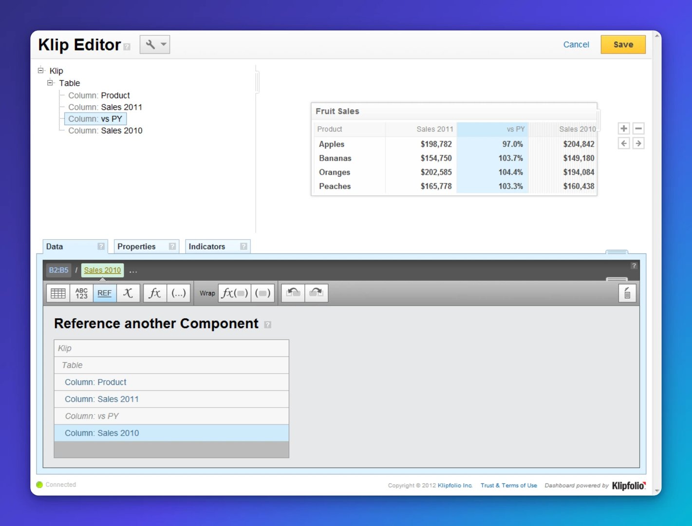
Hidden columns solve two practical problems. First, they let you set up indicators that compare two values without displaying both. For example, you can flag whether this year's revenue is up or down versus last year, without showing the prior-year figure in the table. Second, hidden columns support formula reuse. If you're summing 12 months of sales data and need that total in multiple places, reference the hidden column instead of rebuilding the formula each time.
Both uses reduce the chance of inconsistent numbers across your dashboard, which means fewer "which figure is right?" conversations.
Create custom dashboards for you and your team.
Get started with KlipsWhat else can tables do?
The table component also works with indicators, hyperlinks, and images, giving you flexibility well beyond what most teams use by default. There's enough depth here that this won't be the last time we cover it.
Ready to build? Learn more about the table component on the Klips support site.
Published 2026-08-24


Most recent
- AUG 11Beyond simple sign-ups: how True Trials and Activation predict growth
- JUL 7Why business leaders miss important trends in their dashboards
- JUN 19The best chart for the job: Visualizing data for non-technical users
- JUN 95 tips to understand (and organize) your restaurant data
- MAY 26Think in Horizons, Not Seconds
- MAY 2010 Cloud BI Dashboard Tools for Small Businesses in 2026