

What is a data dashboard?
Learn what a data dashboard is, how it works, key types, and examples. See best practices to build dashboards your team will use with Klipfolio Klips.
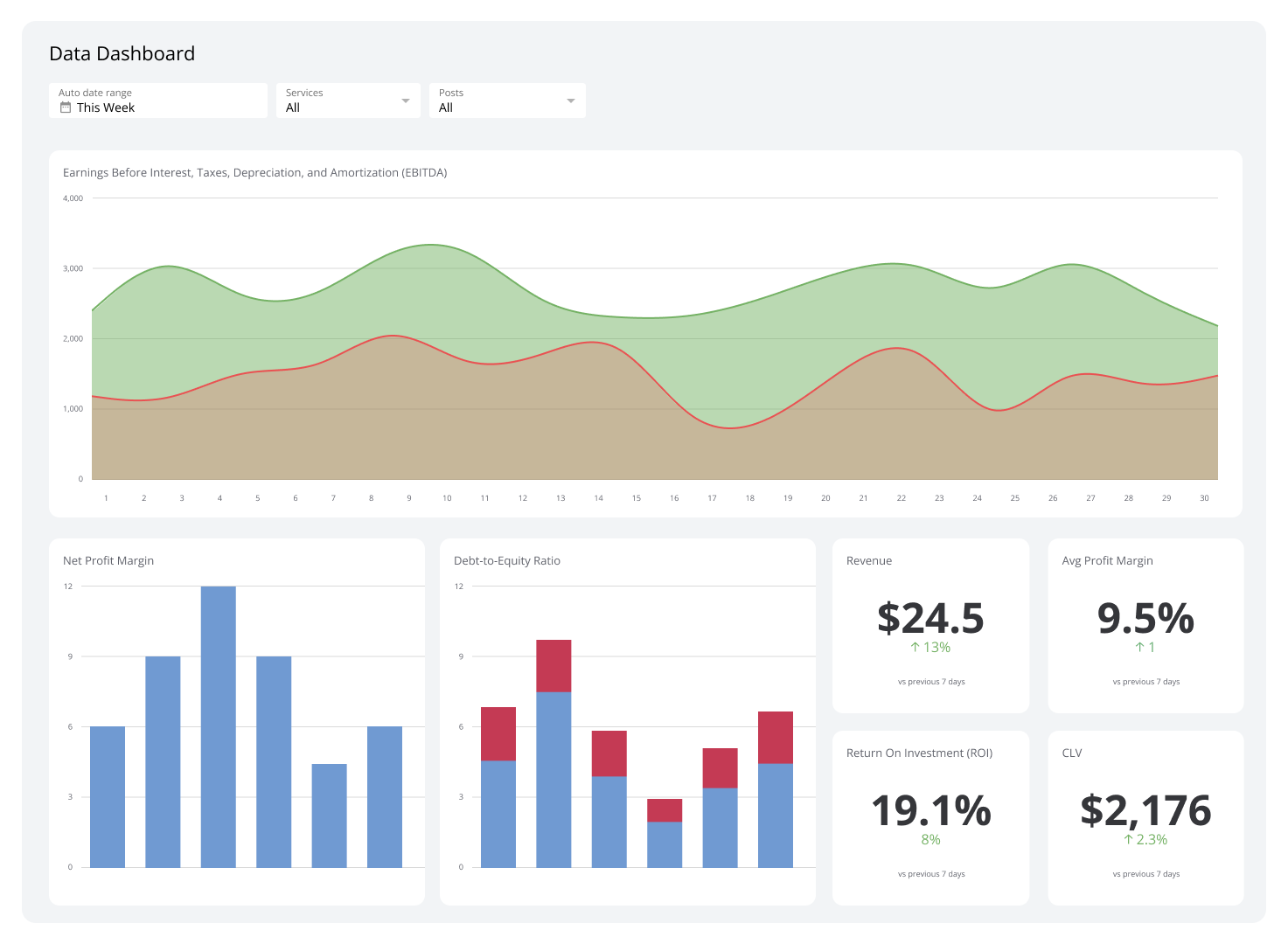
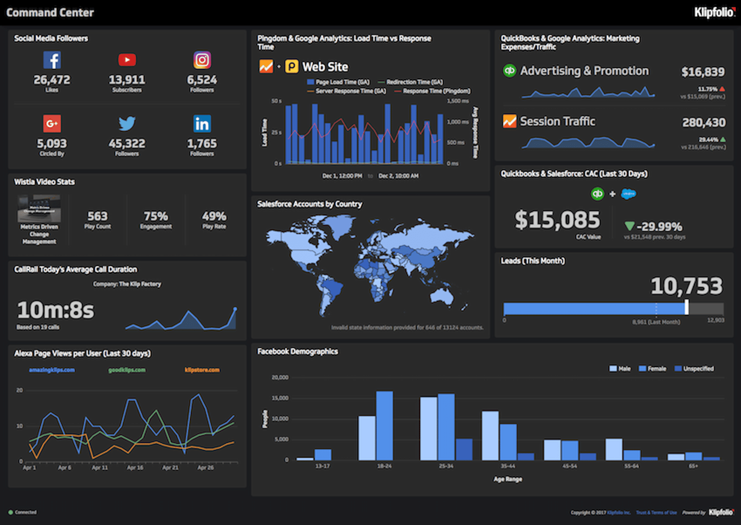
A data dashboard is an interactive tool that displays your most important metrics in one place, so you can see what's happening in your business without waiting for a report or asking someone to pull a number.
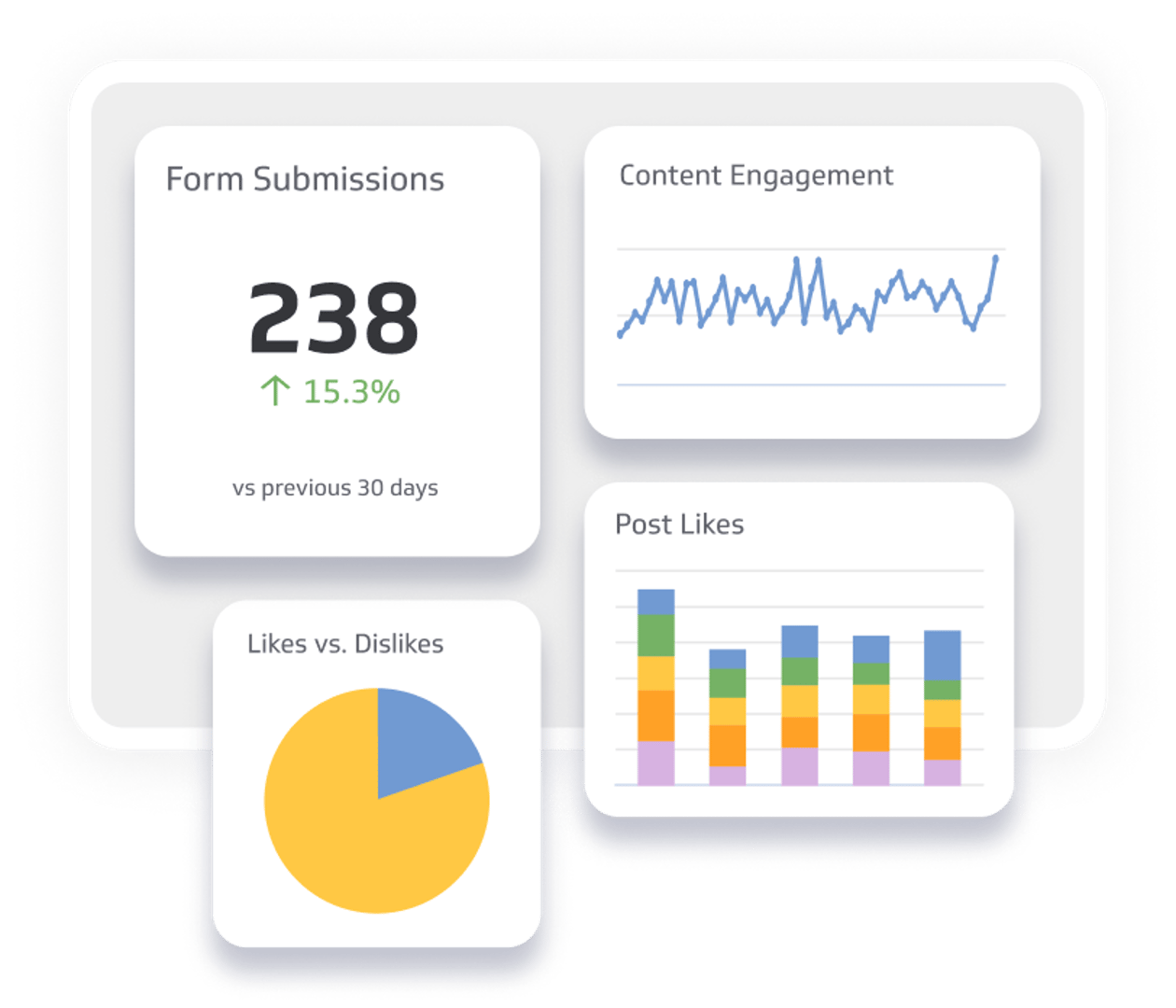
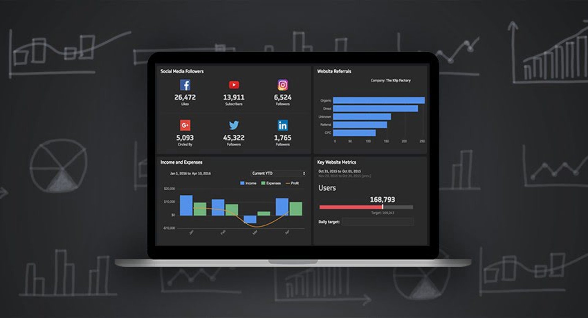
The dashboard connects to your data sources and presents what it finds through visualizations like bar charts, line graphs, and tables. You see trends and performance at a glance, without having to dig through spreadsheets or paste numbers into a chatbot and explain your business from scratch.
Data dashboards matter because they put reliable, consistent numbers in front of the people who need to act on them, in real time. When everyone is looking at the same data, decisions get faster and more confident.
This guide covers the benefits of data dashboards, how they work, common types and examples, and best practices for building dashboards your team will actually use.
Key benefits of using data dashboards
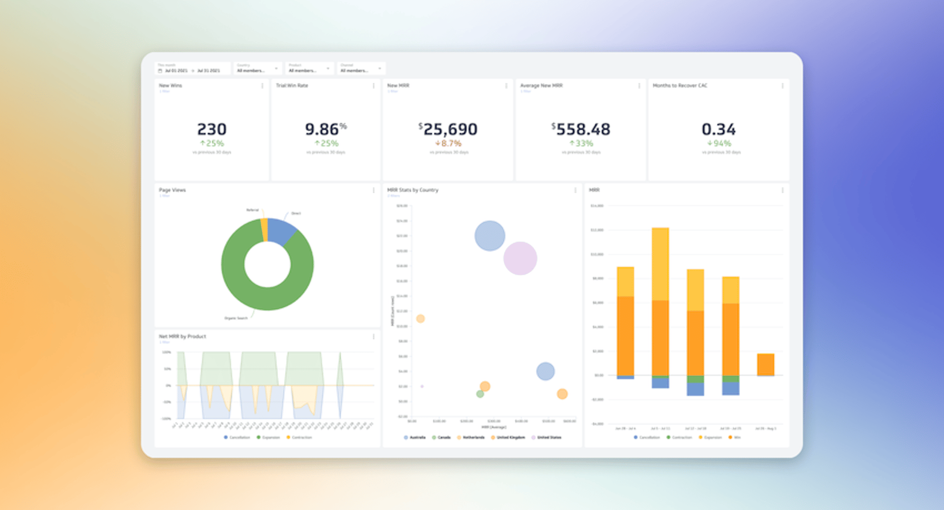
The main advantage of a data dashboard is knowing what's happening across your business without having to go looking for it. Here are three reasons that matters:
Clarity from complex data
Dashboards consolidate data from multiple sources so you can see the bigger picture in one view. Complex data becomes easy to read, and trends, patterns, and outliers surface without requiring anyone to build a custom report.
Faster, more confident decisions
Real-time data access means you are not waiting for a weekly report to understand where things stand. You can spot an opportunity or a problem as it develops and respond before it grows, instead of reacting to last month's numbers.
Better forecasting
Dashboards that combine historical and current data give you a basis for planning, not just reviewing. You can identify growth opportunities, anticipate risks, and make strategic calls backed by what the data actually shows.
How do data dashboards work?
Data dashboards pull information from multiple sources into one central view, so you always have a current, accurate picture of your business metrics. You can connect databases, spreadsheets, and applications without managing the process manually.
Here is what happens behind the scenes:
- Data collection: The dashboard pulls data from sources such as sales databases, CRM systems, marketing tools, and financial software.
- Data integration: Data from different sources is combined into a single repository, so different data sets are compatible and can be analyzed together.
- Data cleaning: Data is checked and corrected for errors, inconsistencies, or duplicates to keep your numbers reliable.
- Data transformation: Raw data is converted into a format ready for analysis and visualization, such as calculating monthly sales totals or average customer satisfaction scores.
- Data visualization: The right charts, graphs, and tables are selected to represent your data clearly.
- Data customization: Layout, colours, and styles are adjusted to match your preferences and make the dashboard easier to navigate.
Types of data dashboards
Understanding the types of data dashboards helps you choose the right one for your needs. Here are the four main types:
Operational dashboards
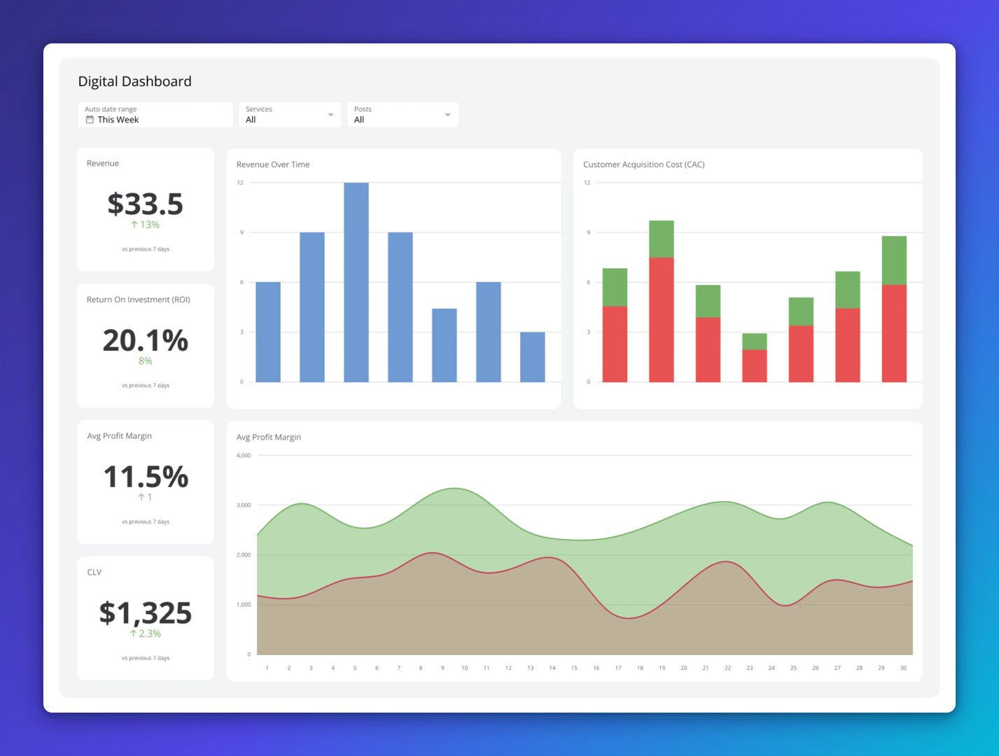
Operational dashboards monitor day-to-day business activities in real time. They give you a live view of production levels, customer service response times, and sales numbers, so you can catch issues early and keep things running smoothly.
These dashboards are built for quick decisions, not deep analysis. If something is off, you see it immediately.
Analytical dashboards
Analytical dashboards support deeper investigation, helping you examine large data sets to understand patterns, trends, and the reasons behind business performance. Managers and analysts use these to answer the "why" behind a number, not just the "what."
This type lets users drill down into the data and explore it from multiple angles, making it useful for planning and strategy.
Strategic dashboards
Strategic dashboards give senior leaders a high-level view of performance against long-term goals. They focus on KPIs like revenue growth, market share, and customer satisfaction, so executives can assess whether the organization is on track and where adjustments are needed.
These dashboards are designed for people accountable for outcomes, not for people managing day-to-day operations.
Informational dashboards
Informational dashboards present specific data sets to a broader audience in a clear, accessible format. They are often used in presentations, reports, and company-wide communications where the goal is shared understanding, not individual analysis.
An informational dashboard might display overall sales performance, website traffic, or customer demographics, using varied visualizations to make the data easy to read for anyone in the room.
Examples of data dashboards
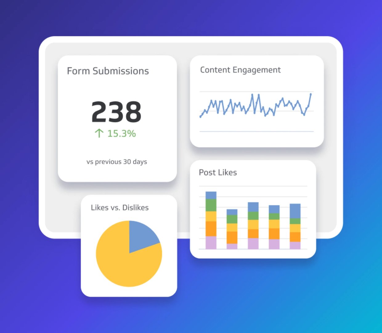
Data dashboards can serve any department or industry. Here are some of the most common types:
Business dashboards
A business data dashboard tracks, analyzes, and displays key business metrics across departments, including sales, marketing, finance, and operations. It gives leaders a single view of KPIs, progress, and performance without having to pull numbers from multiple places.
A management KPI dashboard is a classic example. It surfaces metrics like revenue, profit margins, Customer Acquisition Cost, and employee performance, so you can quickly assess business health and see where attention is needed.
Executive dashboards
Executive dashboards are built for senior decision-makers: CEOs, CFOs, and other leaders who need a clear picture of financial performance, market trends, and overall business health. They use data visualization to make complex information readable at a glance.
The financial KPI dashboard is a strong example. It tracks revenue, expenses, profit margins, and cash flow, giving executives the numbers they need to make informed strategic calls.
KPI dashboards
KPI dashboards track the specific indicators most critical to your business objectives. A sales cycle length dashboard, for example, tracks how long it takes a lead to become a customer, including average time to close, leads at each funnel stage, and conversion rate. That visibility helps you spot bottlenecks and improve efficiency.
Project dashboards
Project management dashboards give you a centralized view of timelines, milestones, and resource allocation across active projects. Instead of waiting for a status update, you can see where things stand and catch issues before they become delays.
Performance dashboards
Performance dashboards evaluate overall business performance across operations, marketing, sales, and warehouse order management. They help you identify strengths and weaknesses across the business, so you know where to focus.
A procurement dashboard, for example, tracks supplier performance, cost savings, purchase order cycle time, and compliance rates, giving you the visibility to manage resources efficiently.
Website dashboards
Website dashboards monitor how your site is performing by tracking user behaviour, traffic sources, and conversions. They help you understand what visitors are doing and where to improve.
A web analytics dashboard is a common example. It tracks page views, unique visitors, bounce rate, and conversion rate, helping you identify trends, improve content, and increase engagement.
Create custom dashboards for you and your team.
Get started with KlipsIndustry-specific dashboards
Industry-specific dashboards give business owners in any niche the insights tailored to their particular context. Here are four examples:
Healthcare dashboards
Healthcare dashboards track metrics related to patient care, hospital performance, and operational efficiency, helping providers improve patient outcomes, reduce costs, and maintain regulatory compliance.
Marketing dashboards
Marketing dashboards monitor campaign performance by tracking ROI, lead generation, and conversion rates. The data they surface helps you refine strategies and improve effectiveness.
Retail dashboards
Retail dashboards track sales performance, inventory management, and customer behaviour. Sales trends, stock levels, and customer preferences give you the data to make better decisions about what to sell and how to sell it.
Sales dashboards
Sales dashboards monitor team performance by tracking sales revenue, lead conversion rates, and pipeline health. They help you identify top performers, improve sales processes, and hit your targets.
5 ways to make an effective data dashboard
Building a dashboard is only the first step. It also needs to surface the right information for the right people, clearly and reliably. Here are five ways to make that happen:
1. Target specific audiences and goals
Start by defining who will use the dashboard and what decision it needs to support. An executive dashboard focuses on high-level KPIs like revenue and overall performance. An analyst dashboard might include more granular data and detailed visualizations.
Set clear objectives from the start, whether that is monitoring sales performance, tracking campaign results, or managing project progress. Clear goals keep the dashboard focused and prevent it from becoming a data dump.
2. Find the right data sources
Choose data sources that provide accurate, up-to-date information. Validate your data regularly to keep it clean. Reliable numbers build trust, and trust is what makes a dashboard useful to the people who need to act on it.
3. Know the right visualizations to use
Different types of data call for different visualizations. Use line graphs to show trends over time, and bar charts to compare categories. Keep visuals simple and focused. An overcrowded dashboard obscures what matters most.
4. Keep the design simple and consistent
A consistent colour scheme and layout make the dashboard easy to navigate. Remove unnecessary elements and focus on essential data. A clean dashboard design helps key information stand out without requiring users to interpret the layout first.
5. Continuously improve based on feedback
Collect feedback from users regularly to understand what is working and what is not. Use that input to make ongoing improvements. Dashboards that evolve with user needs stay useful over time.
Common data dashboard mistakes to avoid
Even well-designed dashboards can fall short. Here are six mistakes to watch for:
Using inaccurate or incomplete data
Inaccurate or incomplete data leads to wrong conclusions and poor decisions. Validate your data every time you update your dashboard. If people cannot trust the numbers, they will stop using the dashboard.
Overloading with too many visualizations
Too many charts and graphs overwhelm users and obscure what matters. Keep visualizations focused on the metrics that drive decisions, not every metric you can track.
Not defining clear stakeholder needs and goals
A dashboard that does not match what its users actually need will go unused. Define those needs upfront. Executives may want high-level KPIs in bar or pie charts; analysts may need detailed data and more complex chart types like scatter plots or heatmaps.
Ignoring dashboard design best practices
Good design makes dashboards intuitive and easy to navigate. Interactive elements like filters and drill-down features add value when used well, and add confusion when overused.
Focusing only on historical data
Historical data alone does not give you the full picture. Include real-time views so you can respond to what is happening now, and add forecast views to plan for what comes next. Balancing past, present, and future data leads to better decisions.
Making dashboards static
Static dashboards limit how deeply users can explore the data. Dynamic features like drill-downs and filters let users investigate what they see and understand the story behind the numbers.
Create custom dashboards for you and your team.
Get started with KlipsYour key to data-driven decisions
Data dashboards give you a clear, consolidated view of the metrics that drive your business. They surface trends and patterns from across your organization and put the right information in front of the right people, without anyone having to go looking for it.
Klipfolio Klips makes it straightforward to build, customize, and share dashboards that keep your whole team aligned. With 130+ data connectors, Excel-like formulas, and flexible distribution options, you can get everyone looking at the same reliable numbers, fast. Explore dashboard examples to see what is possible, or get started for free today and start making decisions with confidence.
Published 2026-08-21



Most recent
- AUG 11Beyond simple sign-ups: how True Trials and Activation predict growth
- JUL 7Why business leaders miss important trends in their dashboards
- JUN 19The best chart for the job: Visualizing data for non-technical users
- JUN 95 tips to understand (and organize) your restaurant data
- MAY 26Think in Horizons, Not Seconds
- MAY 2010 Cloud BI Dashboard Tools for Small Businesses in 2026