

How to use burndown charts to manage agile software releases
Deadlines are a fact of software development. Burndown charts give agile teams a clear, real-time picture of how much work remains and whether a release is on track. This post covers how to use burndown charts across planning, execution, scope control, and team management, including the key patterns to watch for so you can course-correct before it's too late.

Deadlines are a fact of software development. The question isn't whether your release has one; it's whether your team can see clearly enough to hit it without burning out along the way.
The burndown chart is one of the most reliable tools for managing agile software releases under real-world time constraints. This post walks through how we've used burndown charts across planning, execution, and team management, and what patterns to watch for so you're never caught off guard.
Note: All charts in this post are from Youtrack, the issue tracking tool we use.
What is a burndown chart?
A burndown chart shows how much work remains on a project and how much time is left to complete it. Work sits on the vertical axis; time runs along the horizontal. As the project progresses, remaining work should decrease until it hits zero, ideally right at the planned release date.
What makes the chart genuinely useful is the comparison it draws: the ideal burn rate (how fast work needs to disappear to hit the deadline) versus the actual burn rate (how fast work is actually disappearing). That gap, or the absence of one, tells you everything you need to know about where the release stands.
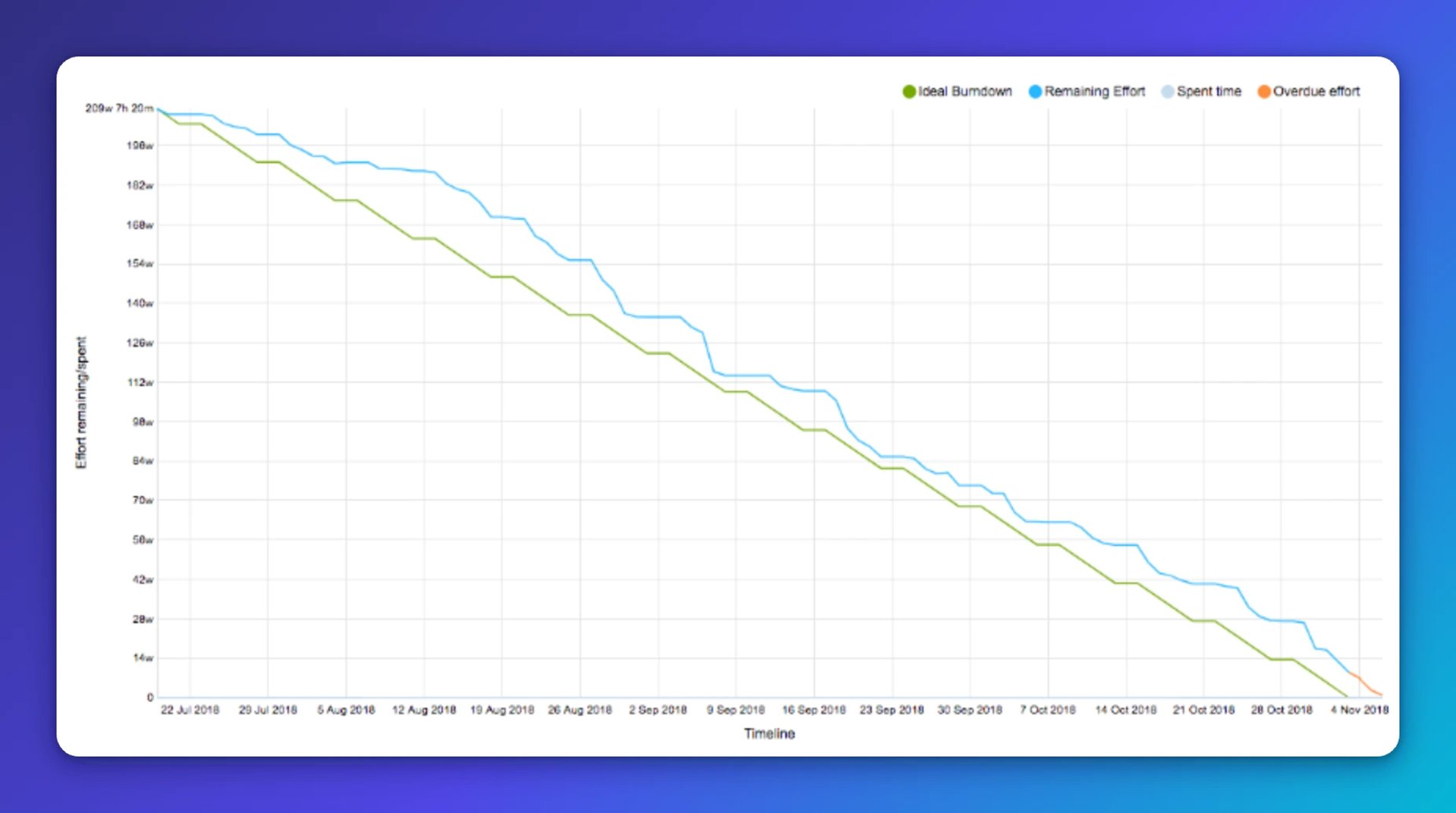
The chart above is a real example from one of our releases. The team held a consistent burn rate throughout. There was a small scope increase early on (the bump in the blue line), and the release landed slightly late (the orange overdue line), but the picture was always clear.
6 ways burndown charts help your team
Burndown charts give agile teams reliable answers across several critical areas:
- Target dates: Identify a realistic completion date before committing to one
- Stakeholder expectations: Show leadership why a date works or doesn't, with data behind it
- Scope control: Catch scope creep early, before it quietly kills the deadline
- Team behaviour: Surface patterns that reveal how a team is actually working
- Multi-team visibility: Monitor several teams at once without micromanaging
- Backlog management: Know what to cut, defer, or reprioritize in real time
How we used burndown charts to manage a release
1. Setting a realistic target date
At the start of one project, we were handed a fixed delivery date. The project was already underway, and we had enough velocity data to run the numbers. The conclusion was immediate: there was no path to that date. If we'd agreed to it, we would have missed by more than two months.
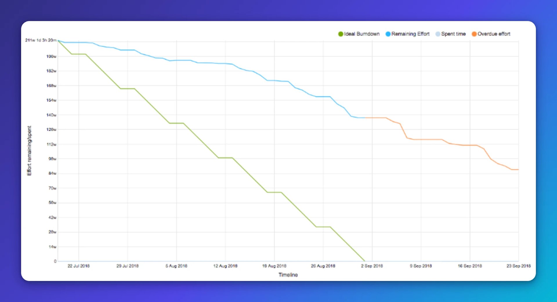
The distance between the blue and green lines makes that gap impossible to argue with. We used the actual sprint velocity data to model a few alternative targets and landed on a date roughly two months later. The chart did the heavy lifting in that conversation with senior management. No one had to take our word for it; the picture was right there.
Create custom dashboards for you and your team.
Get started with Klips2. Controlling scope before it controls you
Every release starts with a high-level scope. As teams break work into user stories at finer granularity, new items surface, estimates grow, and the backlog quietly expands. Burndown charts make that expansion visible the moment it starts happening.
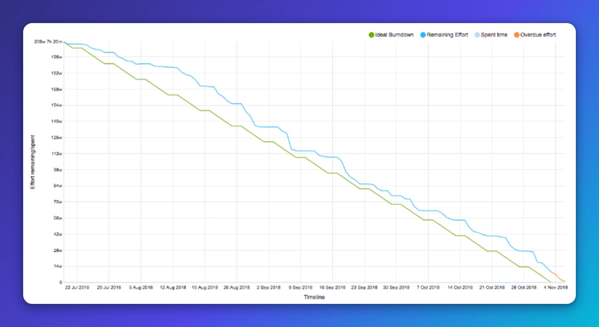
The slight bump in the blue line early in this release cycle is exactly what scope creep looks like. We caught it, dropped several features from the backlog, and scheduled them for a future release. If we hadn't acted, the blue line would have kept climbing away from the green, and the deadline would have slipped without anyone seeing it coming.
Observing team behaviour and managing multiple teams
We run burndown charts at two levels: one covering the full release backlog across all teams, and one for each individual team's portion of the work.
The high-level chart shows overall release progress. The team-level charts show how specific teams are performing and reveal behavioural patterns that aggregate numbers hide. They can also flag teams that are overloaded before those teams hit a wall.
This structure lets you stay informed at a macro level without pulling teams into constant status meetings or asking anyone to explain their numbers from scratch.
Patterns to watch for in team burndown charts
Flat lines with no progress
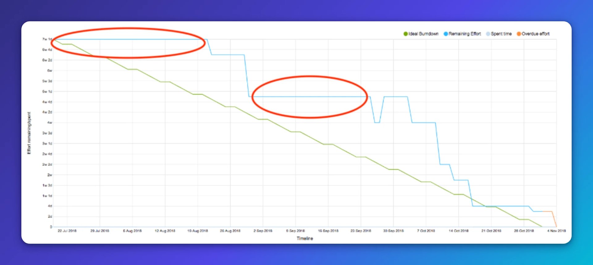
Straight horizontal stretches mean work has stalled. That warrants a conversation, not an assumption.
A bump in the blue line
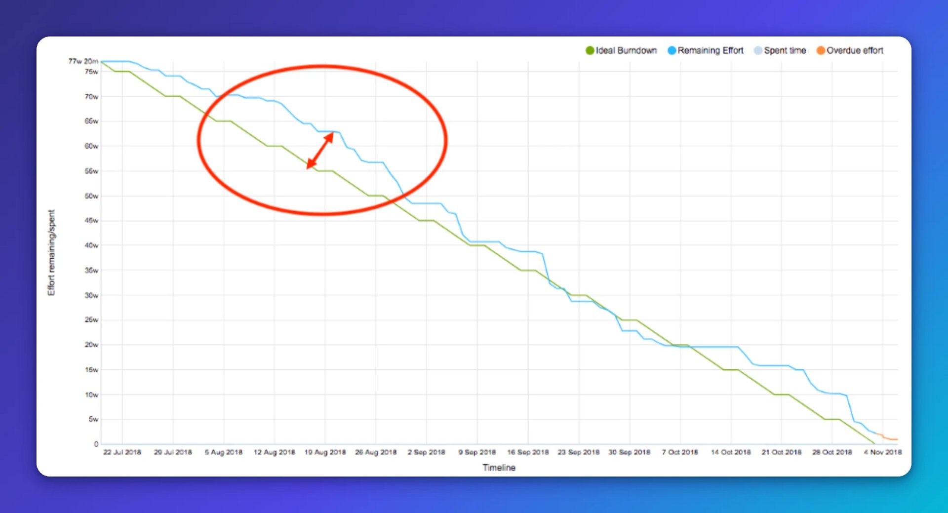
When the actual line rises above the ideal, scope is growing or the team has slowed. Either way, it needs attention now, not at the next sprint review.
Faster-than-expected progress
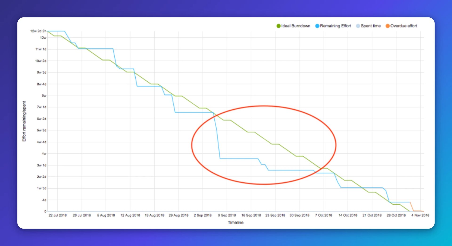
Progress that outpaces the ideal line isn't always good news. It can mean estimation padding or a team that's running out of work. Both signal a chance to reallocate capacity to teams that need it.
A flat line followed by a sudden drop
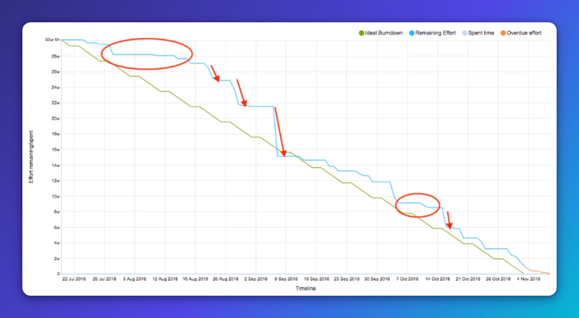
This pattern usually points to long-running feature branches: work that's being done but not shipped. Because we don't count work as done until it's in production, a team can be genuinely busy while the chart shows nothing moving. Then the branch merges and the line drops sharply.
Long-running feature branches carry real risk. The fix is to break large features into smaller shippable increments and release them continuously behind a feature switch. When you see this pattern, treat it as a signal that risk is accumulating in the release.
Continuously monitoring the release and managing the backlog
Knowing where you are is only half the job. The burndown chart tells you; you decide what to do with that information.
During one release, we noticed the burn rate trending in the wrong direction. We drilled into each team's backlog, identified who was contributing to the delay, adjusted scope, reallocated resources, and cut a few features. The release got back on track.
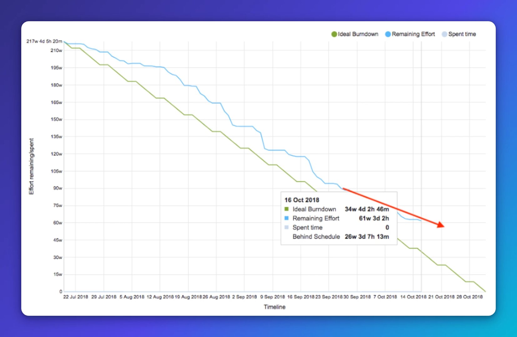
That kind of course correction is only possible when you're watching the chart regularly, not just at the end of a sprint.
Making burndown charts work in practice
A burndown chart is only as useful as the data behind it. A few things make the difference between a chart that guides decisions and one that just sits in a folder:
- Automate the updates. Manual chart maintenance is a burden that eventually gets skipped. Integrate your charts directly with your issue tracking tool so they stay current without extra effort.
- Set realistic goals. Targets need to reflect actual team velocity, not wishful thinking. Technical specs being in place before estimation begins makes a significant difference here.
- Make the charts accessible. Senior leaders need the high-level view. Team members need to see their own progress and that of teams whose work affects theirs. Both groups should be able to find the charts without asking.
- Review them in standing meetings. We open our burndown charts in weekly scrum of scrums sessions, where scrum masters from all teams review progress and surface risks and dependencies together.
When burndown charts are kept current, shared openly, and acted on, they give everyone, from the team doing the work to the leaders accountable for the outcome, the same clear picture of where things stand. That shared clarity is what keeps releases on track and teams out of the all-nighter spiral.
Published 2026-08-21




Most recent
- AUG 11Beyond simple sign-ups: how True Trials and Activation predict growth
- JUL 7Why business leaders miss important trends in their dashboards
- JUN 19The best chart for the job: Visualizing data for non-technical users
- JUN 95 tips to understand (and organize) your restaurant data
- MAY 26Think in Horizons, Not Seconds
- MAY 2010 Cloud BI Dashboard Tools for Small Businesses in 2026