
Three ways to increase dashboard user engagement
Forgotten passwords, lost bookmarks, and old habits can sideline even a well-built dashboard. These three tactics close that gap: build interactive dashboards with filters and drill-downs, provide context through visual indicators and annotations, and use email reports as teasers that pull users back to the live experience. Apply all three and your team will stop waiting for numbers and start acting on them.

Your team won't act on numbers they never see. Forgotten passwords, lost bookmarks, and the pull of old habits mean even a well-built dashboard can sit ignored. These three tactics close that gap and turn your dashboard into something people actually return to.
1. Build interactive dashboards
A dashboard should be a live window into your organisation's performance, helping teams track the metrics defined by your organisation. Static dashboards are just images. They may contain relevant data, but users can't filter, drill down, or focus on the specific numbers they need to make a call.
Interactive dashboards invite exploration. Instead of passive viewing, your team engages directly with the data and gets to the answer faster, without waiting for someone to pull a custom report.
Add filters and controls to let users slice data by product type, team member, geography, or any variable that matters. Build a dropdown list so users can quickly narrow results. Add a date-picker to eliminate manual scrolling through long records. Use drill-down functionality in tables to show summaries with detailed views just a click away.
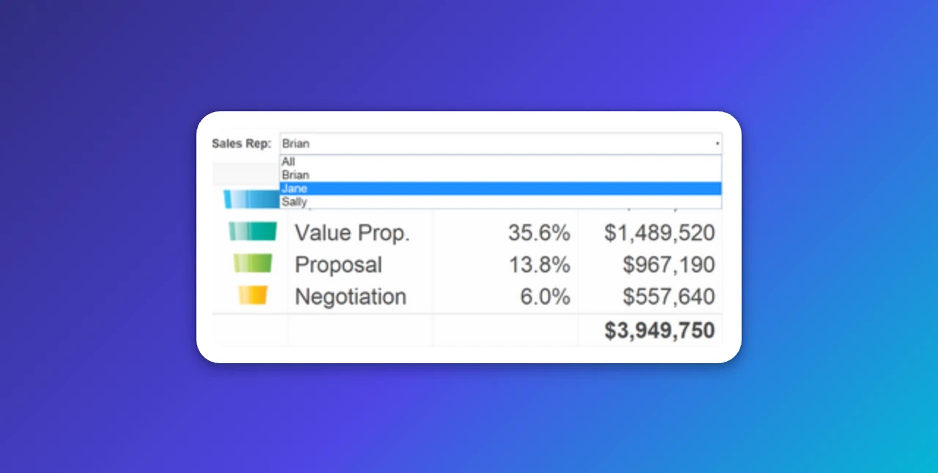
Interactivity transforms passive viewers into active participants. As the saying goes: "I hear and I forget. I see and I remember. I do and I understand."
2. Provide context and commentary
Never let data stand alone. A dashboard packed with numbers means nothing if users can't immediately understand what they're looking at, or what to do about it.
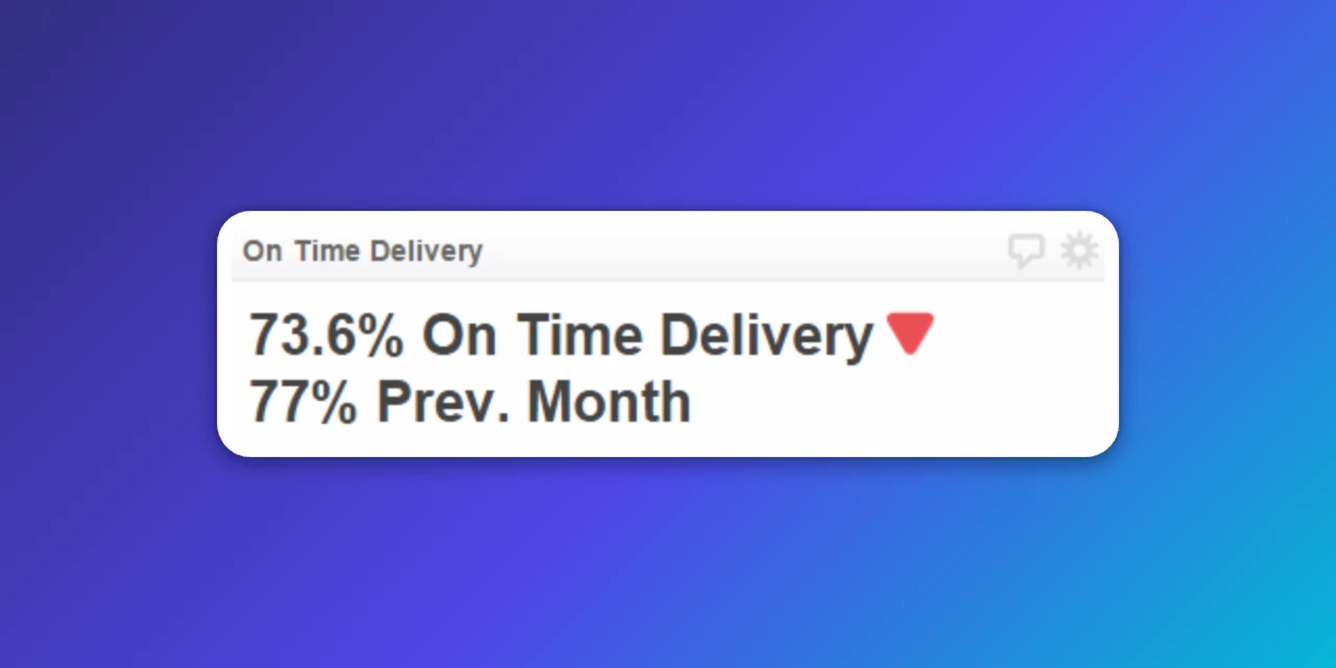
Consider this: if you see "50 units sold this month," the next questions are automatic. What did we sell last month? How does that compare to target? Preempt those questions by providing context upfront, so the dashboard hands you the answer instead of making you dig for it.
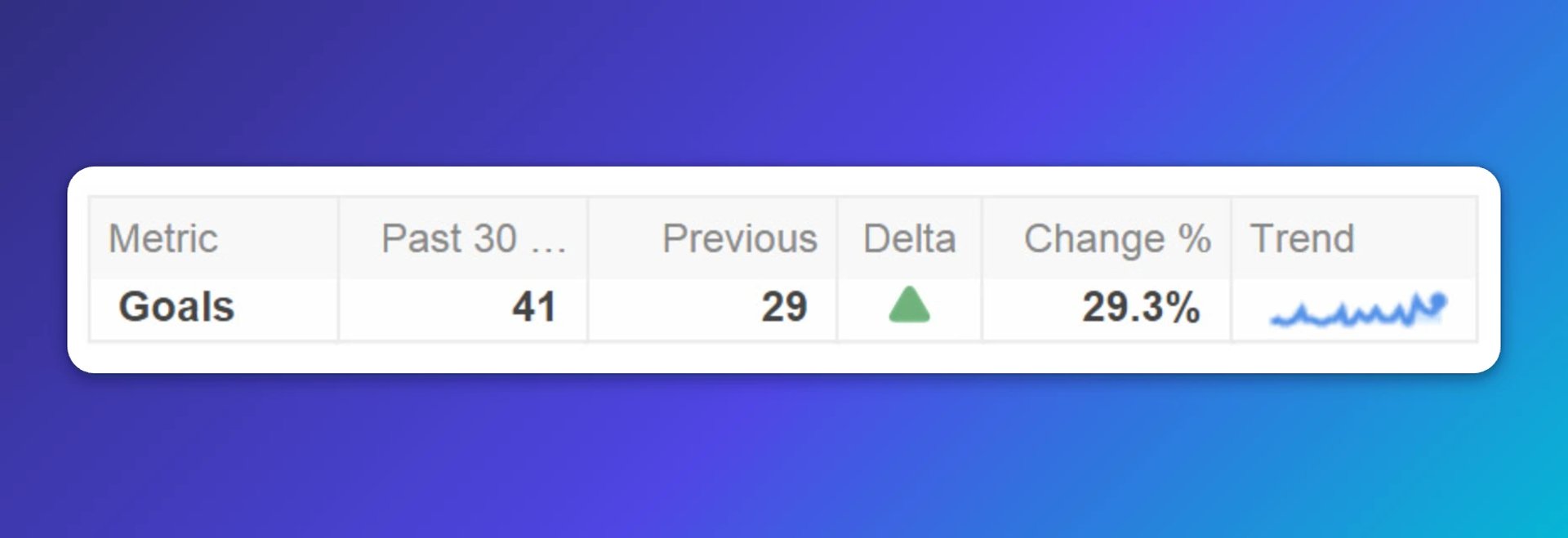
Use visual indicators to highlight the status of critical metrics. Add indicators to show whether performance is on track or needs attention. Display historical data alongside current figures to reveal trends. Use sparklines to show performance over time without consuming valuable screen space.
Enable team discussion through annotations. Let users add comments directly to your dashboard, sparking dialogue about what's happening and why. This transforms dashboards from reporting tools into collaboration platforms, where the context lives alongside the number instead of scattered across emails and chat threads.
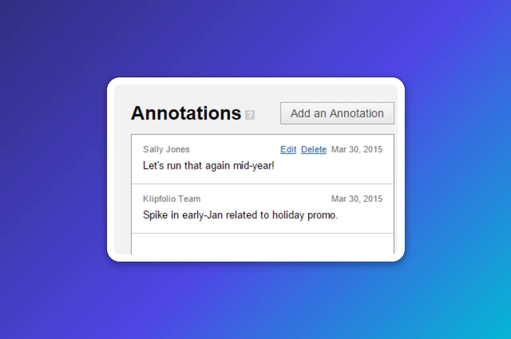
By default, "View Only" users cannot add annotations. Assign a custom role to users who should participate. When new users log in, they'll see a notification indicator showing that colleagues have commented, encouraging them to join the conversation.
3. Send summary reports by email
This might seem counterintuitive. Why email a snapshot when a live dashboard exists? The best experience is always in the browser, but email reports serve a specific purpose: they remind users what they're missing and give them a reason to log in.
Think of email reports as teasers. Create a summary dashboard or tab that highlights only the most important metrics, stripping away granular detail. Send this report daily, weekly, or at a frequency that suits your team. Make it clear that the full picture, with all interactive features and detailed data, is available by logging in.
Avoid the trap of over-reporting. Sending too much detail too often causes email reports to be ignored. A focused overview with a clear call to action is far more effective than a dense summary that replaces the dashboard instead of pointing back to it.
Create custom dashboards for you and your team.
Get started with KlipsBring your dashboards to life
A well-designed dashboard deserves an audience. If your team struggles to break old habits, invest time in onboarding. Show them what they can access, explain the value, and apply these three tactics. The goal is a dashboard that surfaces what matters without anyone having to go looking, and a team confident enough in the numbers to act on them.
Published 2026-08-24



Most recent
- AUG 11Beyond simple sign-ups: how True Trials and Activation predict growth
- JUL 7Why business leaders miss important trends in their dashboards
- JUN 19The best chart for the job: Visualizing data for non-technical users
- JUN 95 tips to understand (and organize) your restaurant data
- MAY 26Think in Horizons, Not Seconds
- MAY 2010 Cloud BI Dashboard Tools for Small Businesses in 2026