

How to build an accounts receivable dashboard that improves business performance
See how one SaaS team connected accounts receivable data from Google Sheets and Salesforce to build a weekly dashboard in Klipfolio. The dashboard gives Customer Success, accounting, and operations leaders a shared view of outstanding balances and at-risk accounts every Friday, so the team can act on the same numbers at the same time and reduce forced cancellations.

At a growing SaaS company, overdue accounts aren't just a finance problem. They're often the first sign that a customer is unhappy.
That's the lens our Customer Success team brings to accounts receivable. When leadership asked for better visibility into outstanding balances and at-risk accounts, the goal wasn't just cleaner collections. It was earlier intervention, fewer forced cancellations, and a team that could act on the same numbers at the same time.
This is the dashboard we built to do that, and how we built it using Klipfolio.
Our accounts receivable dashboard
The dashboard is a weekly snapshot of every customer account with an outstanding balance.
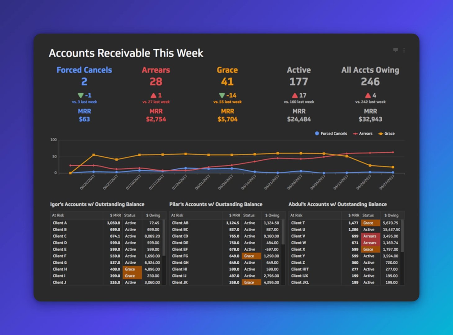
It has three sections. The top section shows key accounts receivable KPIs. These sales metrics are standard in SaaS and familiar to anyone tracking subscription revenue.
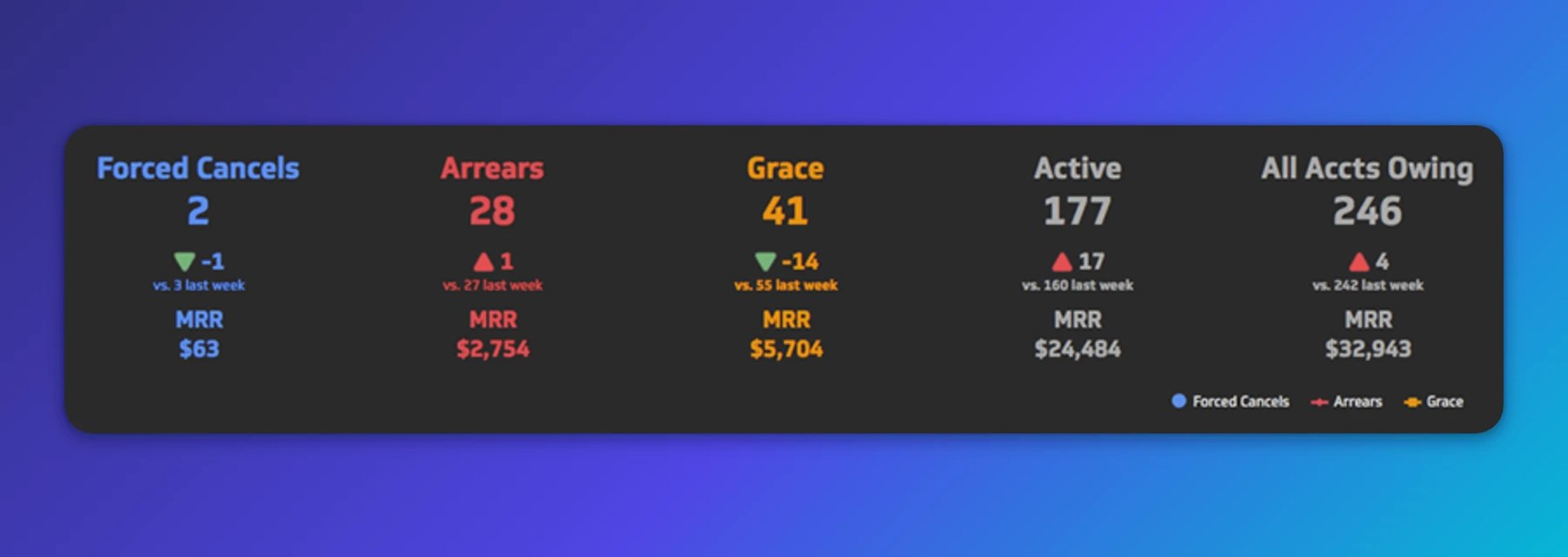
Each KPI shows three numbers: account count in that category, period-over-period change with colour-coded trend indicators, and total monthly recurring revenue at stake. Context is everything here. A number without a trend is just a fact. A number with a trend is a signal.
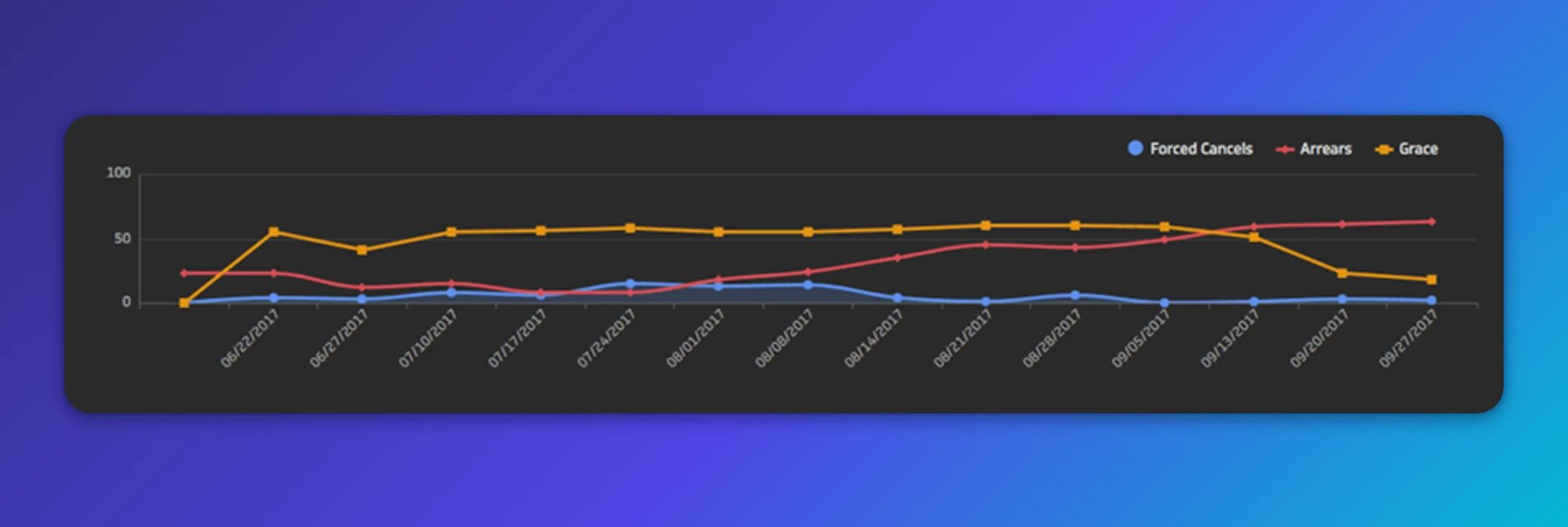
The middle section shows weekly trend lines for three account categories: Forced Cancels, Arrears, and Grace. Colours match the KPIs above so the connection is immediate. Hovering over any point shows the exact account count for that day.
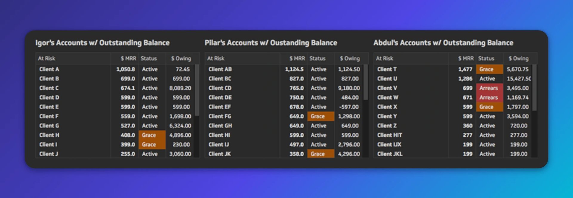
The bottom section is a set of tables showing at-risk accounts organised by sales rep. Each row includes monthly recurring revenue, account status (Active, Grace, or Arrears), and amount owing. This is where the team decides who to call first.
The dashboard publishes weekly and is shared via private URL with our Customer Success, accounting, and operations teams. Every Friday morning, it also arrives as an automated PDF email. No one has to remember to check it.
How we built it with Klipfolio
What is Klipfolio?
Klipfolio is cloud-based dashboard software that connects to your data sources and turns them into real-time visualisations. You can connect web apps like Zuora, Xero, and Salesforce; Excel files; databases; or data warehouses, then build custom Klips and publish them to a shared dashboard. Learn more here.
Create custom dashboards for you and your team.
Get started with KlipsConnecting the data
The data source was a Google Sheet: a report exported from Salesforce that pulls subscription and billing data from Zuora. Salesforce is our account hub, so Zuora data flows into Salesforce records and then into the sheet.
The first step was connecting that Google Sheet to Klipfolio.
Klipfolio's Connector Gallery lets you authenticate with a wide range of services, including Google Drive files.
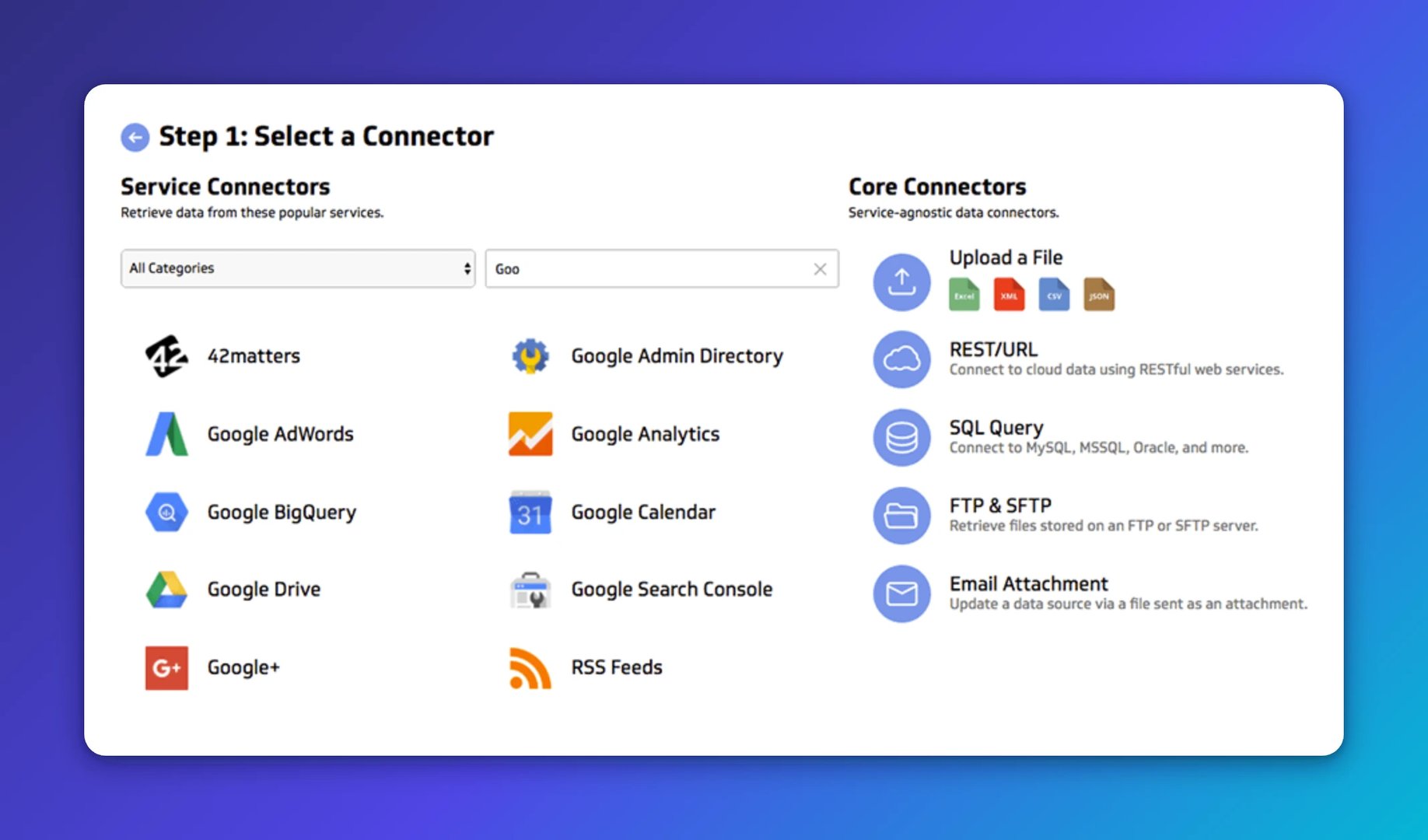
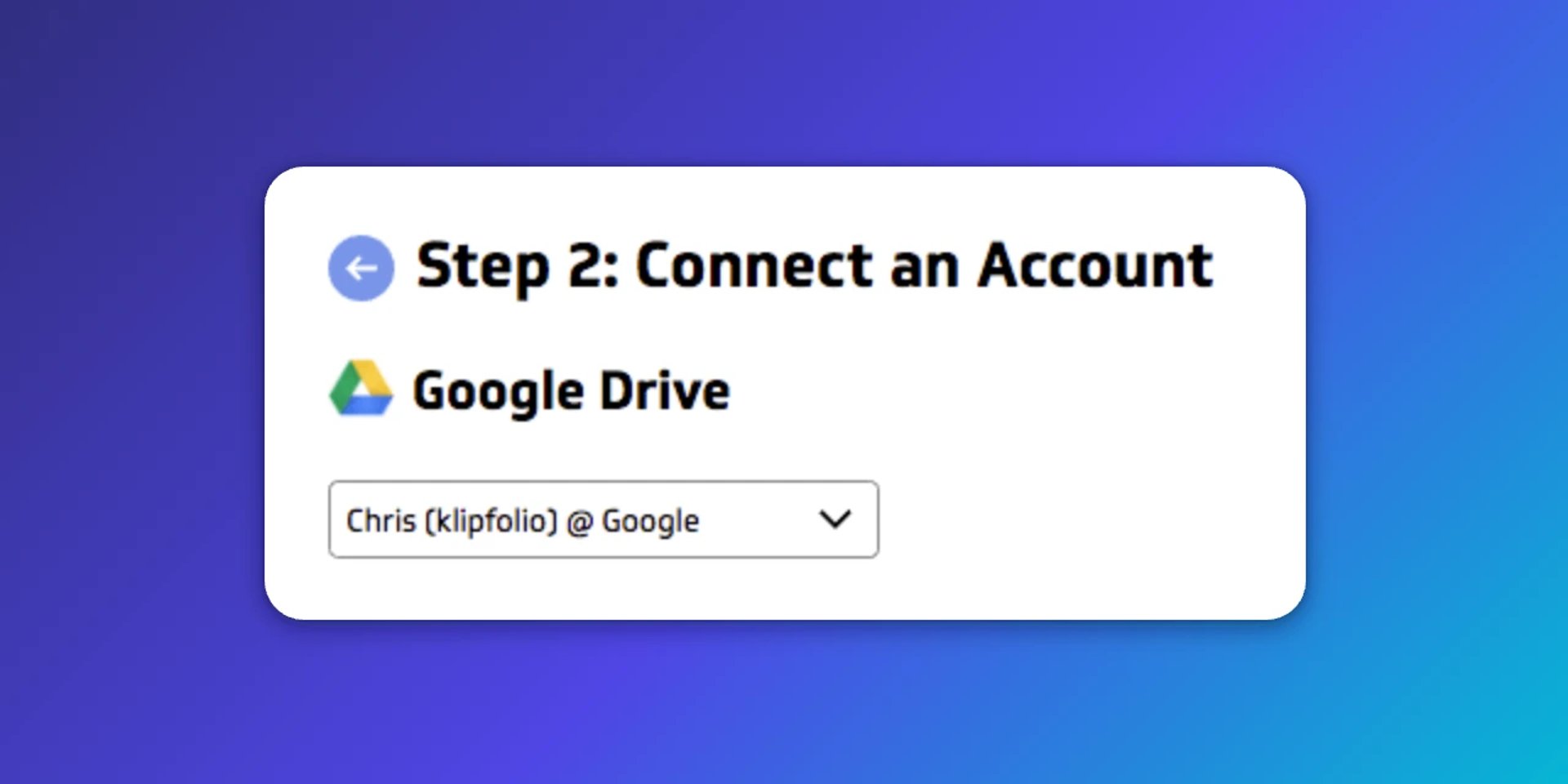
After selecting the Google Drive connector and authenticating, we selected the specific Google Sheet to reference.
Then we set the data refresh rate to every 30 minutes. Klipfolio supports refresh intervals as frequent as every minute, depending on the data source.
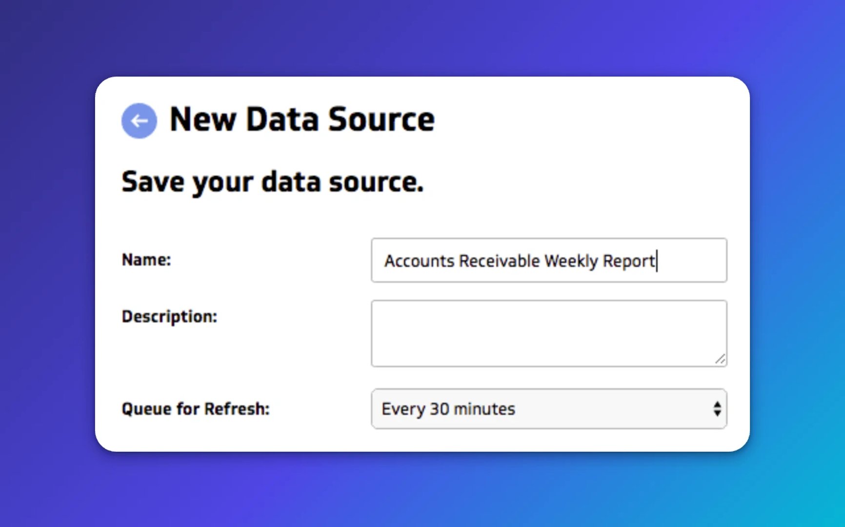
From that point on, Klipfolio pulls fresh data automatically. Every Klip referencing that source updates without anyone touching it.
Building the Klips
With the data source connected, we used the Klipfolio Editor to build each visualisation.
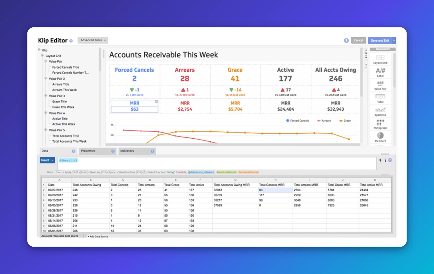
The data source appears at the bottom of the editor. You can connect multiple sources and work with them as separate tabs simultaneously. Klips are dragged from the component menu into the preview area. The formula bar is where you define what data to pull and how, using Excel-like functions.
The build itself took focused work across several sessions. The result was a dashboard that answered the questions leadership actually cared about, not just a prettier version of the spreadsheet.
Choosing the right KPIs
Getting the KPIs right took iteration. Several versions went back to leadership before the final design was approved. The questions that guided each round:
What action does this data inspire? If a number doesn't point toward a decision, it doesn't belong.
Does it provide enough context? A metric without a trend or comparison is hard to act on.
Will the team understand it immediately? If it needs explaining, it needs redesigning.
This post on picking the right KPIs for your business shaped a lot of that thinking.
The iteration process was valuable in itself. It forced the team to agree on what mattered, why it mattered, and what they'd do when the numbers moved. That alignment is harder to get from a spreadsheet or a one-off report, and it's harder to get from pasting data into a generic AI tool that doesn't know your business.
Why this dashboard changed how the team operates
The leadership team wanted to know three things every week:
Are forced cancellations declining, especially for high-value accounts?
How many accounts owe us money, and what is the total amount?
Which account reps own at-risk accounts, and can they help collections engage those customers before a cancellation is forced?
The dashboard answers all three, every Friday, without anyone having to pull a report or chase down a number. The team reviews it together and decides which accounts need attention first.
That's the real shift. The data was always there. What changed was that everyone could see the same numbers at the same time, with enough context to act. Fewer conversations about what the numbers mean. More conversations about what to do next.
Raw data in a spreadsheet has limited power. Paired with the right structure and clear thinking about what you need to know, it becomes something a team can actually run on.
Published 2026-08-24
More in Dashboards
6 dashboards I use daily to run my SaaS company

Klipfolio Partner How-To #1: Duplicating dashboards across client accounts

17 KPIs Every Data-Driven Manager Needs to Lead Their Team
7 ways to present KPIs that your management team will love

The starter guide to dashboard design

12 important sales enablement metrics you shouldn't miss
Most recent
- AUG 11Beyond simple sign-ups: how True Trials and Activation predict growth
- JUL 7Why business leaders miss important trends in their dashboards
- JUN 19The best chart for the job: Visualizing data for non-technical users
- JUN 95 tips to understand (and organize) your restaurant data
- MAY 26Think in Horizons, Not Seconds
- MAY 2010 Cloud BI Dashboard Tools for Small Businesses in 2026