

The fundamental OKR dashboard
An OKR dashboard is a real-time visual display of your Objectives and Key Results. This article covers what belongs on a well-built OKR dashboard, how to visualize and score performance using five chart types and a weighted points system, and what makes the difference between a dashboard people actually use and one that gets ignored.

What is an OKR dashboard?
An OKR dashboard is a real-time visual display of your Objectives and Key Results, showing every team member exactly how their work connects to company priorities, without anyone having to pull a report or ask for an update.
OKRs (Objectives and Key Results) give leaders a structured way to set clear expectations and measure progress against them. This article covers what belongs on a well-built OKR dashboard, how to visualize and score performance, and what makes the difference between a dashboard people actually use and one that gets ignored.
What is an OKR vs a KPI?
An OKR (Objectives and Key Results) is a goal-setting framework that defines what you want to achieve and the measurable outcomes that confirm you got there. A KPI is a metric that tracks ongoing business performance.
OKRs define the destination. KPIs tell you whether the engine is running well along the way. Both belong on a well-structured dashboard, but they serve different purposes.
The principle of OKRs
OKRs work by cascading corporate strategy down to the team or individual level. The goal is clarity: every person knows exactly what is expected of them for a given period.
A well-formed OKR follows this structure: [verb] [noun] [target] [time period]. For example: "Increase monthly recurring revenue to $1,000,000 by second quarter."
About half of organizations cascade OKRs to the team level. The other half take them all the way to the individual. Everything in this article applies to both, though the examples reference the individual level.
Create custom dashboards for you and your team.
Get started with KlipsWhat belongs on an OKR dashboard
Four categories of information belong on a complete OKR dashboard:
- Big Picture OKRs: Goals tied to the individual but scored at the corporate, department, or team level. The individual contributes significantly, but ownership is shared.
- Individual OKRs: Goals owned entirely by that person, linked to specific performance targets for the period.
- Feedback: Input from colleagues and stakeholders, including 360 reviews, one-on-one conversations, project completion surveys, customer satisfaction scores, and similar signals.
- Values and culture: The behaviours someone demonstrates and the culture they contribute to, both of which affect the employee experience and overall productivity.
Best practice is seven to ten OKRs per person at any given time. Each OKR carries a weighting, and the sum of all weightings equals 100%. This makes the priorities explicit: if the company is focused on acquiring new customers, that priority flows down through every level, and the weightings reflect it.
This is what a fair performance agreement looks like. Leadership makes the priorities clear. If an employee hits those priorities and the company still misses its targets, the employee should be recognized for delivering what was asked of them. If leadership set the wrong priorities, that accountability sits with leadership.
Weightings also shift as strategy shifts. A new customer acquisition OKR might carry 20% weight in Q1 and drop to 10% in Q2 as focus moves elsewhere. The employee sees the change, understands the new emphasis, and adjusts accordingly.
How to visualize OKRs
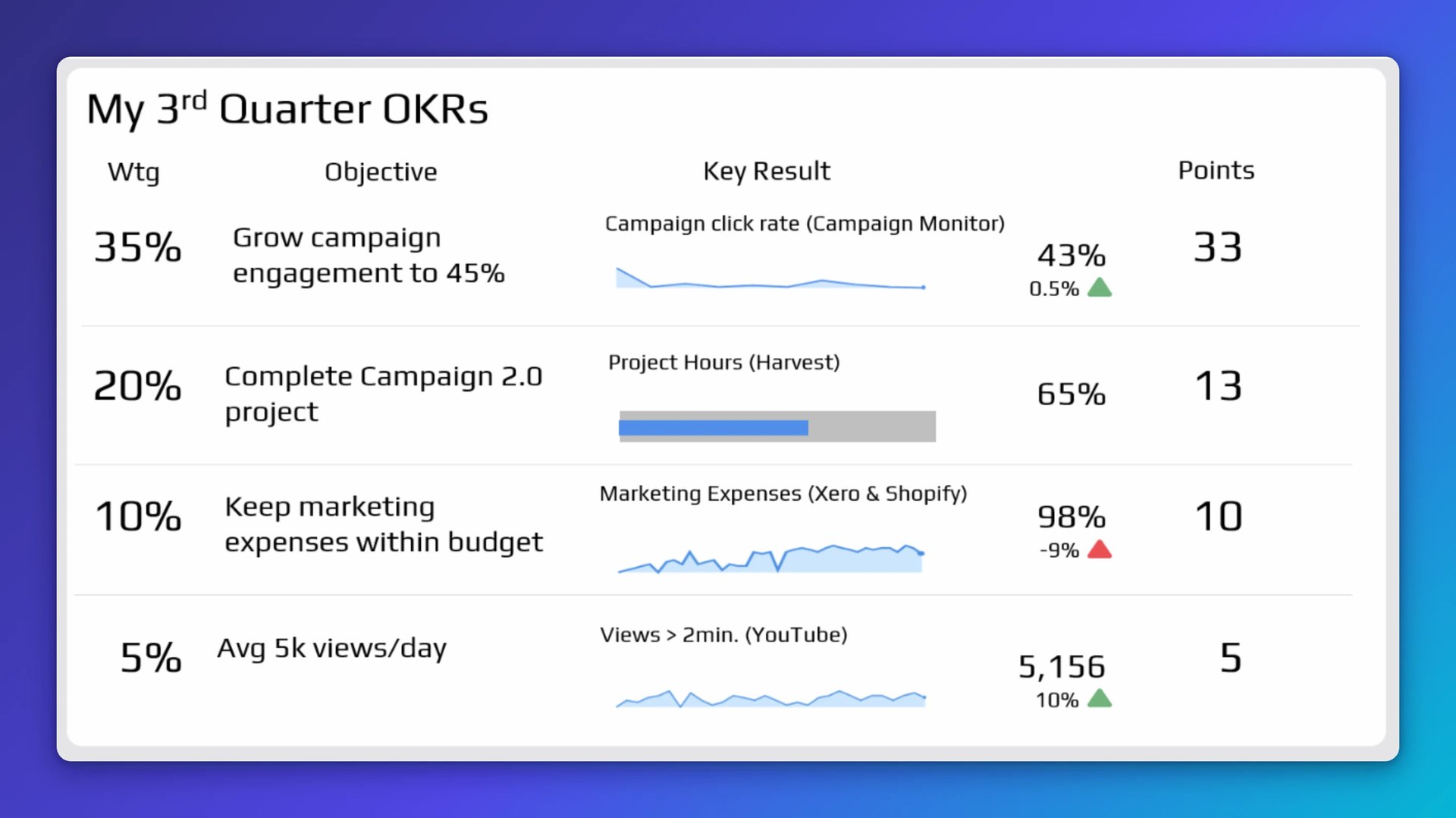
Each row on the dashboard represents one OKR. Here is what each column shows:
Wtg: The priority weighting agreed between the employee and their manager for this quarter. All weightings sum to 100%.
Objective: What the employee is responsible for this period, stated as [verb] [noun] [target].
Key Result: The measurable outcome that confirms the objective was met. Five visualization types cover everything you need:
- Sparklines: For tracking flow or trend across a period
- Bullet charts: For projects where you need to know completion level, without worrying about cost or timing
- Thermometers: For non-project goals where the final score is what matters
- Simple bar charts: For comparing several items that are not part of a sequential flow
- Stars: For scores given by external parties, such as customers, vendors, or stakeholders
Each Key Result also notes its data source (for example, Google Analytics, Shopify, or a CRM) directly in the title line, so anyone reading the dashboard knows exactly where the number comes from.
Points: Each Key Result is scored out of 100. Hitting the target earns 100 strategy points. That score is then multiplied by the OKR's weighting to calculate the contribution to the overall period score.
In more sophisticated implementations, your role in a given process also affects your score. Using a RACI model as a guide: the person responsible might earn 100% of the strategy points, accountable earns 50%, consulted earns 15%, and informed earns 0%.
One note on scoring: this approach uses a 0 to 100 scale rather than the 0 to 1 scale John Doerr recommends. The 0 to 100 scale is easier for most people to interpret and gives more granularity when assessing partial performance. There are no fixed rules in OKRs; use what works for your organization.
The complete OKR dashboard
When all four categories come together, the result is a dashboard that gives every person a clear, honest picture of where they stand.
A Klipfolio dashboard built for OKRs has several practical advantages:
- No manual data entry: Numbers feed directly from your existing sources automatically.
- Always current: Real-time data means no one is waiting for a quarterly review to find out how they are doing. You know where you stand without having to check.
- Readable by anyone: You can read your own dashboard, a colleague's, or a team's without any prior training.
- Works everywhere: Accessible on any device, in a team meeting room, a one-on-one, or while working remotely.
- Complements HR, not replaces it: This dashboard adds to existing HR processes like annual goal-setting and performance coaching. It does not try to replace them.
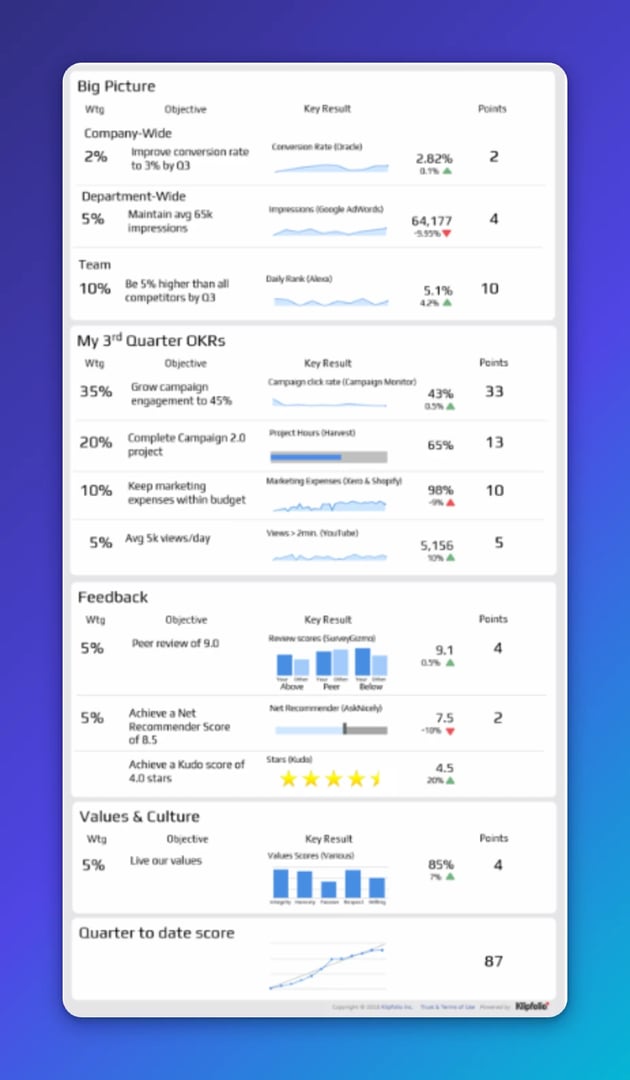
Next steps
An OKR dashboard is standardized across the organization, but each team needs to adapt it for their own responsibilities and priorities. A structured workshop typically covers the strategic cascade, identifies key performance nodes, surfaces the right Key Results, and helps define OKRs that are clear and measurable.
If you want to see what this looks like in practice, the OKR Primer video is a good starting point.
Published 2026-08-21
More in Dashboards
Beyond simple sign-ups: how True Trials and Activation predict growth
6 dashboards I use daily to run my SaaS company

The Hidden Value of SaaS Sign Up Rate Benchmarks

Klipfolio Partner How-To #1: Duplicating dashboards across client accounts

The ultimate guide to SaaS KPIs and metrics
17 KPIs Every Data-Driven Manager Needs to Lead Their Team
Most recent
- AUG 11Beyond simple sign-ups: how True Trials and Activation predict growth
- JUL 7Why business leaders miss important trends in their dashboards
- JUN 19The best chart for the job: Visualizing data for non-technical users
- JUN 95 tips to understand (and organize) your restaurant data
- MAY 26Think in Horizons, Not Seconds
- MAY 2010 Cloud BI Dashboard Tools for Small Businesses in 2026