

Personalizing a Dashboard for 200 Users
A consumer content publisher managing 200 affiliated contributors needed each partner to see their own performance data in real time, without manual report pulling or emailed spreadsheets. Working with Empirical Path, they used Klips to build personalized dashboards that filtered data automatically at login, so each of the 200 users saw only their own numbers. This case study walks through the full process: defining KPIs, simplifying the data, designing the dashboards, setting up user-level filtering via a Google Sheet, and testing before rollout.
When 200 content partners all ask the same question, you need one answer that works for each of them individually.
A well-known consumer content publisher manages a network of 200 affiliated contributors. These partners submit articles and videos for publication across the client's mobile apps and website. Naturally, every one of them wanted to know: how is our content doing?
Answering that question once is easy. Answering it 200 times, in real time, for 200 different data slices, is a different problem entirely. The client didn't want to paste numbers into a spreadsheet and email it around. They wanted each contributor to see their own performance, automatically, without anyone having to pull a report.
They asked Empirical Path for help.
Defining the right KPIs first
With access to a large data set covering everything the affiliates wanted to know, the task was to build real-time dashboards that surfaced localized KPIs to each specific content provider. Learn how to define your organization's KPIs.
The first step was working with the client to establish clear business goals and agree on the metrics worth tracking. Skipping this phase is tempting, but it reliably produces dashboards that don't support decisions. The team aligned on pageviews by user device, user demographics, and top content categories.
Getting this right upfront meant every subsequent step built toward something useful, not just something visible.
Simplifying the data
Next, the team simplified the data set to make it easier to work with in Klips. Google Tag Manager reduced the administrative overhead of managing Google Analytics data integration. Custom GA reports captured specific events, content groupings, and custom dimensions.
The goal was clean, reliable data. When 200 users are each trusting a number to represent their own performance, accuracy isn't optional.
Designing and building the dashboards
With the data in order, the team mocked up dashboard layout concepts, defined Klip chart types and visualizations, and chose the visualizations that would communicate each metric clearly. Doing this design work before building kept the construction phase straightforward.
How user-level filtering works
Here is the method used to set up the Klips backend for user-login filtering across 200 users. All you need is a Google Sheet as a Data Source for your Klips dashboard. Within the Google Sheet, create a tab that looks like this:
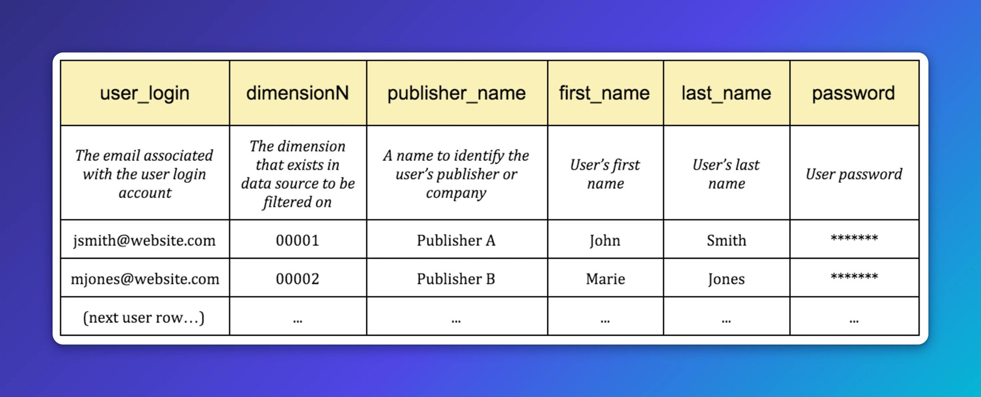
Using this sheet, Klips filters data based on the "dimensionN" field. When John Smith (00001) logs in, every Klip he sees contains only data where dimensionN = 00001. If the underlying data source shows total sessions from Nov 15 to Nov 16, John Smith sees his total: 4,000. Marie Jones (00002) sees 2,100. And so on, down 198 more rows.
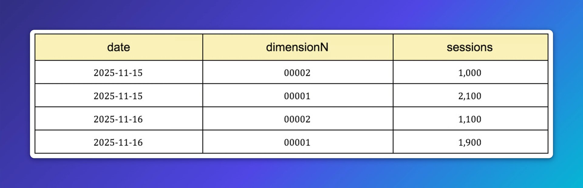
Each user gets a clean, accurate view of their own numbers without seeing anyone else's. No manual filtering, no emailed reports, no waiting.
Klipfolio documentation on user-level filtering can be found here.
Create custom dashboards for you and your team.
Get started with KlipsTesting before rollout
Once the individual KPIs were built, the team set up test logins for quality assurance testing. Google Analytics Query Explorer was used to compare the data surfaced on the Klips dashboards against the source data. For non-GA data sources, a SQL workbench works well for querying dependencies directly, checking the raw data, and making any adjustments before finalizing the query in the related Klips data source.
Once the numbers checked out, all 200 users were added to the Google Sheet table and given seats in the Klips admin screen (see pricing details for Klipfolio Klips here).
That's how you personalize a dashboard for 200 users, each seeing exactly what they need to know, without anyone having to ask.
At Empirical Path, web analytics, A/B testing, and tag management consultants focus on measuring your marketing and online presence. The Reporting and Advisory Practice translates data into business insights by creating custom reports and synthesizing web analytics, advertising, marketing automation, social, and CRM data into dashboards using automatically updated spreadsheets, Klipfolio, and other tools. The Web Analytics Implementation Practice fixes and enhances web analytics implementations, making your metrics more trusted, complete, and actionable. Contact www.searchdiscovery.com to learn more.
Published 2026-08-21
More in Partner Section

Klipfolio Partner How-To #1: Duplicating dashboards across client accounts

Klipfolio Partner How-To #2: Company Properties can simplify client set-up

Data-Driven Agency Series, Chapter 4: The essentials of an agency pitch

Data-Driven Agency Series, Chapter 3: The power of agency reporting

Data-Driven Agency Series, Chapter 2: Using data to foster lasting customer relationships

Data-Driven Agency Series, Chapter 1: Best KPIs for Marketing Agencies
Most recent
- AUG 11Beyond simple sign-ups: how True Trials and Activation predict growth
- JUL 7Why business leaders miss important trends in their dashboards
- JUN 19The best chart for the job: Visualizing data for non-technical users
- JUN 95 tips to understand (and organize) your restaurant data
- MAY 26Think in Horizons, Not Seconds
- MAY 2010 Cloud BI Dashboard Tools for Small Businesses in 2026