

Building custom HubSpot reports and dashboards with Klipfolio
HubSpot's built-in reporting is solid, but leaders who need a complete view of sales and marketing performance often find it too rigid. This post covers the core HubSpot reporting gaps, including cross-source data, custom visualizations, and sharing outside the platform, and shows how to close them with Klipfolio. It includes a step-by-step walkthrough of connecting HubSpot data via the API and building a custom email subscription timeline dashboard.

HubSpot is a leading sales and marketing platform, but if you're using it day-to-day, you've probably hit a wall with reporting. The built-in dashboards show you what HubSpot knows. They don't show you the full picture, and they don't always show it the way you need.
This post covers the core HubSpot reporting gaps users run into, and how Klipfolio closes them.
Why HubSpot's built-in reporting falls short
HubSpot gives you solid out-of-the-box reports. But leaders who need a complete view of their sales and marketing performance often find the built-in tools too rigid.
The most common frustrations:
- Combining HubSpot data with data from other sources: HubSpot can't merge its data with, say, GA4 or Facebook Ads in the same view. That makes it hard to see how your full funnel is actually performing, not just the HubSpot slice of it.
- Customizing metrics and visualizations: you can't always access the exact data points you want, or combine them the way a decision requires. You end up working around the tool instead of getting a straight answer.
- Sharing visualizations outside HubSpot: HubSpot doesn't export charts. You can export raw numbers, but the visuals stay locked inside the platform. That means screenshots in slide decks, or manually explaining your numbers to people who weren't in the room.
If any of those sound familiar, Klipfolio is built to solve them. You connect your HubSpot data once, and from there you get custom dashboards that combine sources, show exactly what you need, and distribute themselves without anyone having to pull a report.
Working with HubSpot's APIs
HubSpot publishes a set of APIs that power the platform itself. All the documentation lives on their developers portal. If you're not a developer, don't let that put you off. You don't need to write code; you need to understand how to read an API query and point it at the right endpoint. A short 101 video is a good place to start if APIs are new to you.
HubSpot's APIs are RESTful, meaning they use standard HTTP requests to retrieve and send data. That makes them straightforward to connect to cloud services like Klipfolio.
HubSpot exposes over two dozen APIs. Knowing which endpoint holds the data you want is the main skill to develop. The developers portal is your reference while you build out queries in Klipfolio.
Connecting your HubSpot data to Klipfolio
There are two ways to bring HubSpot data into Klipfolio:
- Write your own API query in Klipfolio's Connector Gallery to connect a specific HubSpot data endpoint directly.
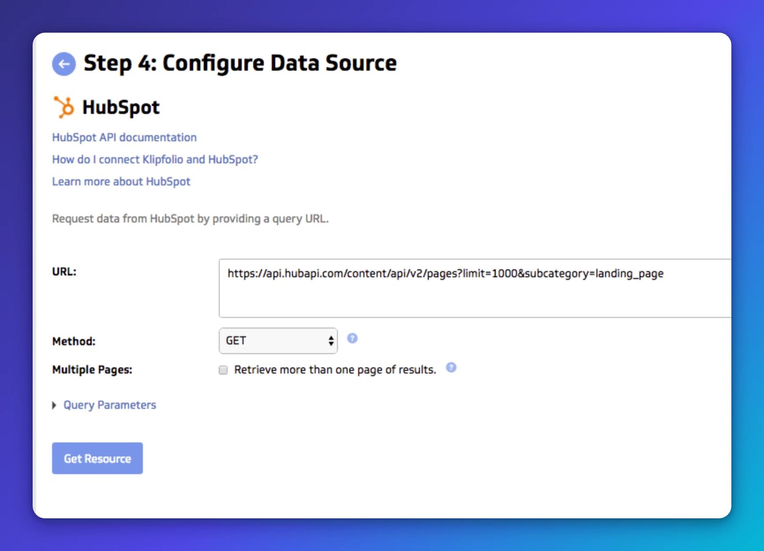
- Add a pre-built Klips and authorize Klipfolio to pull from your HubSpot account during setup. For example:
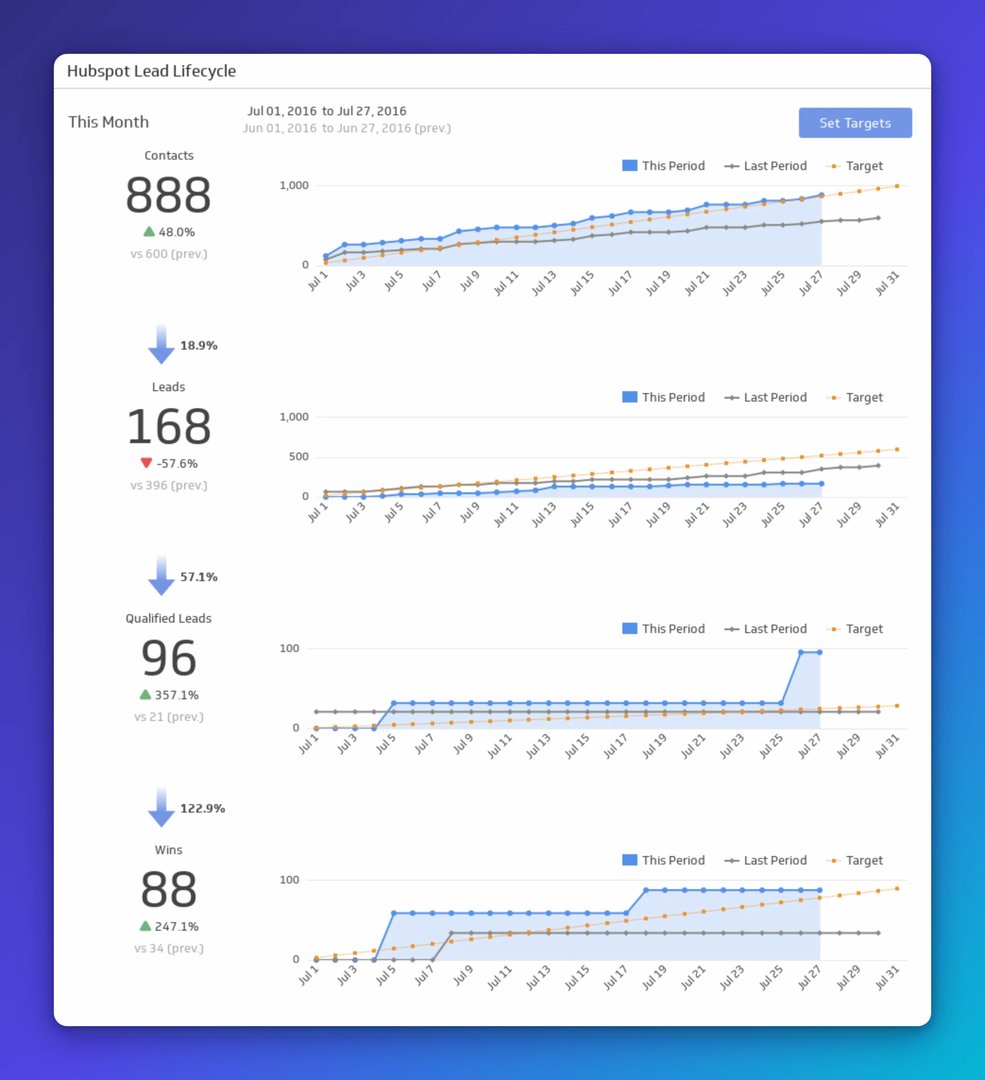
Create custom dashboards for you and your team.
Get started with KlipsLead Lifecycle
Take your marketing funnel to the next level. This is a complete lead lifecycle funnel with total numbers at each stage and visualizations of your progress.
The pre-built route is the fastest path to a working dashboard. The custom route gives you full control. The rest of this post focuses on the custom approach.
To connect via the Connector Gallery: from your Klipfolio dashboard, click "Library", then the "Data Sources" tab, then "Create a New Data Source". Search for the HubSpot connector or scroll to find it.
You'll be asked to authenticate with your HubSpot credentials. This creates a secure connection between your two accounts. Once authenticated, you'll land on a configuration page with an empty URL field:
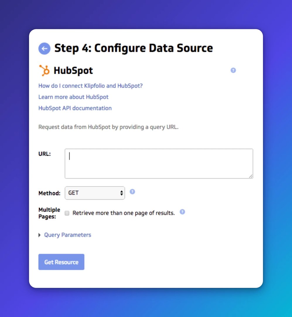
From here, refer to HubSpot's API documentation to write the query that pulls the data you need.
Here are a few examples to get started:
Subscription status
https://api.hubapi.com/email/public/v1/subscriptions/timeline (limit)
Keyword list
https://api.hubapi.com/keywords/v1/keywords (limit)
Recently created deals
https://api.hubapi.com/deals/v1/deal/recent/created?count=500 (count)
Data returned from these queries comes back in JSON format. If that's new to you, the JSON and XML datasource help article is a good primer.
Building HubSpot dashboards with Klipfolio
Once a HubSpot data source is connected and saved in your Klipfolio library, you can use it to build any Klip you need. The same data source can power multiple visualizations across multiple dashboards.
The example below walks through a real build so you can see exactly how the pieces fit together.
Example: creating an email subscription timeline
This example uses the email subscription status timeline endpoint. The goal is a bar chart showing daily Subscribers, Unsubscribes, and Bounces for the current month.
Start by modifying the base query to pull only the current month's data, using startTimestamp and endTimestamp parameters. This endpoint requires Unix time in milliseconds. Klipfolio's date parameters in queries handle the formatting dynamically:
https://api.hubapi.com/email/public/v1/subscriptions/timeline?limit=1000&startTimestamp={date.startOfMonth.format("epochTime")}000&endTimestamp={date.endOfMonth.format("epochTime")}000
The limit is set to 1000 results. Klipfolio also supports pagination if you need to pull additional pages.
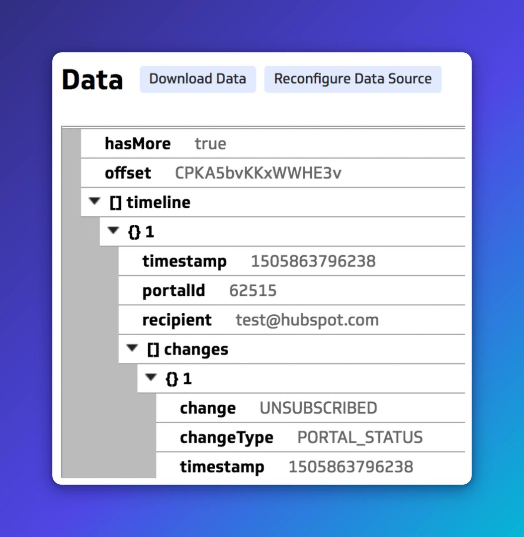
The returned data is in JSON format. Each timeline object contains a changes array, which holds the subscription event data you'll use to build the chart.
Standard approach
Set up the x-axis first, using the timestamp from the changes array:
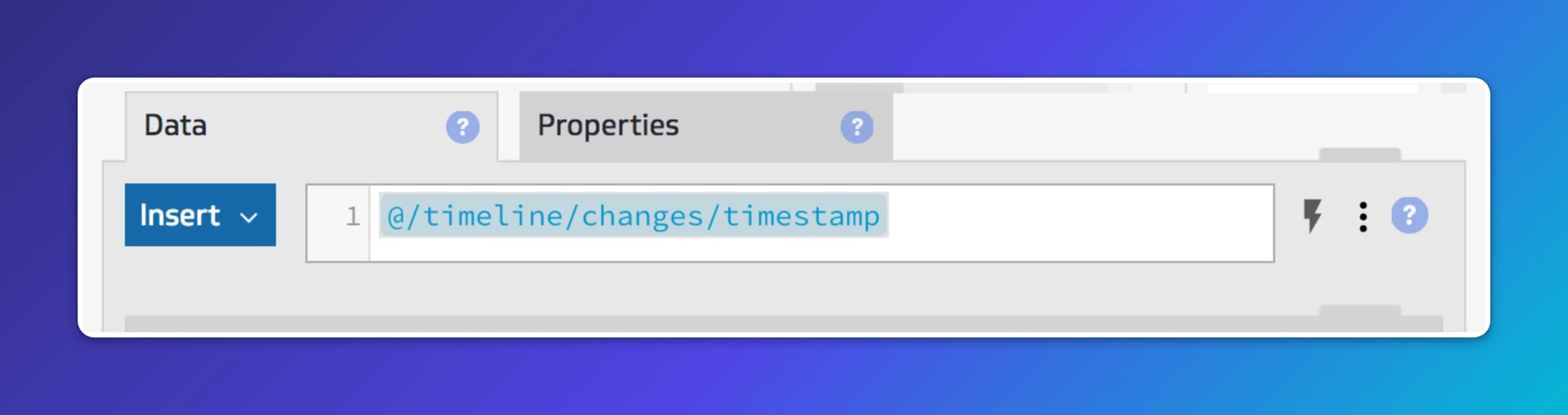
The raw timestamp comes back in Unix milliseconds, which isn't readable on a chart. Adjust the format in component properties to display the day of the month instead:
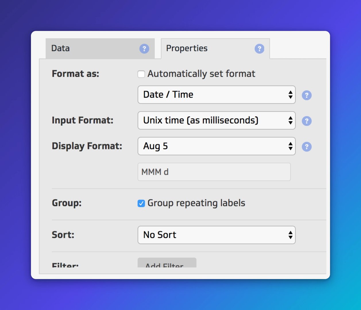
Enable "Group repeating labels" so the chart groups each series by day.
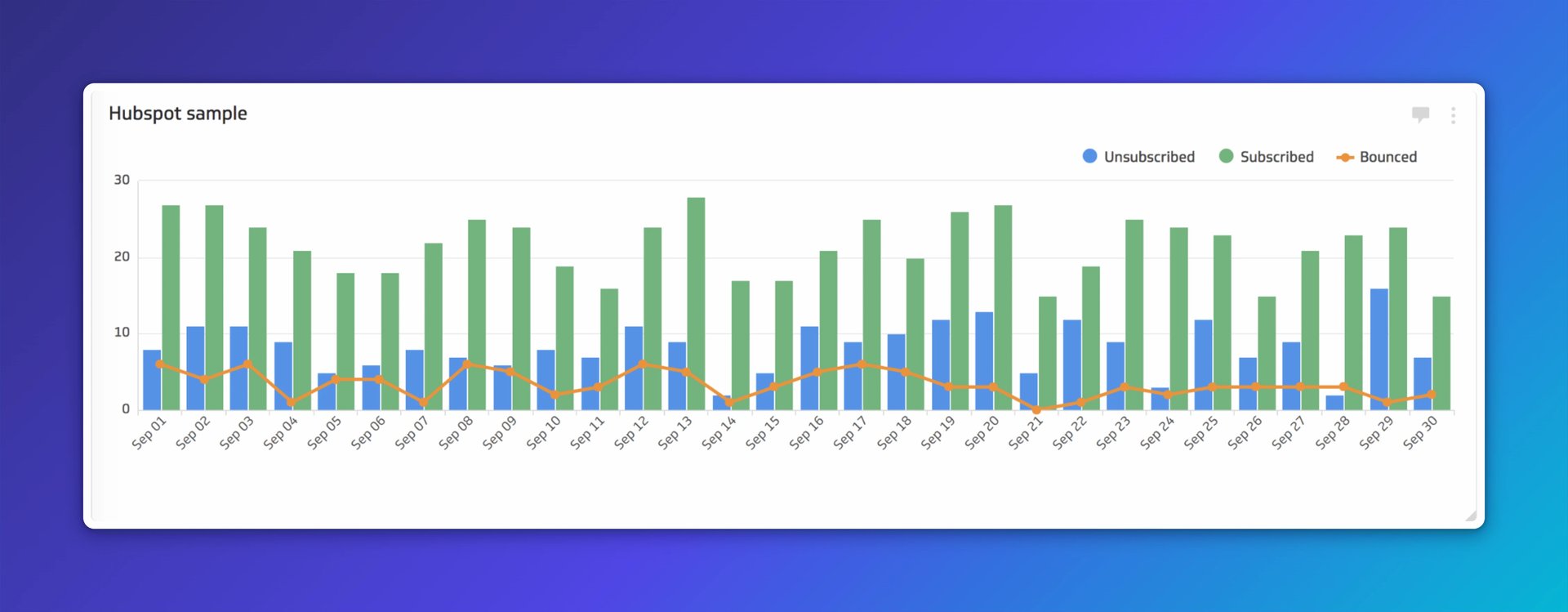
Next, create three series: Subscribed, Unsubscribed, and Bounced. Use a simple IF function in each series to check the change type and return the matching data. Set the aggregation type to "Count" for each. A blank value doesn't count toward the group, so the grouping stays clean.

The result is a chart that shows you exactly where subscribers are coming from, where you're losing them, and how that breaks down day by day:
Create custom dashboards for you and your team.
Get started with KlipsAdvanced approach
HubSpot doesn't always return data for every day in your selected range. If you want a complete set of dates on the x-axis, not just the days with events, use Klipfolio's formula bar to fill the gaps.
Set the x-axis date range using the DATERANGE function, combined with date functions like TODAY, DATE_STARTOF, DATE_ENDOF, and DATEVALUE:

For each series, use SELECT to filter by change type, GROUP and GROUPBY to aggregate the data, and LOOKUP to align it to the x-axis.
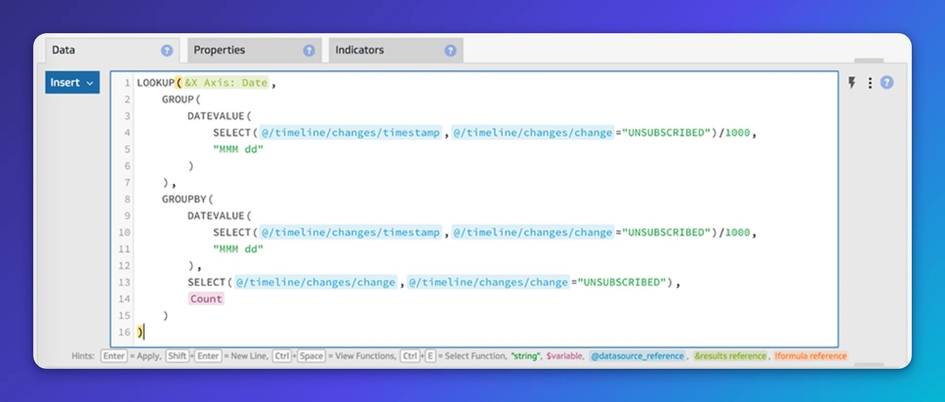
One detail to watch: DATEVALUE expects Unix time in seconds. HubSpot returns timestamps in milliseconds. Divide the timestamp by 1000 before passing it to DATEVALUE.
The advanced approach gives you a chart where every date in the month appears, whether HubSpot returned data for it or not. That's the version you can trust when you're presenting to someone who'll notice a gap.
Published 2026-08-21
More in Dashboards
6 dashboards I use daily to run my SaaS company

The 5 most important SEO KPIs for digital marketing success

What are the best inbound marketing KPIs?

Klipfolio Partner How-To #1: Duplicating dashboards across client accounts

Klipfolio Partner How-To #2: Company Properties can simplify client set-up

Top 10 Marketing Dashboard Ideas for Tech Companies
Most recent
- AUG 11Beyond simple sign-ups: how True Trials and Activation predict growth
- JUL 7Why business leaders miss important trends in their dashboards
- JUN 19The best chart for the job: Visualizing data for non-technical users
- JUN 95 tips to understand (and organize) your restaurant data
- MAY 26Think in Horizons, Not Seconds
- MAY 2010 Cloud BI Dashboard Tools for Small Businesses in 2026