

Understanding social media interaction KPIs
Social media interaction KPIs are among the most misunderstood measures of content performance. This post walks through five KPIs using Facebook data from two budget airlines, giving you a clear framework for measuring social media interactions and knowing what to do with what you find.

When you post on social media, you want the content to land. The clearest signal it did? People interacted with it.
Social media interactions are one of the most useful, and most misunderstood, measures of content engagement. Knowing which KPIs to track, and how to read them, is what separates a gut feeling from a decision you can act on.
This post walks through five interaction KPIs using Facebook data from two budget airlines: Ryanair of Ireland and Eurowings of Germany. The goal is to give you a clear framework for measuring social media interactions and knowing what to do with what you find.

What do social interactions really mean?
Social media interactions are the actions an audience takes on a post: likes, comments, shares, and reactions on Facebook; likes, replies, reposts, and quote posts on X (formerly Twitter); likes, comments, and saves on Instagram.
Each platform defines interactions a little differently.
For Facebook, social interactions include:
Likes
Comments
Shares
Emoji reactions
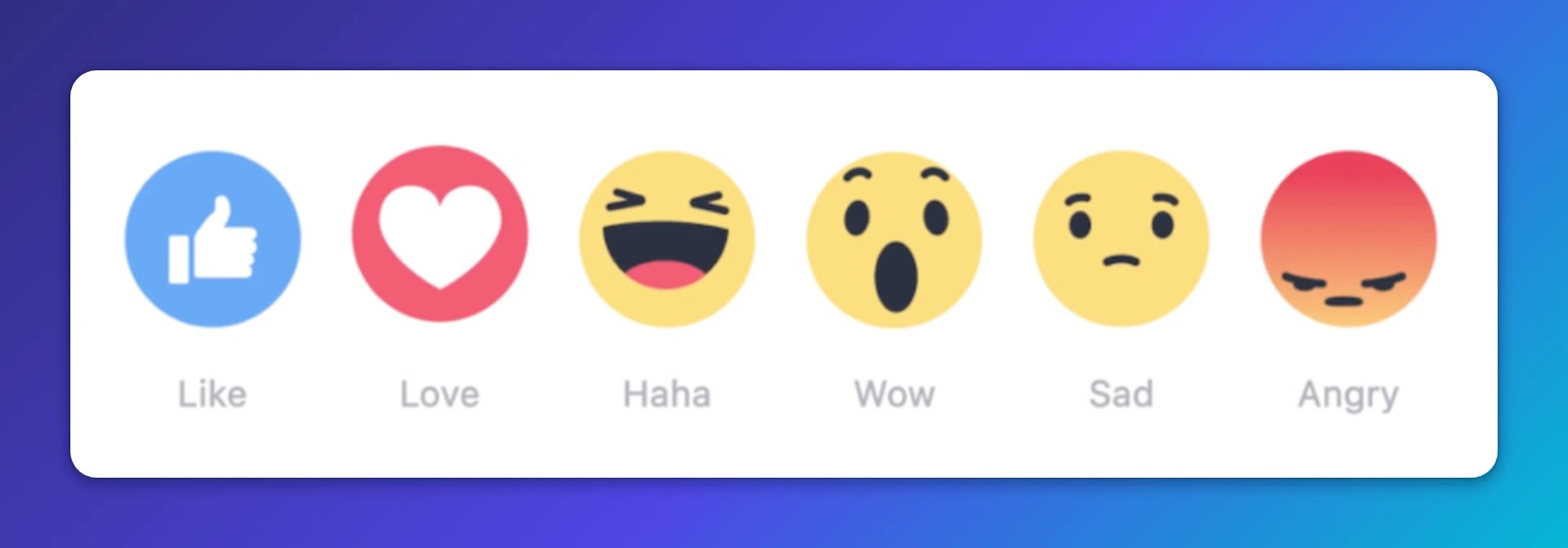
On X, interactions commonly include likes, replies or mentions, reposts, and quote posts. Instagram works differently: shares are limited, so interactions typically include likes, comments, and saves. Video views and plays are useful directional signals, but treat them separately from interaction counts.
The KPIs below use Facebook data, but the logic applies across platforms.
5 approaches to measuring social interactions
These five KPIs give you a layered view of how your content is performing, from the broad picture down to the specific decisions you can make.
Facebook Total Interactions
Facebook Engagement Rate (by reach preferred)
Facebook Average Interactions Per Post
Facebook Interaction Rate by Post Type or Format
Facebook Interaction Rate by Day and Hour
1. Facebook Total Interactions
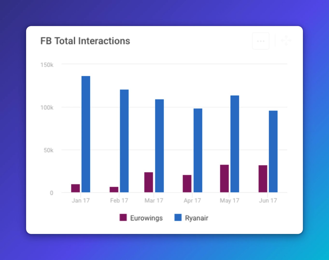
Total Interactions is the sum of all likes, comments, shares, and reactions your page received over a given period. It tells you, at a glance, whether your content is connecting with your audience.
A six-month view in a column chart gives you a clean read on volume over time without confusing overlaps. Spikes stand out immediately.
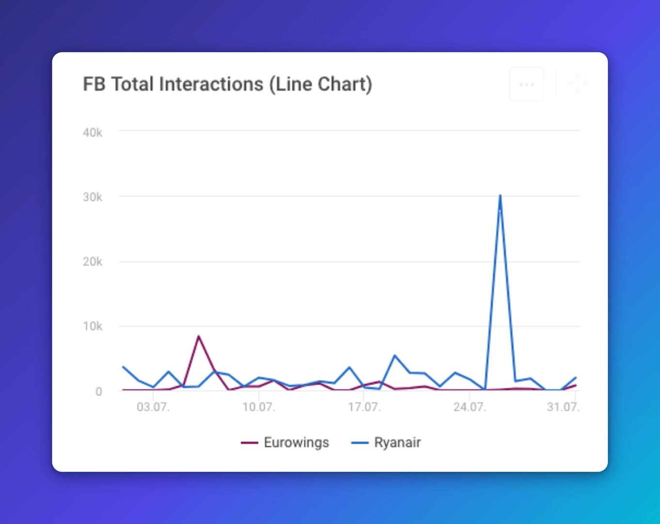
Ryanair's data shows a clear spike in the last week of July 2017, driven by a high-performing video post. That kind of peak is easy to miss in a table and obvious in a chart.
When you want to find your best-performing content and pinpoint the exact posts behind a spike, switch to a line chart with a daily time frame:
Total Interactions is a strong starting point. But it does not account for audience size or posting frequency, so it can mislead when you are comparing two pages. That is where engagement rate earns its place.
Create custom dashboards for you and your team.
Get started with Klips2. Facebook Engagement Rate (by reach preferred)
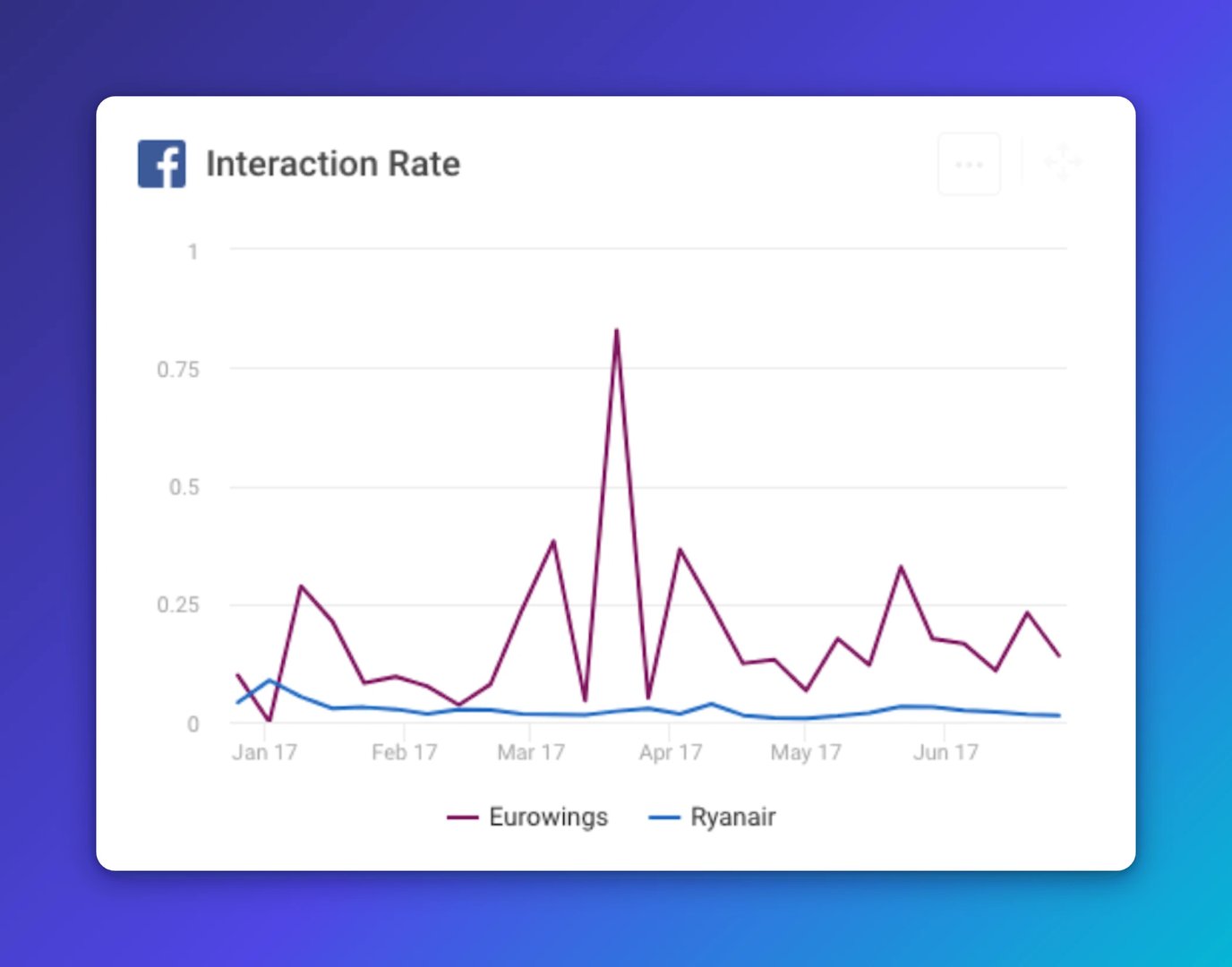
Engagement Rate puts interactions in context. Instead of a raw count, it shows how efficiently your content earns responses relative to how many people actually saw it.
The recommended approach: interactions per post divided by reach per post (or impressions), averaged over a period. Reach-based rates are more reliable than follower-based ones because follower counts fluctuate and not every follower sees every post. As audience size grows, a follower-based rate can fall even when absolute interactions are rising, which gives a distorted picture.
In the airline comparison, Eurowings (around 580,000 fans) consistently outperforms Ryanair (around 2.3 million followers) on Engagement Rate, even though Ryanair generates far more total interactions. That is not a contradiction: it reflects the difference in audience size and how the rate normalizes for it.
This is the kind of number that tells you whether your content is working, not just whether your page is large.
3. Facebook Average Interactions Per Post

Average Interactions Per Post breaks the data down to the individual post level. It answers a straightforward question: on average, how much engagement does each post earn?
If you post 30 times in one month and 30 times the next, but your average interactions per post rise, your content is improving. A weekly or monthly view makes those trends easy to read.
In the airline data, Ryanair leads on total volume, but Eurowings is more efficient: more interactions per post, on average. That is a signal worth paying attention to, especially if you are deciding how often to post or where to focus creative effort.
4. Facebook Interaction Rate by Post Type or Format
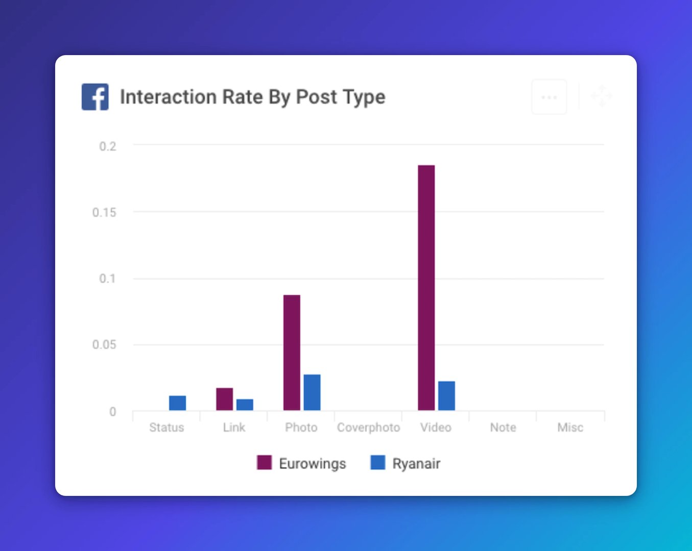
Not all content performs equally. Breaking interactions down by post type shows you which formats your audience actually responds to.
In the airline comparison, links and status updates lag behind photos and videos in interaction rate, which aligns with the general view that visual content performs best. But Ryanair's data tells a different story: photos outperform videos for that specific audience.
That is worth noting if you are tempted to follow broad industry benchmarks. What works for a competitor's audience may not work for yours. Modern formats like Reels, Stories, and carousels are worth testing too; group comparable formats when you compare performance so you are reading the data fairly.
Your own numbers are the most reliable guide. Use them.
5. Facebook Interaction Rate by Day and Hour
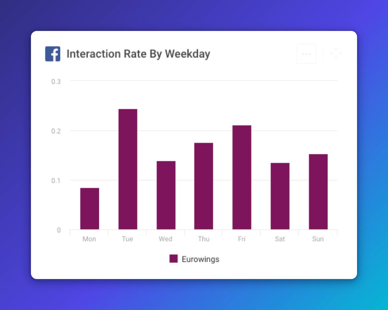
"When is the best time to post?" is one of the most common questions in social media management. There is no universal answer, but your own data will get you close.
Look at interaction rates by day and hour, in your audience's primary time zones. Algorithms personalize distribution, so published research on optimal posting times reflects averages across many accounts, not yours specifically.
Eurowings' data from the first half of 2017 shows consistently lower interaction rates on Mondays. Whether that reflects audience behaviour or weaker Monday content is hard to say from the data alone. But the pattern is clear, and clear patterns are what you act on.
If Mondays are underperforming, you have two options: change what you post on Mondays, or shift your posting schedule. Either way, you are making a decision backed by your data, not a guess.
Create custom dashboards for you and your team.
Get started with KlipsWhat to take away from social media interaction KPIs
The five KPIs above work together. Start with the right question, then choose the metric that answers it.
Want an overall read on social performance? Start with Total Interactions, visualized as a column chart across weeks or months.
Want to find your best-performing content? Use a line chart with a daily time frame to make individual peaks visible.
Want to know if your content is efficient? Track Average Interactions Per Post and Engagement Rate by reach.
Want to know what type of content works best? Break down interaction rates by post type or format.
Want to know when to post? Analyse interaction rates by day and hour using your own audience data.
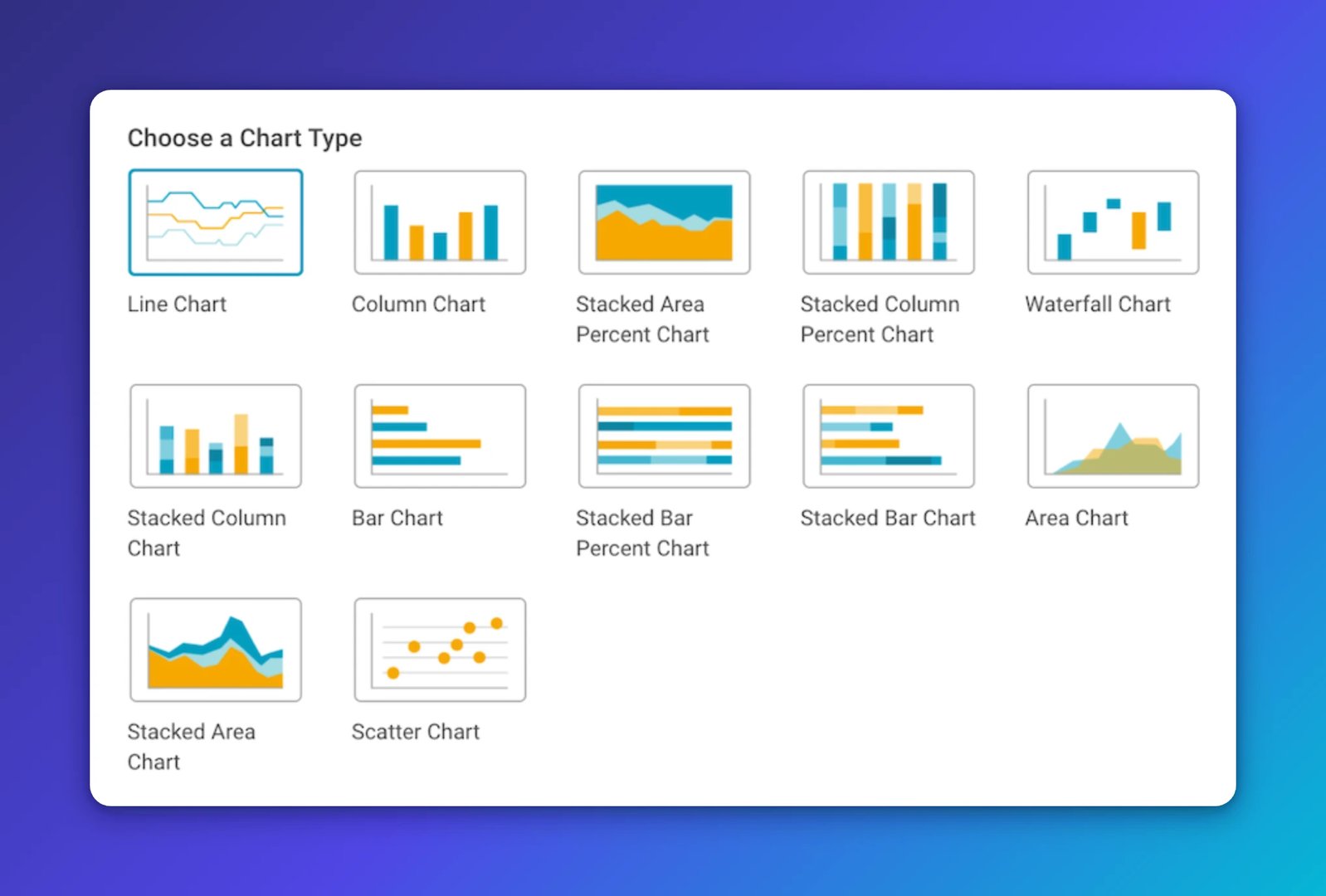
Data visualization matters here. The same numbers look different in a column chart versus a line chart, and choosing the wrong format can hide the insight you are looking for. Take it seriously.
The underlying principle is simple: keep your social media performance data in view. When you do, the high points and low points become obvious. You can double down on what works and fix or drop what does not. That is how you stop guessing and start deciding.
See also:
Published 2026-08-24


Most recent
- AUG 11Beyond simple sign-ups: how True Trials and Activation predict growth
- JUL 7Why business leaders miss important trends in their dashboards
- JUN 19The best chart for the job: Visualizing data for non-technical users
- JUN 95 tips to understand (and organize) your restaurant data
- MAY 26Think in Horizons, Not Seconds
- MAY 2010 Cloud BI Dashboard Tools for Small Businesses in 2026