

What the fastest-growing SaaS companies actually track
The fastest-growing SaaS companies share a common trait: they track the right things. This post analyzes what those companies actually measure across their websites, traffic, SEO, and growth tooling. The goal is to extract patterns worth borrowing, regardless of your industry or stage, drawing on data from SaaS 1000, SimilarWeb, Spyfu, and BuiltWith.
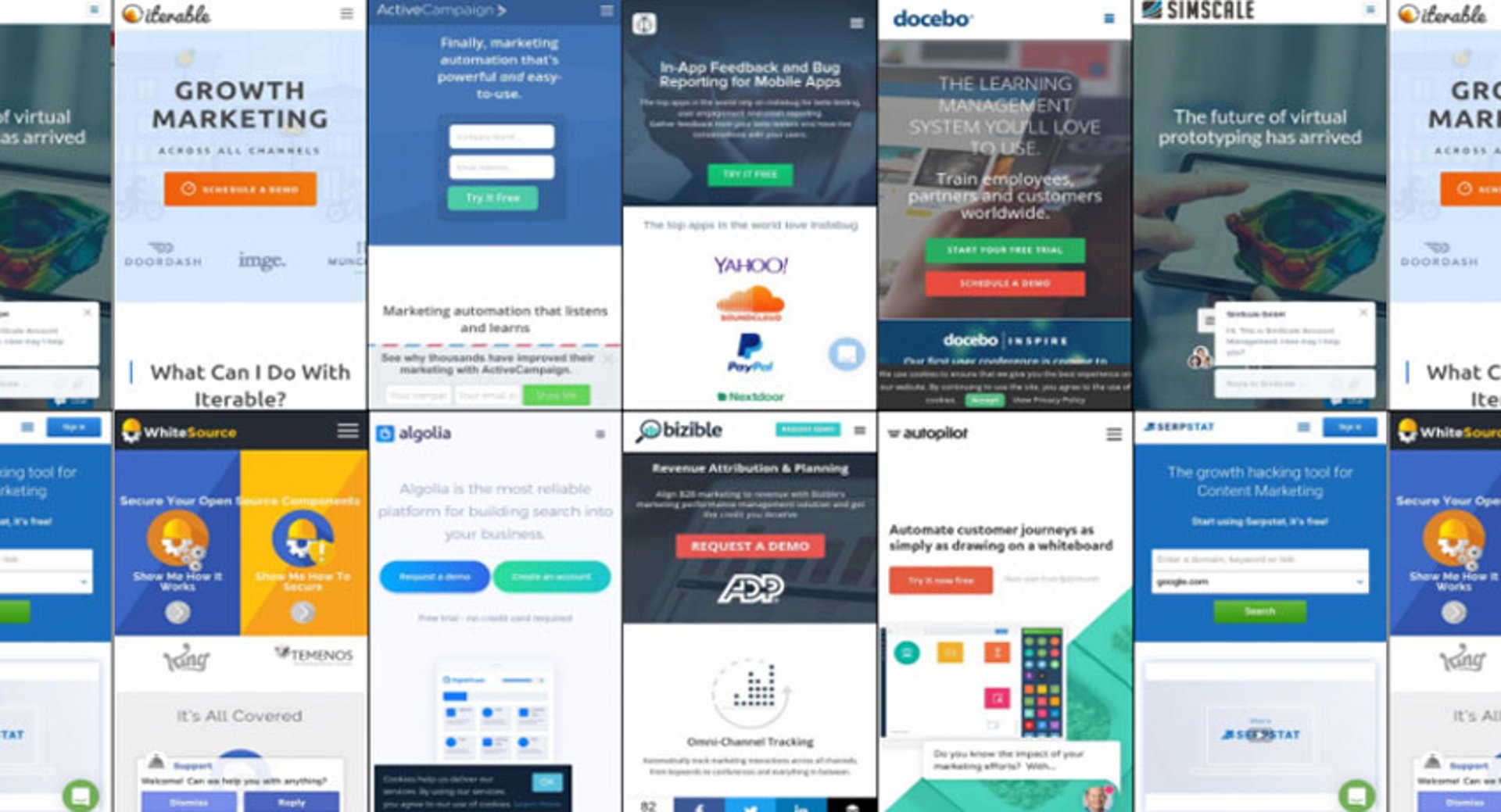
The fastest-growing SaaS companies share a common trait: they track the right things. Not every metric, just the ones that drive decisions.
This post looks at what those companies actually measure across their websites, traffic, SEO, and growth tooling. The goal isn't to name-drop specific startups. It's to extract the patterns worth borrowing, regardless of your industry or stage.
The original analysis drew from SaaS 1000, a list curated by Tom Blue, Founder of Lead411, ranking the world's fastest-growing SaaS companies with over 40 employees by headcount growth over six months. The companies spanned tools, platforms, and verticals, which made the patterns that emerged across all of them more meaningful, not less.
What fast-growing SaaS companies track on their websites
The first thing worth noting: these companies don't just build great products. They treat their websites as measurable growth assets and monitor performance closely.
Two free tools surface most of what you need to start: Hubspot Website grader and Google PageSpeed Insights.
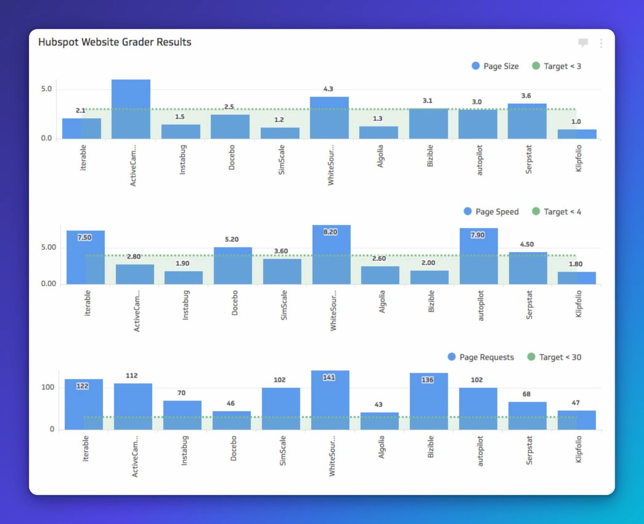
Across the companies reviewed, a few key performance indicators (KPIs) stood out as both trackable and actionable.
Page size: Most sites stayed under 3MB. That's the target. Heavy pages cost you load time, and load time costs you users.
Page load speed: Only about four of the ten sites met the 3-second threshold. This matters more than most teams admit. Google's rankings weight mobile performance heavily, and users don't wait. The Google PageSpeed Insights tool is worth running regularly. It identifies specific problems and tells you exactly how to fix them.
HTTP page requests: This is where almost every site struggled, including the fastest-growing ones. Too many JavaScript files, CSS resources, and third-party widgets all competing to load above the fold. Every extra request adds latency.
Here's what a poorly optimized load sequence looks like:
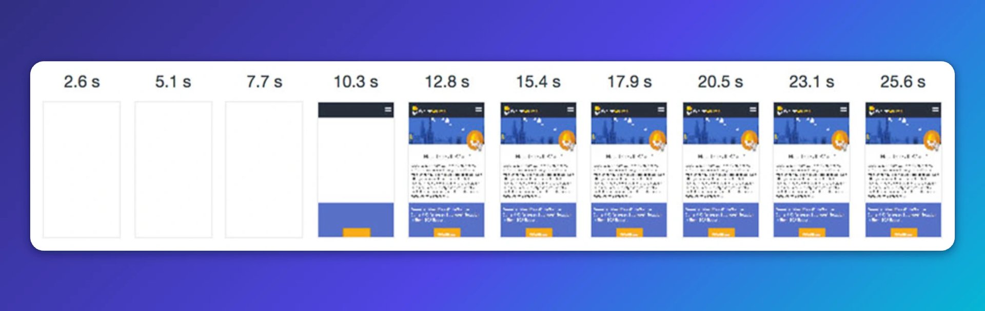
That site didn't start rendering until around 10 seconds. Most users would have assumed their connection dropped. The lesson: a low bounce rate can mask a slow site if your audience is highly motivated, but you shouldn't count on that.
And here's what the underlying request chain looks like when it's overloaded:
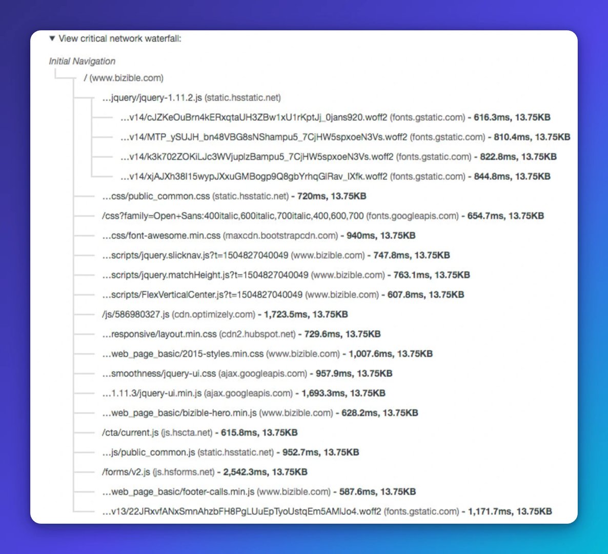
That critical request chain showed 21 chains, 14,297ms, over 2 requests, totalling 13.75KB, with font resources doing most of the damage. Simplifying that chain directly improves load time.
Three website KPIs worth acting on
Meta tags, titles, and headings: These aren't glamorous, but they're low-hanging fruit. Missing meta descriptions, untagged images, and unlabelled headings all hurt SEO. Fast-growing teams add people quickly and sometimes skip the basics. A short checklist prevents that. Accessibility optimization and search crawler optimization are the same thing.
Image compression: Stop using high-resolution images for web. Nobody is printing your homepage. Compress every image. Google's WebP format delivers superior lossless and lossy compression and makes pages load faster without visible quality loss.
HTTP request reduction: Remove JavaScript and CSS that blocks above-the-fold content. What the user sees first needs to load fast. The number of HTTP requests your page makes directly affects load time, which affects user experience, bounce rate, and conversion.
Key website metrics fast-growing SaaS companies benchmark
Across the companies analyzed, using data from SimilarWeb, a few benchmarks emerged that are worth tracking against your own site.
The group averaged:
2:43 average session duration
3.1 pages per visit
50.45% bounce rate
These aren't targets to hit blindly. They're reference points. If your numbers are significantly worse, that's a signal worth investigating. If they're better, understand why before you change anything.
One important note on interpreting traffic data: August consistently showed a traffic dip across nearly all the companies reviewed, roughly a 9.82% average decline. The likely cause is summer vacations. This is exactly why trend comparisons matter more than point-in-time snapshots. Month-over-month tells you what changed. Year-over-year tells you whether it's a pattern. Tracking both is how you answer the question "is something wrong, or is this normal?"
There was also no meaningful correlation between how long a company's domain had been active and how much traffic it generated. A newer domain with a strong SEO strategy can outperform an older one. Time helps, but it doesn't substitute for deliberate content and keyword work.
What these companies track for SEO
Using Spyfu, the SEO data made one thing clear: strong organic presence takes time. There are no shortcuts. But the companies doing it well share a few measurable habits.
First-page keyword win rate: Across the group, the ratio of total organic keywords ranked to keywords ranking on page one averaged around 3.12%. That's the benchmark. Most keywords don't make it to page one, and that's normal. The goal is to keep pushing the ones that matter.
Keyword retention: Getting to page one is hard. Staying there is harder. Several companies saw significant keyword losses in a single period, with dozens of terms slipping off page one. This isn't a failure; it's a signal that SEO requires ongoing attention, not a one-time push.
Organic traffic share: Most of the companies drove a significant portion of their traffic through organic search. That's a durable, compounding channel worth investing in consistently.
Top web traffic sources
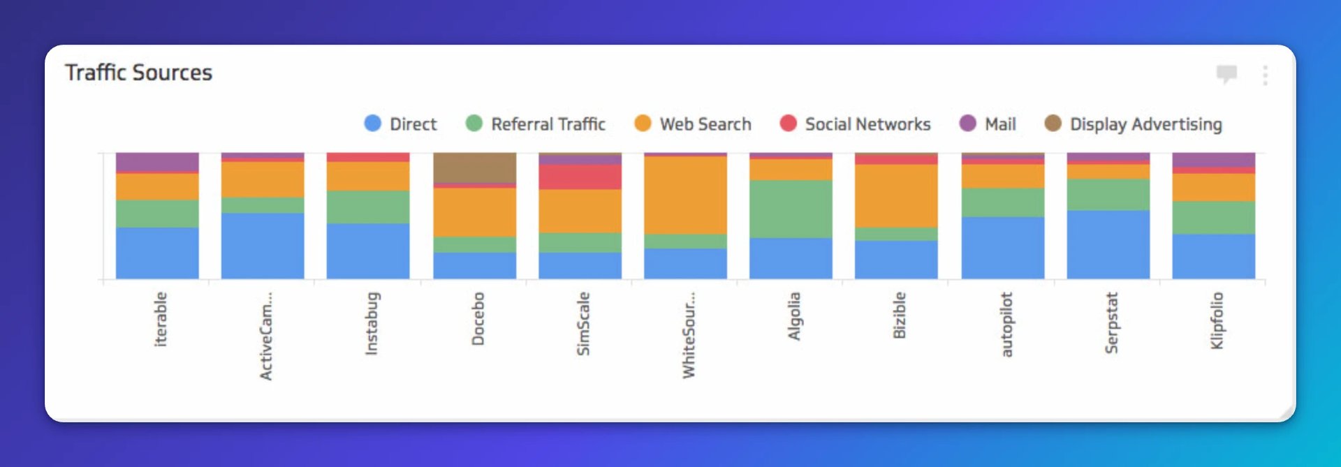
Traffic source mix is hard to benchmark across companies in different categories. What reads as healthy for one business model may be a warning sign for another. That said, a few patterns are worth noting.
Direct traffic tends to be high for products with daily active users. People bookmark the login page and come back repeatedly. High direct traffic is a signal of strong retention and high brand awareness.
Paid traffic can look impressive but requires scrutiny. If a company is driving significant traffic through display advertising, the relevant question is whether that traffic converts and what the attribution looks like back to revenue.
Channel diversification matters as you scale. If one channel drops, you want others to compensate. The most resilient companies in the group weren't dependent on a single source.
Create custom dashboards for you and your team.
Get started with KlipsReferral traffic
Review sites drove meaningful referral traffic for nearly every company in the group. Capterra, GetApp, TrustRadius, G2Crowd, and FinancesOnline appeared repeatedly as top referrers.
The mechanism is straightforward: after an NPS survey, trigger an email to high-scoring customers asking them to leave a review. A small incentive (stickers, swag) increases response rates. The resulting reviews generate referral traffic, improve conversion, and build credibility.
Job postings are another underused referral source. HR sites like LinkedIn and Indeed carry domain authority. Posting roles on multiple platforms widens your candidate pool and earns backlinks from reputable domains.
Social traffic
Most companies concentrated their social efforts on one or two channels rather than spreading thin across all of them. The channels generating the most traffic, in order, were:
Facebook
LinkedIn
YouTube
A few tactics appeared consistently across the top-performing social channels: native video outperformed linked video on Facebook, LinkedIn text posts often drove more click-throughs than image posts, and YouTube served as a long-form education channel rather than a pure acquisition tool.
The common thread: each platform was used with its audience's behaviour in mind, not just repurposed content from another channel.
Homepage design patterns that reduce bounce rate
Across the homepages reviewed, a few structural patterns appeared in the sites with the lowest bounce rates.
The companies with the strongest homepage performance shared these characteristics:
A clear, friction-free CTA. Free trial offers with no credit card required were nearly universal. The absence of credit card friction reduces signup hesitation significantly.
Use cases over product overviews. The homepages that performed best led with what the product helps you accomplish, not what it technically does.
Social proof above the fold or just below it. Customer logos, testimonials, and third-party validation from review sites or press appeared on almost every high-performing homepage.
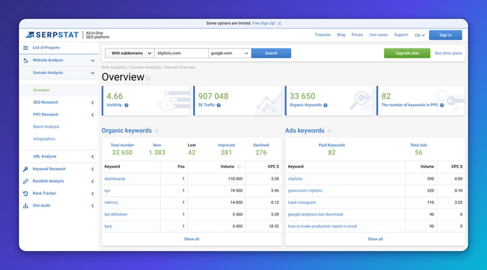
The site with the lowest bounce rate in the group achieved it by prompting visitors to enter their own URL immediately, delivering a personalized result without requiring a login. That's a frictionless first-value moment. The user gets something useful before being asked for anything.
Here's what that experience looked like with Klipfolio's domain entered:
Three homepage examples worth examining for bounce rate performance:
A marketing automation homepage (36.25% bounce rate)
CTA: "Try It Free"
Key message: Powerful and easy to use
Social proof: Customer quotes and video testimonials
Notable: Featured partner integration logos to extend credibility
A search platform homepage (42.31% bounce rate)
CTAs: Both a demo request and a free account creation, clearly separated
Key message: Reliability as the lead value proposition
Social proof: Four recognizable brands with use case context
Notable: Top three use cases called out by vertical (SaaS, Ecommerce, Media)
A mobile feedback platform homepage (44.79% bounce rate)
CTA: "Get Started for Free"
Key message: Product-specific and direct
Social proof: Customer logos near the fold, quotes lower on the page
Notable: Three features highlighted, two use cases, integration partner logos
The search platform's customer testimonial section stood out. Each testimonial was paired with a dynamic button highlighting the specific use case relevant to that customer's industry. That's not just social proof; it's segmented social proof that speaks directly to each visitor's context.
Live chat placement
Seven of the ten companies had live chat enabled. The ones that used it well placed it contextually: chat appeared on the pricing page specifically, not on every page. The ones that triggered chat immediately on homepage load created friction rather than reducing it.
The pattern worth following: let visitors absorb your core message before prompting them. A chat that fires within two seconds of page load interrupts the experience. One that appears after a user has spent time on the pricing page is genuinely useful.
Pricing page strategies
Pricing pages are where intent converts, or doesn't. Three approaches emerged from the companies with the highest traffic volumes.
No pricing available: One of the highest-traffic sites offered no pricing information at all. This creates friction for buyers who want to self-qualify before engaging sales. In a market where buyers expect transparency, hiding pricing forces a conversation that many prospects won't bother initiating.
Usage-based tiered pricing: A well-structured pricing page with clear plan differentiation. The main friction point: a usage slider that introduces uncertainty about final cost. Some buyers respond well to flexible pricing; others disengage when they can't pin down a number. Testing a simplified version alongside the current page would reveal which performs better.
Overcrowded pricing page: Too much information competing for attention. A pricing page that requires significant effort to parse will lose buyers who were otherwise ready to convert. If a pricing page has a high bounce rate relative to the homepage, that's a clear signal to simplify.
Growth tools fast-growing SaaS companies use
Across the group, using BuiltWith to analyze technology stacks, a few patterns emerged in what these companies actually run.
The technology stacks clustered into four categories:
Analytics and tracking: Google Analytics appeared on every site. Most added a second layer, whether Heap, Hotjar, Mixpanel, or a similar tool, to capture behavioural data beyond pageviews. Conversion tracking was nearly universal.
Advertising: DoubleClick and Facebook Custom Audiences appeared across almost every stack. Retargeting was standard, not optional.
Email and CRM: Google Workspace dominated. Most added a dedicated email service provider and a support tool like Zendesk or Intercom.
Tag management: Google Tag Manager appeared consistently, which explains part of the high page request counts. Every tag added through GTM is another request.
The takeaway isn't to copy a specific stack. It's to recognize that fast-growing companies instrument everything. They don't guess which channels work or which pages convert. They measure, then decide.
Create custom dashboards for you and your team.
Get started with KlipsWhat you can take from this
The companies that grow fastest aren't necessarily the ones with the best product. They're the ones who know their numbers well enough to act on them quickly.
The patterns here, from page load time to keyword retention to pricing page design, all point to the same underlying discipline: track the metrics that connect to decisions, not just the ones that are easy to pull.
Running this same analysis on your own competitors will tell you more than any industry benchmark. You'll see exactly where they're investing, where they're exposed, and where you have an opening.
Published 2026-08-22
More in Marketing Analytics

Beyond simple sign-ups: how True Trials and Activation predict growth

The 5 most important SEO KPIs for digital marketing success

The Hidden Value of SaaS Sign Up Rate Benchmarks

What are the best inbound marketing KPIs?

Top 10 Marketing Dashboard Ideas for Tech Companies

The ultimate guide to SaaS KPIs and metrics
Most recent
- AUG 11Beyond simple sign-ups: how True Trials and Activation predict growth
- JUL 7Why business leaders miss important trends in their dashboards
- JUN 19The best chart for the job: Visualizing data for non-technical users
- JUN 95 tips to understand (and organize) your restaurant data
- MAY 26Think in Horizons, Not Seconds
- MAY 2010 Cloud BI Dashboard Tools for Small Businesses in 2026