

Mobile website performance: the essential KPIs
Optimizing mobile website performance is essential. Learn which KPIs to track, what to measure across devices, and which tools give you the clearest picture of where your mobile site stands.

Mobile website performance is how well your site loads, displays, and functions when visitors access it from a smartphone or tablet. Tracking it with key performance indicators (KPIs) tells you exactly where the experience breaks down and what to fix.
Why mobile website performance KPIs matter
More than half of all web traffic now comes from mobile devices. If your site underperforms on a phone, you're losing visitors, conversions, and search rankings.
The numbers make the case:
52.2% of all website visits take place on a mobile device (Source: Statista.com)
58% of Google searches are done on a mobile device (Source: Hitwise)
30% of all online purchases happen on mobile phones (Source: thinkwithgoogle.com)
80% of social media time is spent on a mobile device (Source: comScore)
1-in-5 Americans are smartphone-only internet users (Source: pewinternet.org)
Providing a mobile-optimized experience is no longer optional. Google's mobile-first index, rolled out in 2018, means your site's mobile performance determines how it ranks for everyone, regardless of the device they're searching from. A poor mobile site costs you in search results and in revenue.
What mobile optimization actually means
Mobile optimization covers four interconnected areas. Understanding them helps you know what your KPIs are actually measuring.
Responsiveness
Responsiveness means your site changes shape to fit the device displaying it. When a visitor loads your page on a phone, the layout should reflow to fit that screen, not shrink down like a miniature desktop view.
Here's an example (via Google):
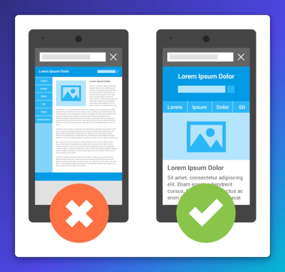
Responsive design is the foundation. Without it, everything else is harder to get right.
Site speed
Forty per cent of visitors leave a page that takes more than three seconds to load. Google recommends your site load in under a second on mobile. That bar is high because mobile devices process data more slowly than desktop computers, and mobile networks add their own latency.
Factors that slow mobile sites down include large image files, render-blocking scripts, and servers that aren't optimized for fast delivery. Addressing these directly improves every other performance metric.
Touch-friendly design
A responsive layout is necessary but not sufficient. Mobile websites need to be designed for fingers, not cursors. Buttons that are easy to click with a mouse can be nearly impossible to tap accurately on a touchscreen. Navigation, forms, and calls to action all need to account for touch interaction.
Layout optimized for mobile screens
Even a responsive site can have layout problems on small screens. A call to action that sits prominently above the fold on desktop might be buried or invisible on a phone. Reducing copy length, using horizontally oriented images, and making CTAs prominent on mobile screens are all steps you can take to close the gap between how your site looks and how it actually performs.
What to consider when measuring mobile performance
Before tracking individual KPIs, it helps to frame your measurement approach around three questions.
Mobile vs. desktop vs. tablet
Start by comparing performance across device types. If mobile and desktop traffic are roughly equal but desktop converts at a much higher rate, that gap is a signal. Something in the mobile experience is blocking conversions, whether it's a hidden checkout button, a slow page, or a form that's hard to complete on a small screen.
Device-level performance
Mobile traffic isn't uniform. Your site may load well on one type of device and poorly on another. Looking at how metrics break down across different mobile devices, such as iPhones versus Android devices, tells you whether a problem is universal or device-specific.
Cross-device behaviour
Most visitors don't use a single device. A visitor might first encounter your brand through an Instagram ad on their phone, browse without converting, then return on a laptop to complete a purchase. Tracking cross-device activity gives you a more accurate picture of how mobile fits into the full path to conversion.
Factors that affect site speed
From improved search rankings to lower bounce rates, the benefits of a fast mobile site compound quickly. When investigating speed, look at image sizes, lazy loading configuration, server response times, and third-party scripts. Each one can add meaningful load time on mobile networks.
Mobile website performance KPIs worth tracking
The right KPIs depend on your site and goals. These six give you strong coverage across speed, engagement, and conversion.
Create custom dashboards for you and your team.
Get started with KlipsPage speed
Page speed is the most fundamental mobile KPI. Use PageSpeed Insights for a score and a prioritized list of fixes. For deeper diagnostics, including historical tracking and load simulation from different regions, GTmetrix adds another layer of detail.
Mobile-friendly status
Google's Mobile-Friendly Test confirms whether Google can crawl and render your mobile site correctly. Failing this test affects your visibility in search results. Treat it as a baseline check before anything else.
Mobile device conversions
Compare conversion rates across device types. A low mobile conversion rate relative to desktop is a clear signal that the purchase or sign-up flow has friction on mobile. This KPI tells you where to focus optimization effort.
Time on site by device
Average session duration broken down by device type shows whether visitors are engaging with your content or leaving quickly. If time on site is significantly lower on a specific device, investigate that device's experience directly.
Google search CTR: desktop vs. mobile
Google Search Console lets you compare click-through rate (CTR) on the same keywords across desktop and mobile. If a keyword performs well on desktop but poorly on mobile, visitors are seeing your page in results and choosing not to click. That points to a title tag, meta description, or SERP appearance issue specific to mobile.
Pages per session on mobile
Pages per session measures how much of your site visitors explore after landing. A low number on mobile suggests visitors aren't finding reasons to go deeper, whether because navigation is difficult, content doesn't load properly, or the experience simply isn't compelling on a small screen.
Tools for measuring mobile website performance
KPIs tell you what to measure. These tools tell you whether you're hitting your targets.
Speed tools
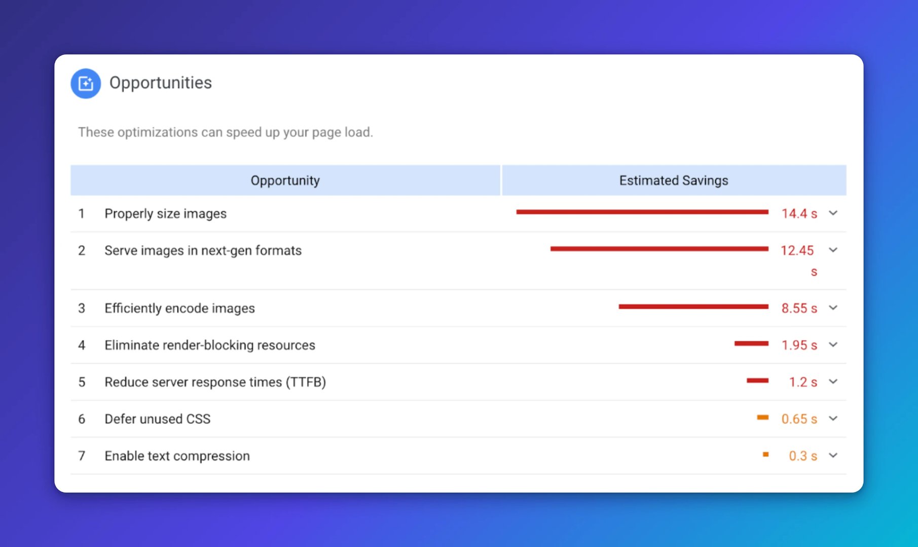
PageSpeed Insights scores your site on mobile and desktop, then gives you a prioritized list of fixes aligned with Google's ranking signals.
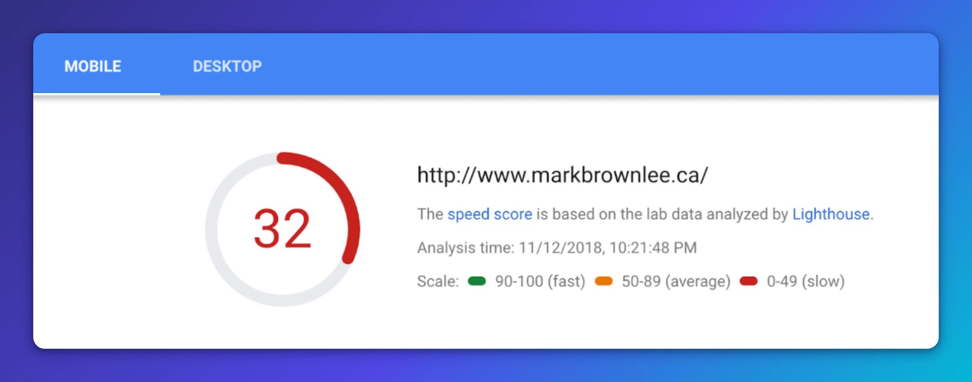
The prioritized recommendations are more useful than the score itself.
GTmetrix goes further, simulating load from multiple server regions and tracking performance history over time so you can measure the impact of changes.
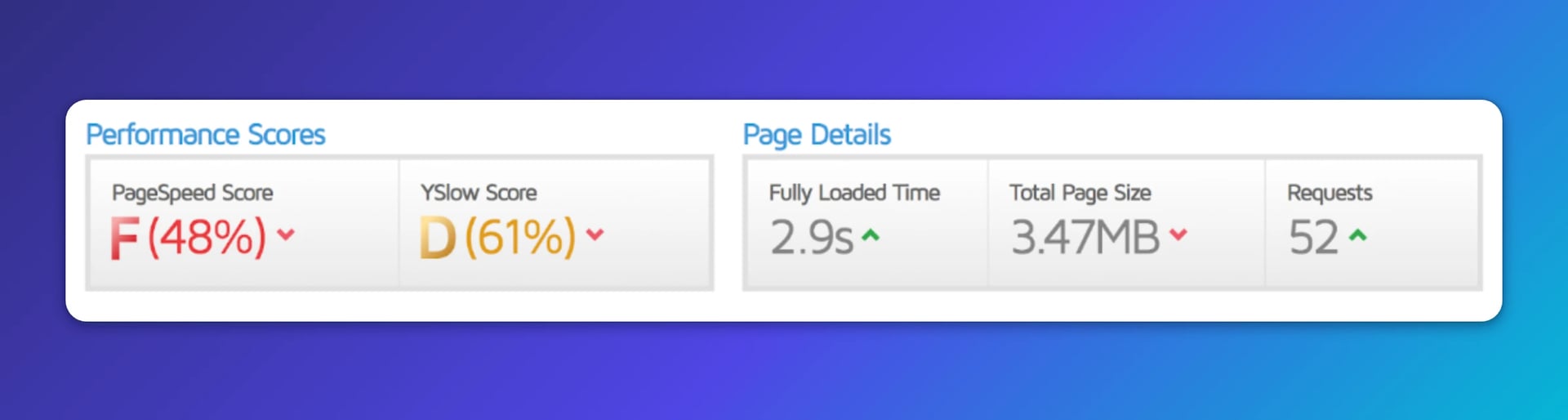
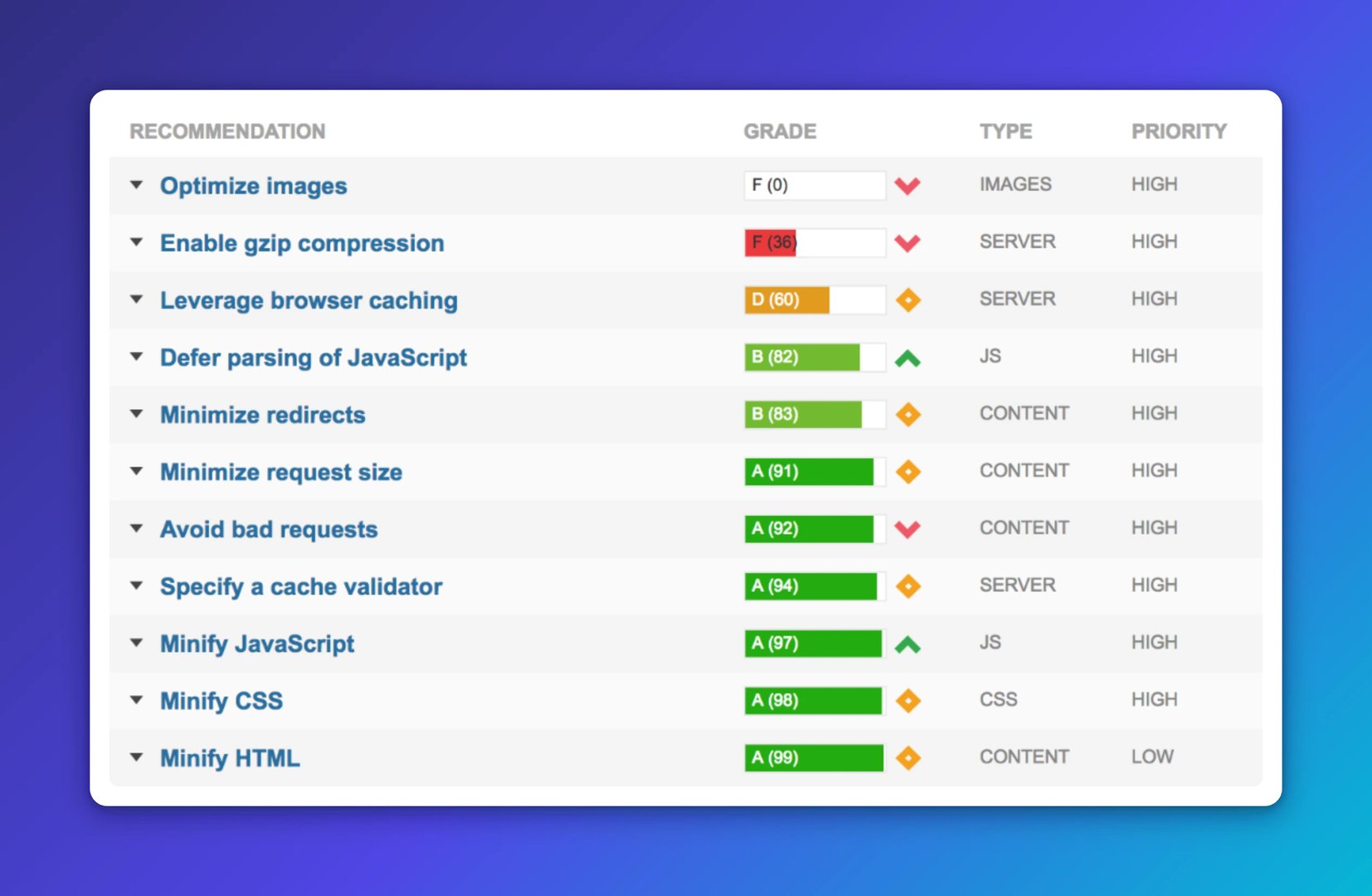
(An example of a site being tested on PageSpeed Insights and GTmetrix)
Responsive design tools
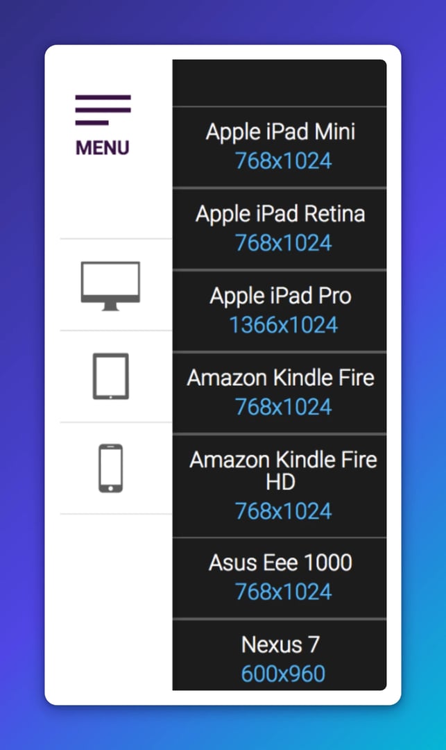
mattkersley.com/responsive shows how your site renders across common screen widths instantly, with no setup required. It's a fast visual check for obvious layout problems.

Responsive Design Checker lets you test against specific real devices, like an Apple iPad Retina, or enter a custom screen dimension.
Analytics tools
Google Analytics breaks down traffic, behaviour, and conversions by device type. The mobile overview report shows the split between mobile, tablet, and desktop visitors. The site speed report highlights pages with slow load times across device types. Adding a mobile segment and comparing it against your full audience is one of the fastest ways to find where mobile experience is costing you.
Google Search Console shows which search terms drive mobile traffic and flags mobile usability issues Google has detected. If your pages aren't rendering correctly on mobile, Search Console is where you'll find out before it affects your rankings.
All-in-one tools
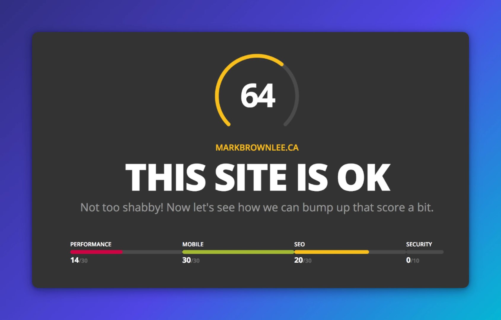
HubSpot's Website Grader scores your site across performance, SEO, mobile readiness, and security in a single report, with actionable suggestions alongside each grade.
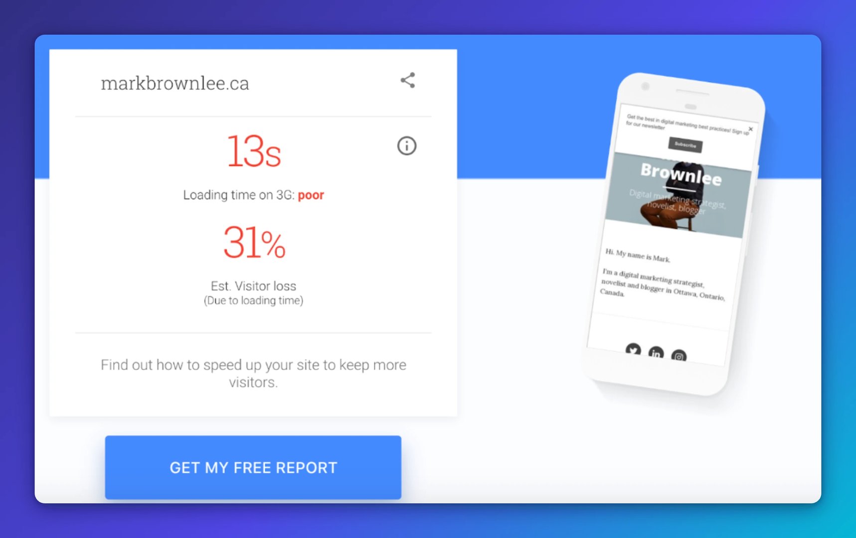
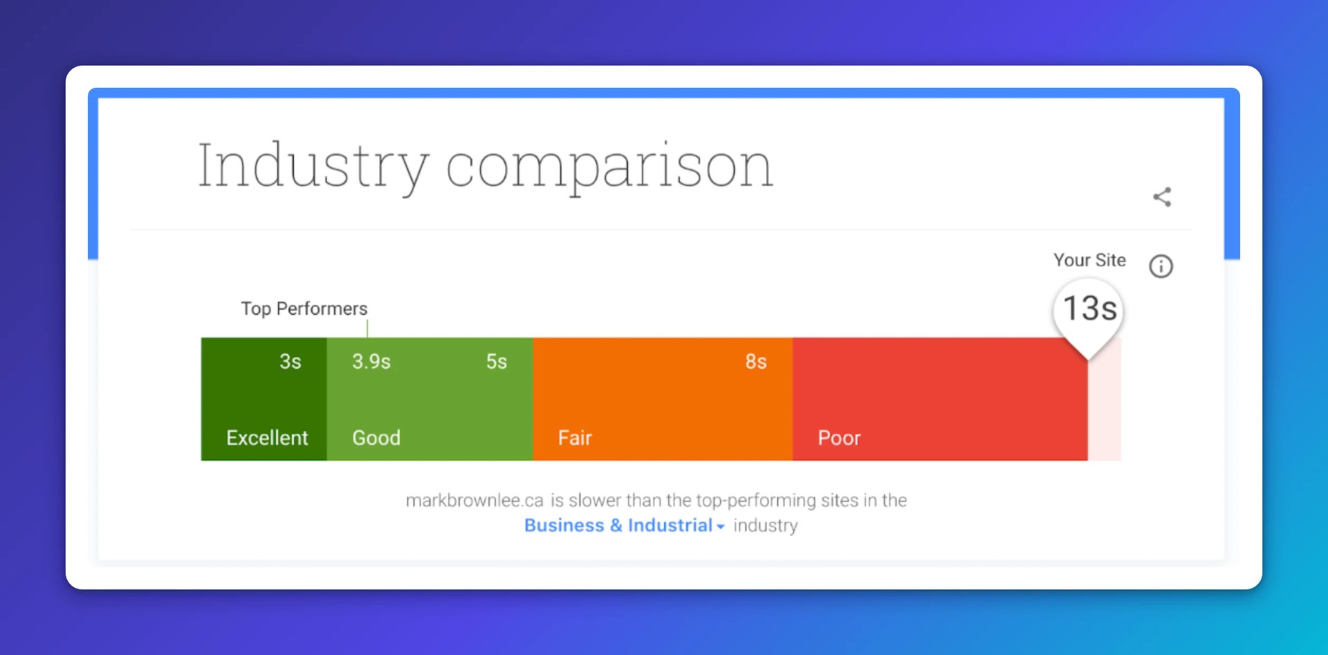
Think With Google's Test My Site benchmarks your mobile load speed against industry competitors and estimates how much traffic you're losing because of a slow site.
Technical tools
mobiReady scores your site against mobile web best practices with pass/fail detail and a visual device preview. It's useful for catching technical issues that simpler tools miss.
k6 (formerly Load Impact) is a developer-focused load testing tool that shows how your site holds up under heavy traffic. It's most valuable ahead of a product launch, campaign, or seasonal spike when you need to know whether your infrastructure will handle the load.
Putting it together
Start with PageSpeed Insights to establish a speed baseline. Add Google Analytics to understand how mobile visitors behave. Use a responsive design checker to catch layout issues. Then layer in the KPIs above to track progress over time.
Speed, responsiveness, and engagement all connect. Improving one tends to lift the others. The goal is a mobile experience that's fast enough to keep visitors, clear enough to convert them, and consistent enough across devices that no segment of your audience is left behind.
Published 2026-08-26




Most recent
- AUG 11Beyond simple sign-ups: how True Trials and Activation predict growth
- JUL 7Why business leaders miss important trends in their dashboards
- JUN 19The best chart for the job: Visualizing data for non-technical users
- JUN 95 tips to understand (and organize) your restaurant data
- MAY 26Think in Horizons, Not Seconds
- MAY 2010 Cloud BI Dashboard Tools for Small Businesses in 2026