
Key metrics for agile development teams
Agile teams need visibility into work-in-progress, defect response, and delivery pace. Learn the six metrics that drive alignment and keep development on track.
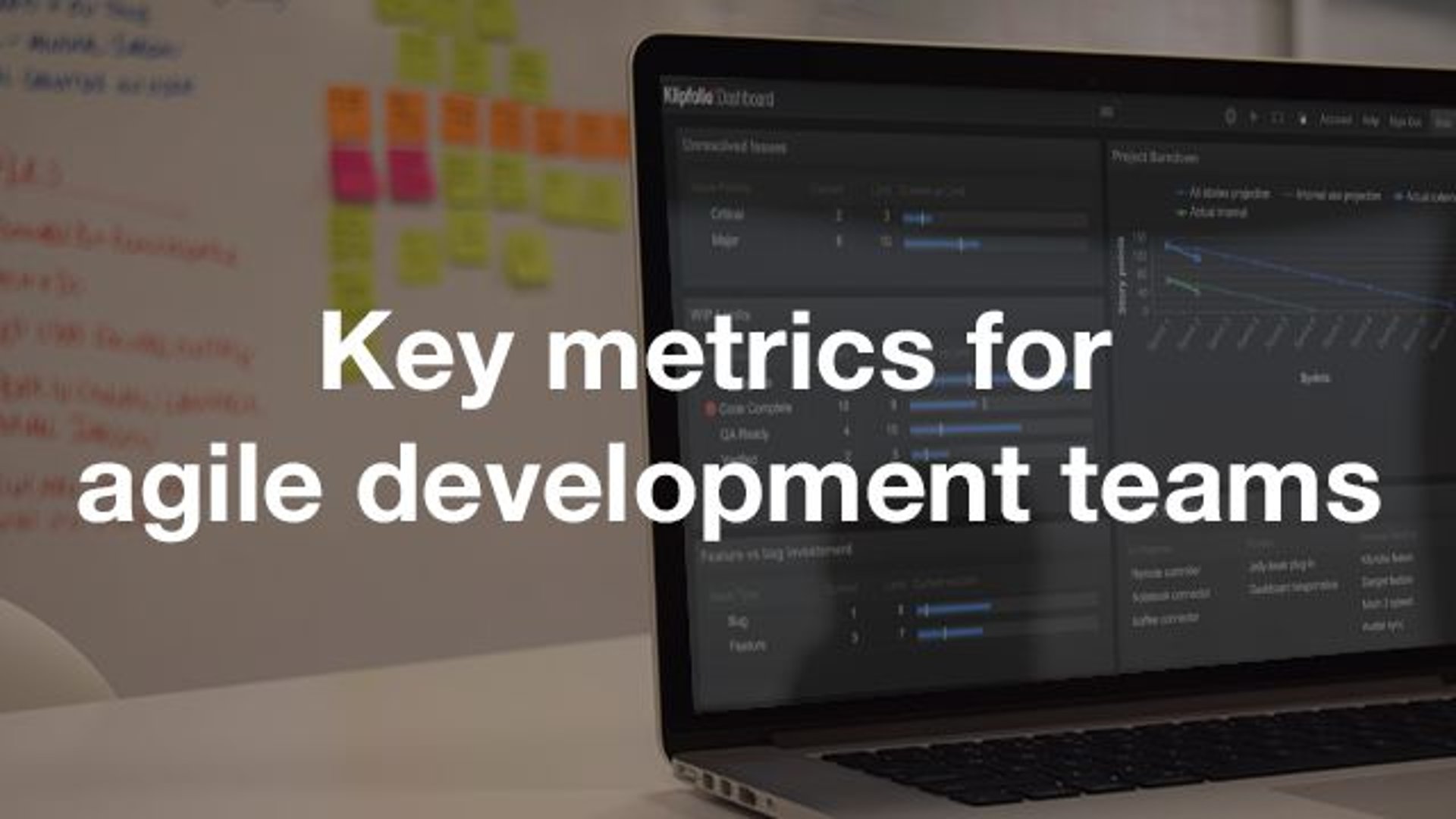
Agile development teams thrive on visibility and rapid feedback. To stay aligned and ship on commitments, you need metrics that surface bottlenecks, track progress, and tell you what to do next—without having to dig for the answer.
This article covers the six metrics that keep development teams focused on what matters: shipping features reliably, resolving defects quickly, balancing maintenance with innovation, and keeping roadmap projects on track.
Why metrics matter for agile teams
Every software development organization shares the same goals. Continuously deliver value to production, respond quickly to customer issues, maintain code quality without sacrificing velocity, and keep strategic initiatives on schedule.
Without visibility into these areas, teams make decisions in the dark. They pull from different tools, rely on memory, or default to whatever feels urgent. The result is misalignment, slower delivery, and no clear answer when someone asks "where do things stand?"
The fix is to centralize your key metrics in one place: a dashboard your team references daily, projects on a screen, and uses in standups to drive action. When everyone sees the same data at the same time, alignment happens naturally. When a metric goes red, the team knows what to do—without waiting for a meeting, a report, or someone to pull the numbers.
The core metrics framework
The following six metrics form a complete picture of development health. Each one tracks a specific objective, connects to a real data source, and triggers a clear action when it moves outside acceptable limits.
Unresolved issues
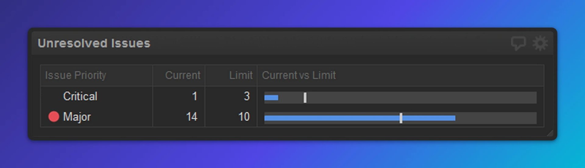
What it measures
This metric tracks the count of critical and major issues in your backlog. Priority levels are typically assigned during a triage meeting where Support, Product Management, Development, and Quality Assurance representatives review incoming defects together.
Why it matters
Critical and major issues directly affect customer experience. A growing pile of unresolved high-priority work means your team is falling behind on commitments, or that incoming defect volume is outpacing capacity. Either way, customers feel it before you do.
When to act
If the count exceeds your defined threshold, revisit priorities immediately. Shift focus to defects until the metric returns to green. That may mean pausing feature work temporarily to address customer-impacting bugs.
Data source
Issue tracking tools like Jira, YouTrack, or Azure DevOps.
Work in progress (WIP) limits
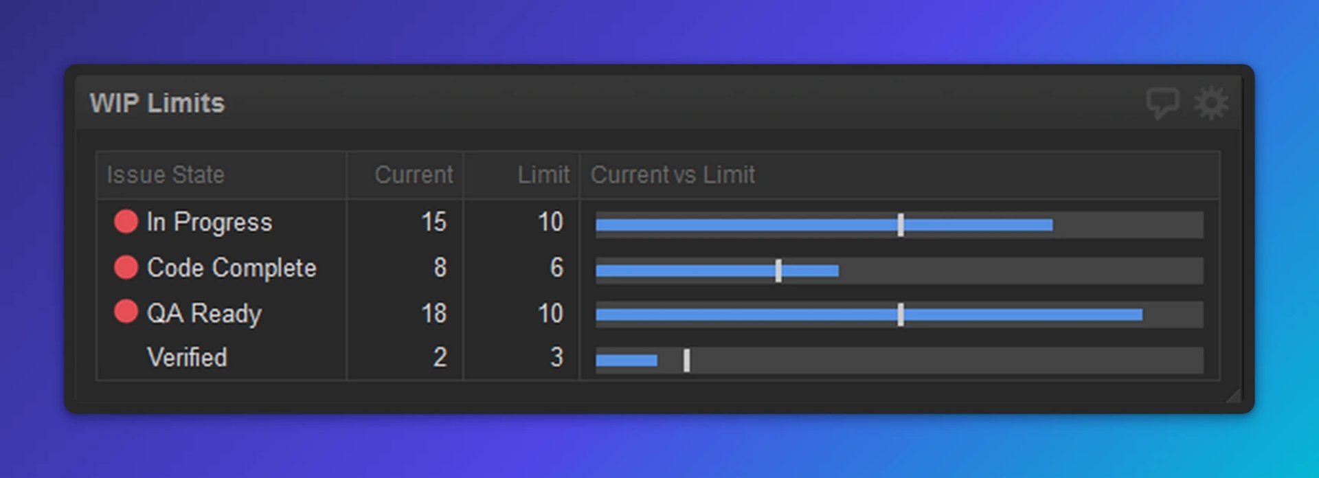
What it measures
WIP limits cap the number of items allowed in each stage of your development pipeline, such as "In Development," "Ready for QA," "In Testing," and "Ready to Release." This is a core Kanban concept that helps teams identify and eliminate bottlenecks.
Why it matters
When too many items pile up in a single stage, work stalls. If ten items are waiting for QA but only two testers are available, your pipeline backs up. WIP limits force the team to finish work before starting new work, which improves flow and reduces context-switching.
When to act
If any stage exceeds its WIP limit (typically shown as a red indicator on your dashboard), stop pulling new work into that stage. Focus on moving existing items through. If QA is overloaded, developers help with testing. If "Ready to Release" is full, prioritize deployments over new features.
Data source
Issue tracking tools like Jira, YouTrack, or Azure DevOps.
Feature versus bug investment
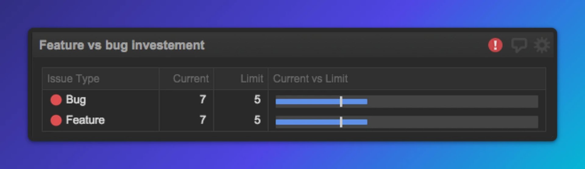
What it measures
This metric compares the effort (hours, story points, or percentage of capacity) your team invests in new features versus bug fixes and maintenance. It shows whether your team is balanced or skewed too far in one direction.
Why it matters
Healthy development requires balance. Too much feature work and technical debt grows, stability suffers, and customers get frustrated by bugs. Too much maintenance and you stall innovation, frustrating leadership and users waiting for new capabilities. The right ratio depends on your business stage and strategy.
When to act
If the ratio drifts outside your target range, adjust priorities in your next planning cycle. Work with Product Management to reset expectations if incoming defects are higher than anticipated.
Data source
Issue tracking tools like Jira, YouTrack, or Azure DevOps.
Create custom dashboards for you and your team.
Get started with KlipsCode review backlog
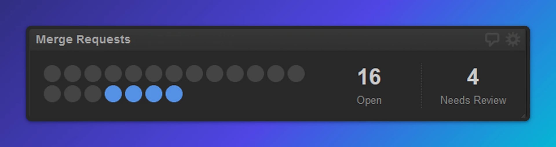
What it measures
This metric tracks the number of pull requests or merge requests awaiting code review and the number waiting to be deployed. It highlights work that is functionally complete but not yet in customers' hands.
Why it matters
Code reviews are a quality gate and a knowledge-sharing tool. When reviews pile up, work stalls and reviewers become a bottleneck. A large number of items waiting to deploy signals that deployment processes are slow or infrequent, which delays value delivery.
When to act
When the code review backlog grows, developers prioritize reviews over starting new work. This keeps the pipeline flowing and ensures quality standards are maintained without becoming a blocker.
Data source
Version control platforms like GitHub, GitLab, or Bitbucket.
Project burndown
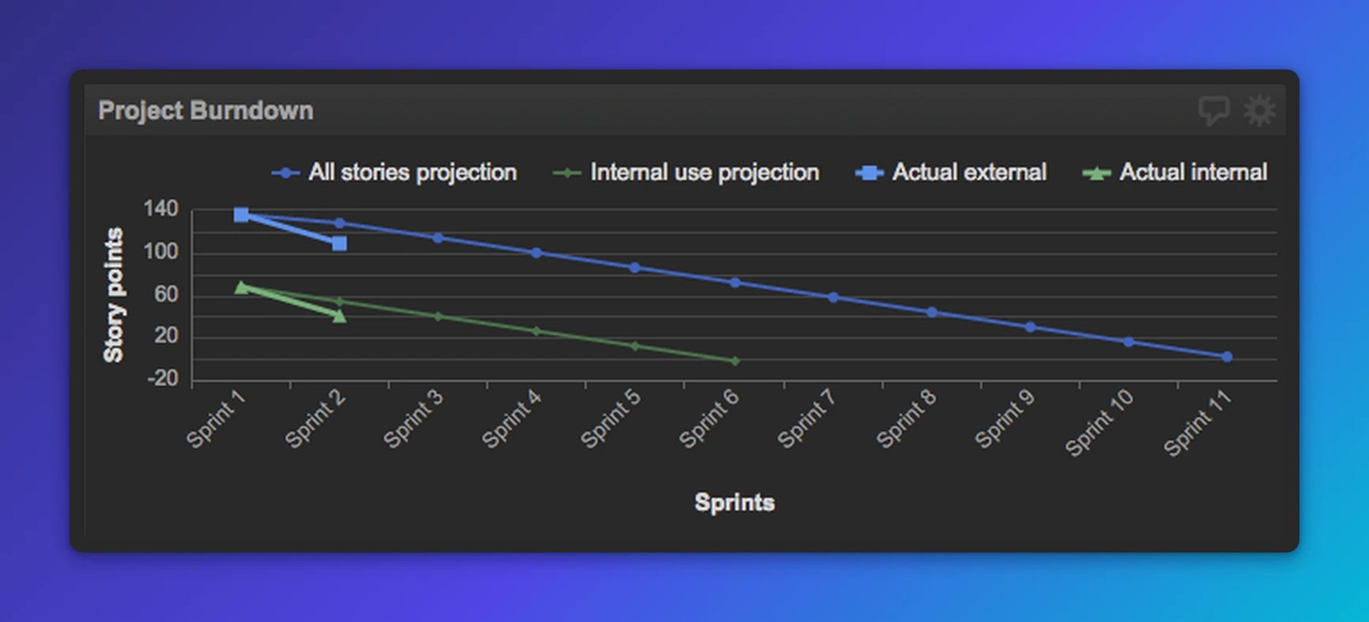
What it measures
A burndown chart plots remaining work (typically in story points or hours) against time, showing both your initial projection and actual progress. It's commonly used to track sprints, releases, or longer-term roadmap initiatives.
Why it matters
Burndown charts tell you whether your team is on pace to deliver. If actual progress consistently lags the projection, estimates were optimistic, scope crept, or the team hit unexpected challenges. You want to know that early, not at the end of a sprint.
When to act
Monitor the trend. If you're consistently below the projected line, conduct a root cause analysis: Are estimates too aggressive? Is the team blocked? Do you need to adjust scope? Communicate early with stakeholders rather than waiting for a deadline to surface the problem.
Data source
Project management tools like Jira, Azure DevOps, or spreadsheets (Google Sheets, Excel).
Release pipeline Kanban
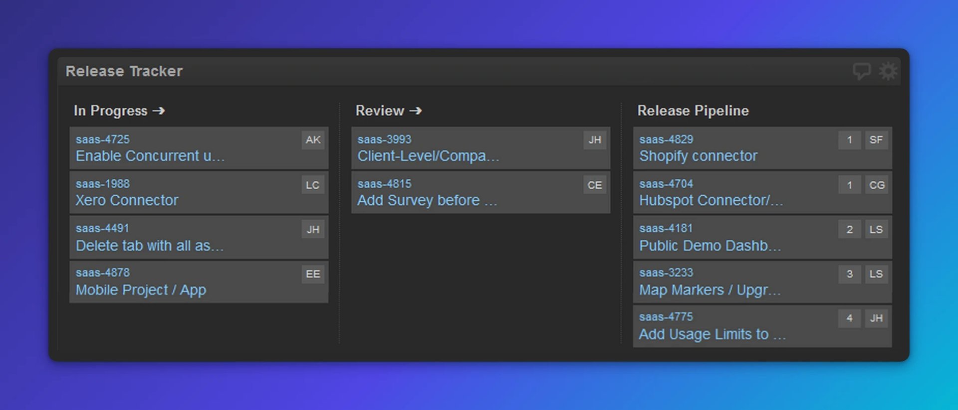
What it measures
A visual Kanban board showing work items as they move through stages: Backlog, In Development, Code Review, Testing, Ready to Release, and Deployed. This is a snapshot of what's in flight and where each item stands.
Why it matters
The Kanban board is a communication tool as much as a metric. It gives everyone on the team visibility into what's happening, reduces status-update meetings, and makes bottlenecks obvious. When the board is projected on a team screen or referenced in standups, it becomes the single source of truth—no one has to ask "where does that ticket stand?"
When to act
Use this metric for awareness and team alignment rather than as a trigger for action. If items are stalled in any stage, investigate and unblock before the delay compounds.
Data source
Project management tools like Jira, Azure DevOps, or spreadsheets (Google Sheets, Excel).
Putting it all together
These six metrics work best on a single, centralized dashboard your team references every day. Project it on a screen visible to the whole team, use it in standups, and make it the default reference for status discussions. That eliminates the need to switch between tools, paste numbers into a chat thread, or wait for someone to pull a report.
When you centralize your metrics, a few things happen without extra effort:
- Alignment improves. Everyone sees the same data and understands priorities the same way.
- Decisions become faster. When a metric goes red, the team knows what to do without waiting for a meeting.
- Accountability increases. Transparent metrics create shared ownership of outcomes.
- Continuous improvement accelerates. Trends become visible, and root causes surface quickly.
The goal is not a surveillance tool. It's shared visibility. A small team with a clear dashboard can operate with the confidence and coordination of a much larger one.
Beyond the basics: Metrics to consider
The six metrics above cover work-item visibility and pipeline health. As your team matures, consider adding metrics that track code quality, infrastructure health, and deployment frequency:
- Continuous integration health: Build pass/fail rates and failure trends over time.
- Test coverage: Automated and unit test coverage percentages, tracked over sprints or releases.
- Deployment frequency and incidents: How often you deploy to production and how many incidents each deployment triggers.
- Static analysis findings: Issues flagged by code analysis tools, tracked to spot quality trends.
- Technical debt: Count of work items tagged as technical debt, monitored to prevent accumulation.
These metrics require more sophisticated data sources and setup, but they provide deeper insight into long-term sustainability and code health.
Getting started
Start with the six core metrics above. Connect a dashboard tool to your existing data sources: your issue tracker, version control platform, and project management tool. Set reasonable thresholds based on your team's capacity and business priorities. Put the dashboard where your team works, and reference it every day.
When your team can see the same metrics at the same time, alignment follows. Decisions get faster, problems surface earlier, and a lean team can stay on top of delivery without anyone having to chase down a status update.
Published 2026-08-24



Most recent
- AUG 11Beyond simple sign-ups: how True Trials and Activation predict growth
- JUL 7Why business leaders miss important trends in their dashboards
- JUN 19The best chart for the job: Visualizing data for non-technical users
- JUN 95 tips to understand (and organize) your restaurant data
- MAY 26Think in Horizons, Not Seconds
- MAY 2010 Cloud BI Dashboard Tools for Small Businesses in 2026