
A dashboard is a tool for monitoring business-relevant metrics and KPIs. It pulls real-time data from multiple sources and presents it in one place — so you always know what's happening across your business without having to chase numbers or wait for some
Learn what a dashboard is, how it differs from a report, the four main types, and how to build one that gives your team real-time clarity and confidence.
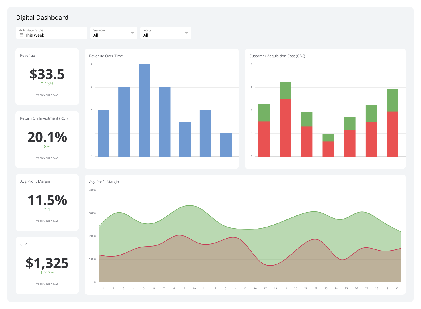
A dashboard is a tool for monitoring business-relevant metrics and KPIs. It pulls real-time data from multiple sources and presents it in one place — so you always know what's happening across your business without having to chase numbers or wait for someone to pull a report.
The best dashboards don't just display data. They surface what matters, flag what's off, and give you the confidence to act — without digging through spreadsheets or pasting numbers into a chatbot and hoping for the best.
What is a dashboard?
A dashboard is a visual display of your most important business metrics, updated automatically from connected data sources.
Dashboards pull data from web services, databases, cloud tools, and reports, then present it in charts, graphs, and tables — giving you a clear view of business performance at any moment. A sales dashboard might show revenue growth and pipeline health. A marketing dashboard might show channel performance and conversion rates. Either way, the goal is the same: you know what's working, what isn't, and what to do next.
What is the difference between a dashboard and a report?
Dashboards and reports serve different purposes. Here's how they compare:
| Dashboards | Reports |
|---|---|
| Display live or near-real-time data | Present historical data |
| Provide an at-a-glance view | Showcase detailed analyses |
| Rely heavily on visual elements | Include written analysis |
| Show high-level information | Provide comprehensive breakdowns |
| Combine data from multiple sources | Cover a defined time period |
| Designed for continuous monitoring | Produced at set intervals |
The short version: dashboards are built for ongoing awareness. Reports are built for deep review. Most teams use both — dashboards to stay on top of things, reports to understand what happened and why.
Types of dashboards
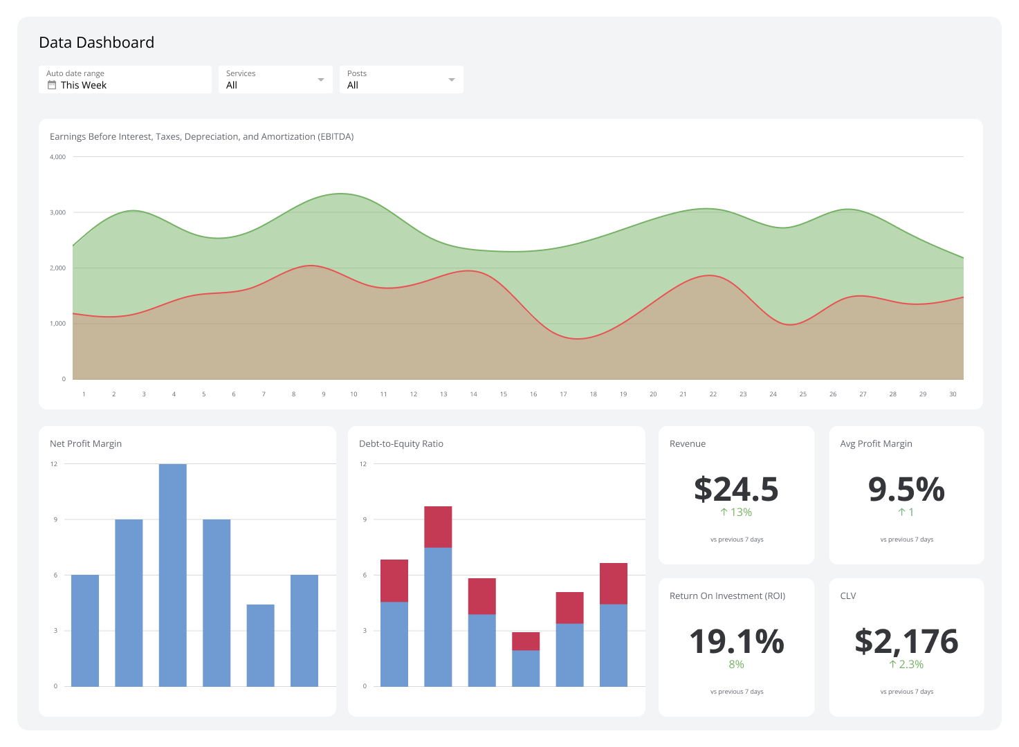
There are four kinds of dashboards: operational, analytical, strategic, and tactical. Each serves a different purpose depending on the decisions you need to make.
Operational
An operational dashboard monitors real-time metrics tied to day-to-day performance. It highlights immediate indicators — response times, task completion, rep activity — so you can spot and resolve issues fast.
For example, tracking the sales per rep metric helps you identify who needs support before a problem compounds. Operational dashboards typically refresh frequently and include features like colour-coded alerts and drill-down views.
Analytical
An analytical dashboard works with historical data to identify trends, test assumptions, and support longer-range decisions. It's less about what's happening right now and more about understanding what the patterns mean.
Analytical dashboards often include advanced features like trend modelling, which can surface issues or opportunities that aren't obvious from day-to-day numbers alone.
Strategic
A strategic dashboard tracks KPIs tied to overall business health — average profit margins, sales growth, return on investment, and customer satisfaction. It's designed for leadership and senior management.
Where an operational dashboard tells you what's happening today, a strategic dashboard tells you whether you're on track for the quarter or year. It's the view that helps you make resourcing, investment, and direction decisions with confidence.
Tactical
A tactical dashboard sits between strategic and operational. It tracks medium-term progress — project milestones, departmental performance, budget versus actuals — and helps managers bridge the gap between long-term goals and daily execution.
Metrics like sales growth by market segment are typical here. Tactical dashboards help teams set realistic targets and course-correct before small problems become large ones.
Why dashboards are worth using
Dashboards save time, reduce errors, and give you the clarity to make faster decisions. Here's what that looks like in practice:
1. You stop guessing and start knowing
When your numbers are scattered across tools, you're always working with incomplete information. A dashboard brings everything into one place — reliably, automatically, and in a format you can act on. No more pasting figures into a spreadsheet and hoping nothing's out of date.
2. Decisions get faster and more confident
Dashboards surface accurate data from live and historical feeds. When the numbers are trustworthy and always current, you spend less time second-guessing and more time deciding.
3. Your team saves hours every week
Dashboards automate data collection and visualization. That's time your team gets back — time previously spent pulling reports, chasing updates, or explaining numbers in status meetings.
4. Problems surface before they escalate
Continuous monitoring means you catch performance issues early. Automated alerts can notify you the moment a metric moves outside a normal range — whether that's a sudden drop in conversion rate or an unexpected spike in support volume.
5. Progress evaluation stays current
Real-time updates mean you're always working with current information. You can spot trends, measure the impact of a change, and deliver meaningful performance feedback without waiting for end-of-month reports.
6. Goals become grounded in reality
When you can see actual performance data, you set targets that are ambitious but achievable. Dashboards give you the evidence to push back on unrealistic expectations and the clarity to raise the bar when results support it.
7. Accountability becomes visible
When performance metrics are shared openly, it creates a culture of transparency. Teams know where they stand. High performers are recognized. Gaps get addressed faster — not because someone's watching, but because everyone can see the same picture.
8. Data reliability improves
Manual data handling introduces errors. Dashboards remove that risk by automating collection and display. The number you see is the number, not someone's best interpretation of it.
9. Routine reporting runs itself
Dashboards can be configured to generate alerts and summaries automatically. That frees your team to focus on analysis and action — not on assembling information that a connected system could surface on its own.
10. Teams stay aligned without constant meetings
A shared dashboard replaces a lot of back-and-forth. Everyone sees the same data, which means fewer status updates, fewer email threads, and faster agreement on what needs attention.
How to create a dashboard
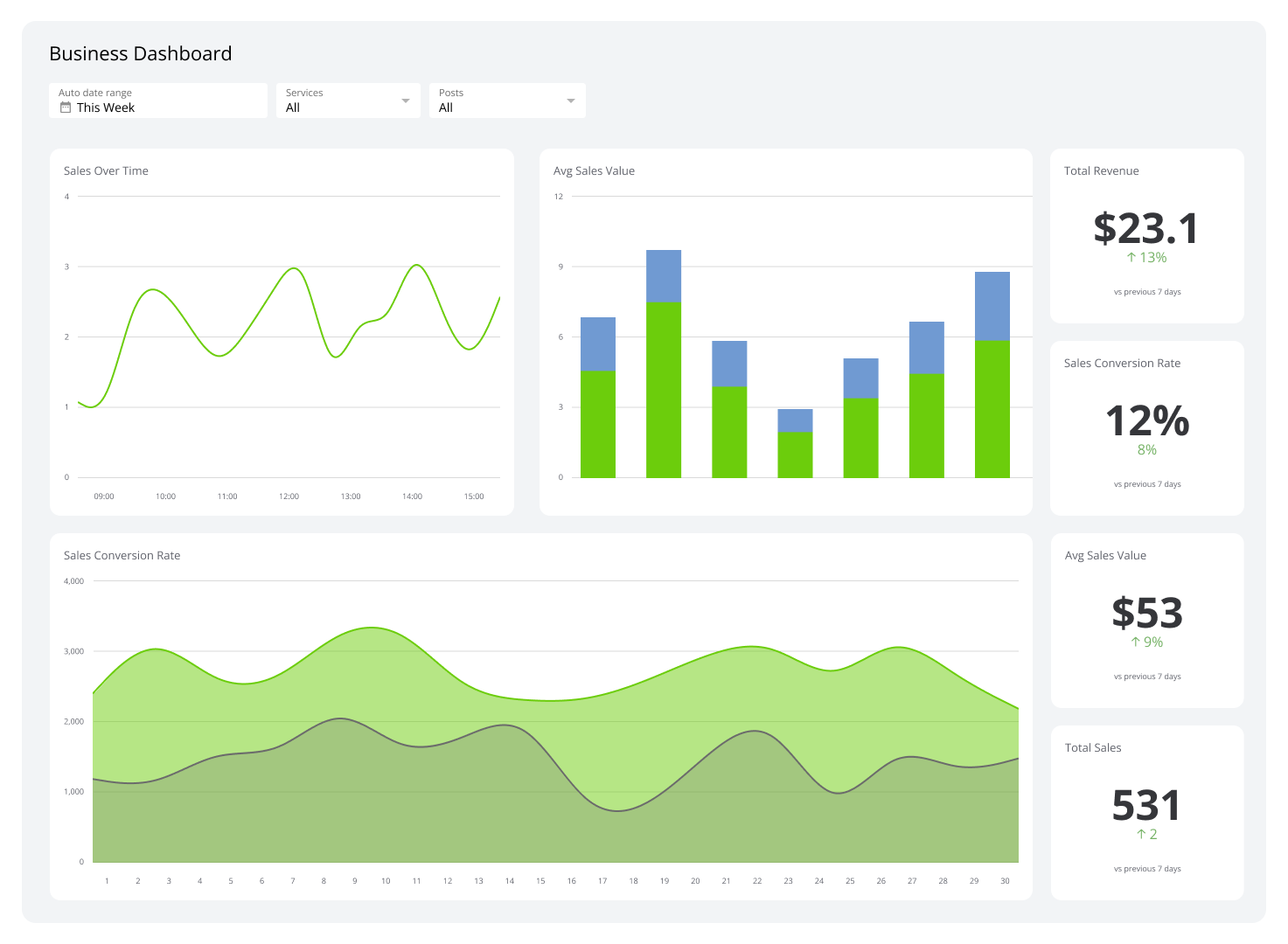
Building a dashboard is more straightforward than it used to be. Most modern dashboard tools are designed so that leaders and managers — not just analysts — can set one up and keep it running.
Step 1: Identify your KPIs
Start by asking what decisions this dashboard needs to support. Talk to leadership, managers, and the people closest to the work. From those conversations, identify the well-defined KPIs that directly connect to business outcomes — not just activity metrics that feel useful but don't drive action.
Create custom dashboards for you and your team.
Get started with KlipsStep 2: Know your audience
A dashboard built for a CEO looks different from one built for a sales team. Understand who will use it and what they need to walk away knowing. Simplicity matters: if the layout requires explanation, it's not working.
Step 3: Select your dashboard software
Spreadsheets can display data, but they can't keep it current automatically. Dashboard software connects to your data sources directly, refreshes on a schedule, and surfaces the right numbers without manual effort.
When evaluating tools, consider:
- Cost and deployment time
- Integration with your existing data services
- Self-service versus managed options
- Distribution methods (TV mode, shared links, scheduled PDFs, embeds)
- Access controls for sensitive data
Klipfolio connects to 130+ data sources, supports 100+ Excel-like functions, and offers flexible distribution — from TV dashboards to scheduled email reports — so your data reaches the right people in the right format.
Step 4: Collect your data points
Important business data rarely lives in one place. Most dashboard tools simplify this through native integrations with cloud tools, databases, and data warehouses. Prioritize accuracy: a dashboard is only as reliable as the data feeding it.
Step 5: Build your dashboard
Keep the layout focused. Use simple charts, graphs, and tables. Include comparison values where possible — context turns a number into insight. A few principles worth following when designing a dashboard:
- Avoid generic templates — build for your specific audience and decisions
- Include comparison values whenever possible
- Use colour sparingly and purposefully
- Be cautious with pie charts — they often obscure more than they reveal
- Prioritize orientation and layout for scannability
Step 6: Gather feedback and refine
Once your first version is live, bring back the people you consulted at the start. What's clear? What's missing? What's being ignored? Use that feedback to sharpen the dashboard before it becomes the default view for your team.
What makes a dashboard effective?
A useful dashboard isn't just accurate — it's built to be used. These are the features that separate a dashboard people trust from one that gets ignored.
24/7 access
Your dashboard should be available anytime, on any device. Access controls ensure sensitive data stays with the right people, while broad availability means your team is never waiting on someone else to pull a number.
Clear visualizations
Charts, tables, and graphs turn complex data into something you can absorb in seconds. The right visualization for the right metric makes the difference between a number that informs and one that confuses.
Reliable data connections
A dashboard is only worth trusting if the data behind it is accurate and current. Strong integrations, scheduled refreshes, and consistent sourcing are what make the numbers reliable — and reliability is what makes the dashboard worth checking.
Dynamic, auto-updating visuals
Static dashboards go stale. Dynamic dashboards update automatically, reflecting the latest data without any manual intervention. That's what allows you to monitor metrics like sales opportunities in real time and act on them quickly.
Flexible sharing options
Data that stays in one place doesn't drive alignment. Good dashboard tools offer multiple distribution methods — shareable links, embedded views, scheduled PDF reports, TV mode — so the right people see the right information in the right context.
Organized tabs and views
Dashboard tabs let you organize data by team, function, or time period. They reduce cognitive load and help each audience focus on what's relevant to them — without drowning in everything at once.
Export and print support
When you need to share data outside a live dashboard — in a board deck, a client report, or a printed briefing — export features preserve the layout and visuals accurately in PDF or PNG format.
Common examples of dashboards
Executive dashboards
Executive dashboards give leadership a consolidated view of business performance — revenue, productivity, risk, and progress against strategic goals. They're designed for fast consumption: a CEO should be able to open one and know where the business stands in under a minute.
Sales dashboards
A sales dashboard tracks live sales performance against targets. It surfaces trends like seasonal patterns and flags issues like declining close rates — so you can adjust strategy, coaching, or resourcing before the quarter slips.
Marketing dashboards
Marketing dashboards consolidate metrics across channels: website traffic, lead generation, conversion rates, and social engagement. They show whether your marketing spend is working and where to focus next.
Development dashboards
Development dashboards help engineering teams monitor project health — code quality, build stability, bug counts, and feature completion. Real-time visibility means issues get caught and resolved faster, which leads to more reliable releases.
Financial dashboards
Financial dashboards bring together revenue, expenses, profit, and cash flow in one view. They make it easier to spot patterns, respond to emerging opportunities, and keep financial performance aligned with business goals.
Customer support dashboards
A customer support dashboard tracks response times, resolution rates, and customer satisfaction scores. It helps support leaders allocate resources effectively, identify training gaps, and keep service quality consistent.
Build dashboards that keep you ahead
A dashboard gives you reliable, real-time visibility into what's happening across your business — without the manual effort, the spreadsheet errors, or the lag of waiting for someone to pull a report.
Klipfolio connects to 130+ data sources, supports rich data visualization, and distributes your dashboards however your team works — from TV screens to scheduled email reports. Start your free trial today — no credit card required.
Published 2026-08-20
Continue learning

Dashboard Data Security and Privacy: A Five-Layer Framework

The CEO's Guide to Metrics That Actually Matter
What is a KPI? Types, Limitations, and How to Make KPIs Work For Your Business

Project Management Dashboard: Guide to KPIs and Examples

What Are Dashboards and Scorecards? Key Differences Explained
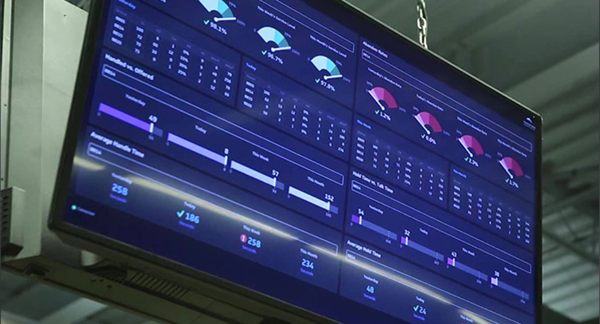
Best Practices for Displaying Dashboards on Large Screens
Most recent
- MAY 28Dashboard Data Security and Privacy: A Five-Layer Framework
- MAR 30The CEO's Guide to Metrics That Actually Matter
- MAR 18What is a KPI? Types, Limitations, and How to Make KPIs Work For Your Business
- NOV 10Project Management Dashboard: Guide to KPIs and Examples
- OCT 16What Are Dashboards and Scorecards? Key Differences Explained
- SEP 3Best Practices for Displaying Dashboards on Large Screens