
Track the content marketing metrics that reveal where you're losing traffic, clicks, and conversions — and how to act on them without digging through reports every time.
Discover four content marketing metrics — CTR gaps, search rank opportunities, top posts by conversions, and behaviour flow — and how to track them with live dashboards.

Live content marketing dashboards make content metrics for content marketing easier to access and act on.
If you're a content marketer, you likely already track marketing metrics like impressions and goal conversions. The problem is that even actionable metrics leave real questions unanswered: which content needs work, where to start, and whether the effort is worth it.
If you've been publishing for a while, you've probably asked yourself:
- What can I do to improve all this content?
- Where should I start?
- What's the ROI on this effort?
It turns out there's a wealth of data available in Google Analytics (GA) and Google Search Console that can help you identify underperforming content, prioritize what to improve first, and forecast the return on your time investment. You just have to know where to look.
Even when you know where the data lives, getting to it isn't always quick. As Andy Crestodina explains in this awesome article, you often have to dig into GA, and in some cases export to a spreadsheet, to view results against targets, benchmarks, or historical trends. That's not ideal when you're trying to make fast decisions about your content.
More questions follow:
- How do I get to this data quickly, without rebuilding the same report every time?
- How do I turn it into something I can act on without waiting for someone to pull a number?
Our answer was to build dynamic visualizations and dashboards with Klips, pulling data from our Google Analytics integration and Google Search Console. Instead of pasting numbers into a spreadsheet or explaining your content situation from scratch every time, you get a clear, always-current view of how your content is performing and where your biggest opportunities are.
Below are four of the most valuable content marketing metrics we track, and how we track them.
Click Through Rate (CTR) improvement opportunities
Most digital marketers track content performance based on organic search ranking and click-through rate (CTR). When content ranks in the top three results for a query, improvement efforts often stall — until rankings drop.
But high rank doesn't guarantee high traffic. Would it concern you to know that your top-ranked post for a given query is only capturing 10% of all clicks?
It concerned us.
According to a CTR study by Advanced Web Ranking, content ranked first on an organic search query draws about 30% of all clicks. Content ranked second tends to generate around 15%, and third-ranked content around 10%.
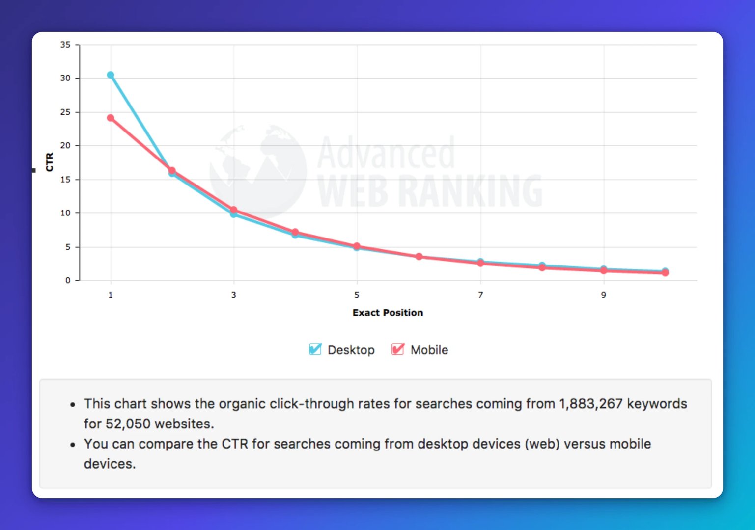
The research gives you specific benchmarks to aim for:
| Organic search rank | Benchmark CTR |
|---|---|
| 1 | 30% |
| 2 | 15% |
| 3 | 10% |
| 4 | 7% |
| 5 | 5% |
What to look for: content that ranks high in search results but has a low click-through rate. That gap is an opportunity.
Consider content ranking second for a query with 100,000 monthly searches. You should expect roughly 15,000 clicks (100,000 × 15%). If you're only receiving 2,500, you're capturing 2.5% of available traffic. Raising CTR from 2.5% to 15% could mean 12,500 more visitors each month — without publishing a single new post.
To monitor average SERP position and CTR, you can go to Google Analytics: Acquisition > Search Console > Queries. It works, but jumping in and out of the tool takes time, and GA won't flag where there's a discrepancy between your ranking and expected CTR.
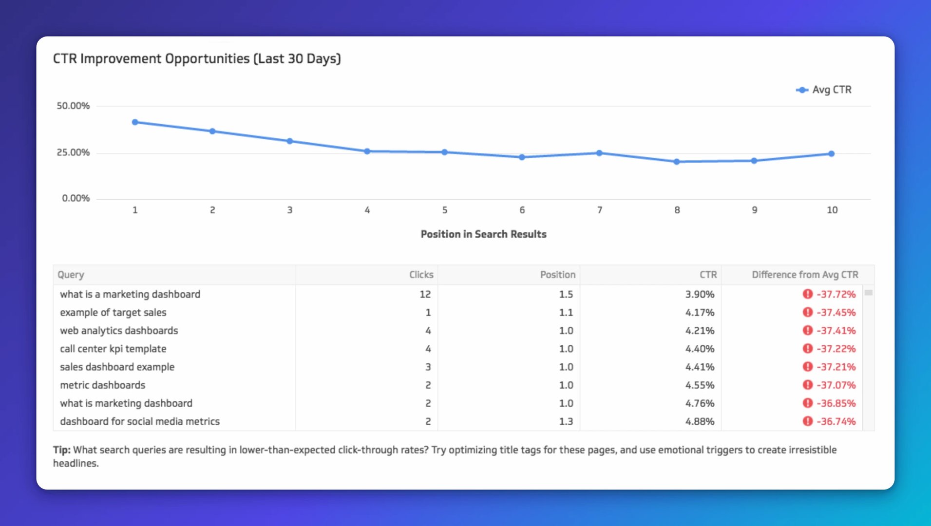
We automated the retrieval of this data and built this visualization in Klips:
View on a live dashboard
This visualization gives us immediate visibility into how our top-ranked content is performing or underperforming based on CTR. It pulls the following data from Google Analytics dynamically:
- Column 1: Search engine queries for which we have high-ranking content
- Column 2: Total clicks our content has received (last 30 days)
- Column 3: Average position in SERPs (last 30 days)
- Column 4: CTR based on total impressions (last 30 days)
Column 5 is a custom column we built in Klips. A formula displays the difference between actual CTR and expected CTR based on SERP position. Red indicators flag where we're missing significant opportunities.
Looking for tips to improve your CTR? Check out point two in this post.
Search rank improvement opportunities
The difference between ranking on page one of organic search results and any page after it is significant. Research suggests that only 1% of search traffic makes it past page one.
Pushing content up many positions takes real effort, especially in competitive categories. To get the best return on that effort, focus on content sitting at the top of page two. Moving those listings to page one delivers the highest ROI for the time invested.
Use a tool like our Search Position Improvement Opportunities klip to surface this data automatically. In Google Search Console, go to Acquisition > Search Console > Queries, then filter for listings with an average position of 11 or 12 (Advanced > Add a Metric > Avg Position). That's the content sitting just off page one.
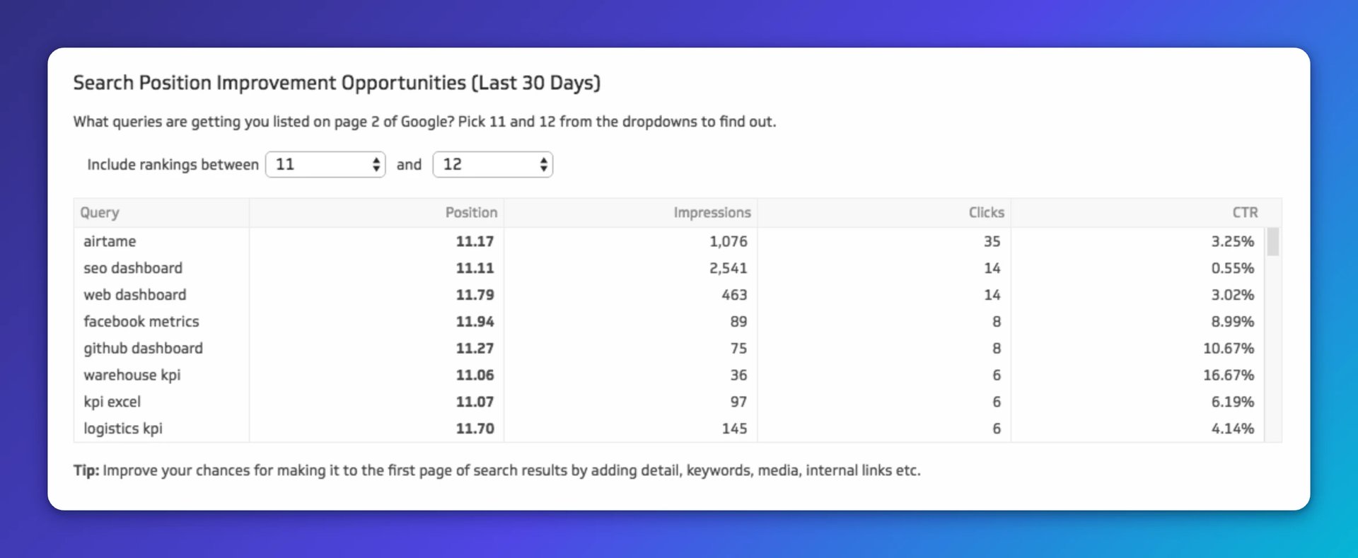
We automated the retrieval of this data and built this visualization in Klips:
View this data visualization on a live dashboard
This visualization helps us decide which content to improve first. It pulls the following data from Google Analytics dynamically:
- Column 1: Search engine queries for which we have content ranking in positions 11 and 12
- Column 2: Average position in SERPs (last 30 days)
- Column 3: Total impressions in these positions (last 30 days)
- Column 4: Total clicks in these positions (last 30 days)
- Column 5: Click-through rate (column 4 / column 3)
Create custom dashboards for you and your team.
Get started with KlipsTop posts by page views and conversion rate
Your top traffic-generating content is often not your top converting content, and vice versa. A smart content strategy pairs high-traffic posts with related posts that convert well, so each piece does more work.
To find your top content by page views in GA: Behaviour > Behaviour Flow > Site Content > All Pages. Filter for a specific content type (like blog posts) by entering the path, for example "/blog," in the search bar next to "Advanced."
Identifying top content by conversions takes a few more steps. Go to Conversions > Goals > Reverse Goal Path, then use the "goal option" dropdown to select the goal you want to track — blog subscriptions, trial starts, ebook downloads, or whatever you've set up.
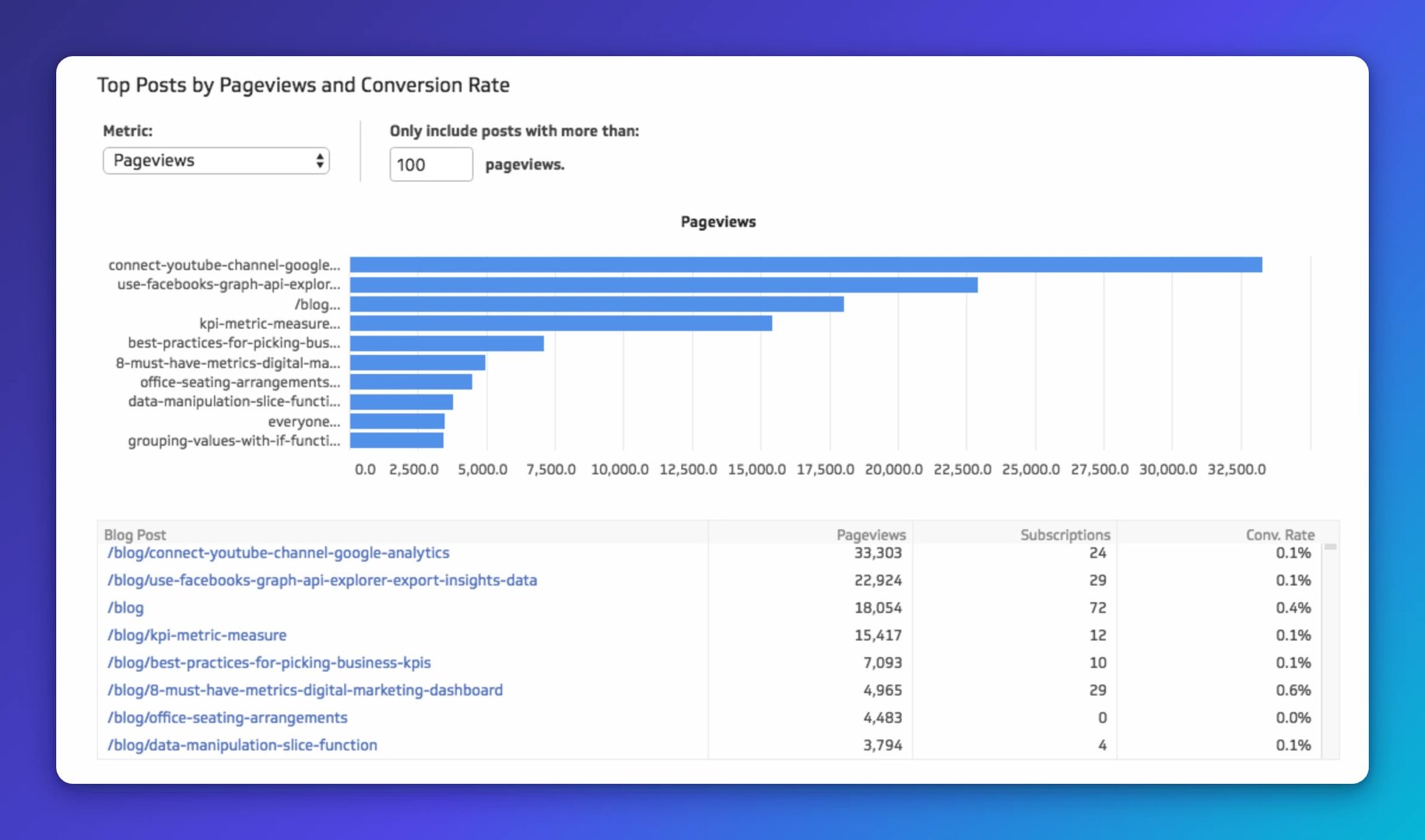
To build a linking strategy, you need to see both views side by side. You can export each report to a spreadsheet and align the data manually, then repeat the process every week. Or you can build a visualization like this in Klips:
View this data visualization on a live dashboard
This visualization lets us quickly toggle between top-performing content by page views and conversions, so we can identify logical linking opportunities without digging through two separate reports. It pulls the following data from Google Analytics dynamically:
Bar chart
- Filter: Number of page views
- Y axis: Top blog posts ordered by most page views
- X axis: Total page views per blog post
Table
- Column 1: Top blog posts
- Column 2: Total page views per blog post
- Column 3: Total blog subscriptions (a goal set up in GA)
- Column 4: Conversion rate (column 3 / column 2)
Behaviour flow and flow-through rate
What top-of-funnel content pulls a reader deeper into your site — and what sends them away?
One way to measure that is to track where users go after consuming an initial piece of content. How many pages they visit after that first interaction tells you whether your content is drawing them further into the marketing funnel or losing them at the door.
Google Analytics' Behaviour Flow report can help you understand the paths users take through your content. Access it via Behaviour Flow > Pages and Events, then select the web page you'd like to report on in the second dropdown.
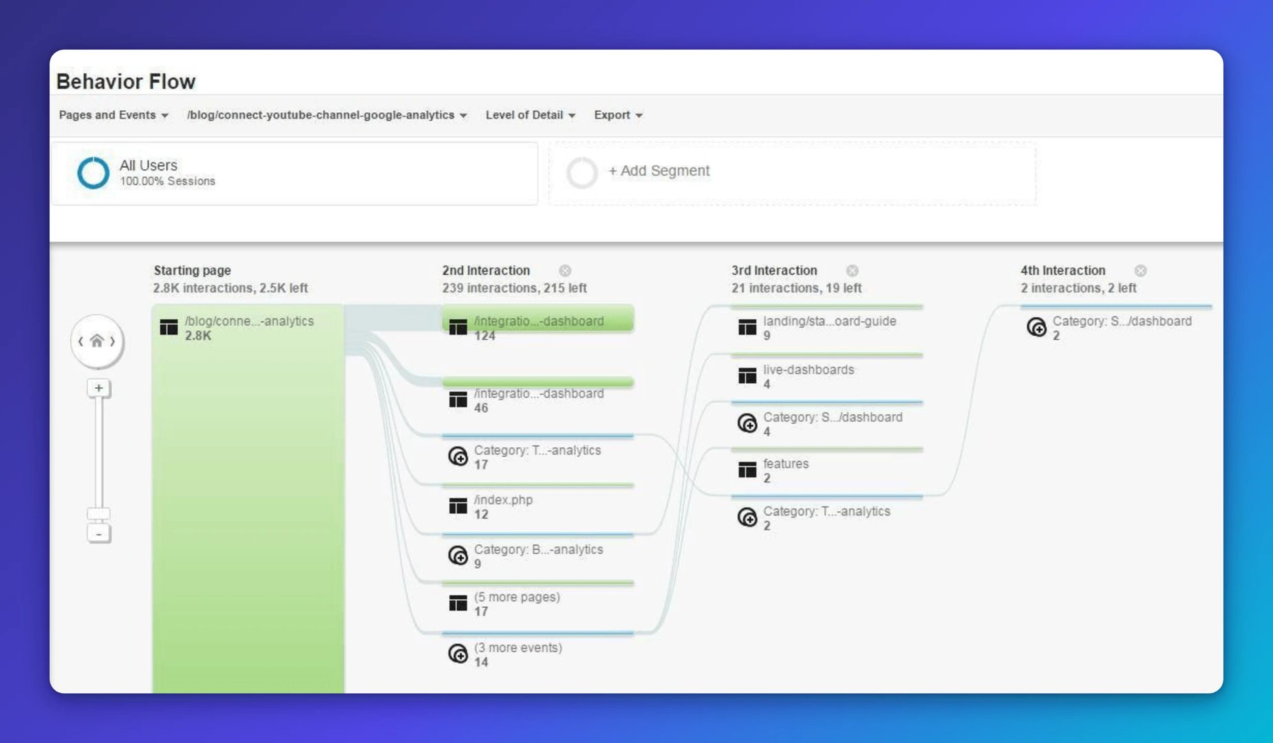
The default GA report displays useful information, but it's not easy to access quickly, and the visualization isn't the most intuitive. We built a focused version in Klips:
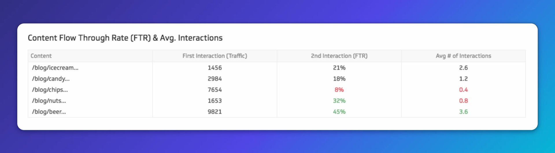
This visualization shows us which top-of-funnel content drives the deepest engagement, based on how many internal pages users view after their first visit. It pulls the following data from Google Analytics dynamically:
- Column 1: Top blog posts by page views
- Column 2: Total number of users (last 30 days)
- Column 3: Percentage of users who viewed a second piece of content after the first
- Column 4: Average number of pages viewed after the first page visit
A low "Avg # of interactions" (highlighted in red) tells us that readers are arriving, reading, and leaving — a signal that the content isn't doing enough to pull them further in.
Start tracking what actually moves the needle
These four metrics give you a clear, consistent picture of where your content is working and where it's leaving traffic, clicks, and conversions on the table. The real advantage isn't just knowing the numbers — it's having them available without having to dig for them every time.
Interested in building your own dashboards with Google Analytics data? See How it works and visit our Google Analytics Integration page.
Published 2026-08-21
Continue learning

Dashboard Data Security and Privacy: A Five-Layer Framework

The CEO's Guide to Metrics That Actually Matter

What is a KPI? Types, Limitations, and How to Make KPIs Work For Your Business

Project Management Dashboard: Guide to KPIs and Examples

What Are Dashboards and Scorecards? Key Differences Explained

Best Practices for Displaying Dashboards on Large Screens
Most recent
- MAY 28Dashboard Data Security and Privacy: A Five-Layer Framework
- MAR 30The CEO's Guide to Metrics That Actually Matter
- MAR 18What is a KPI? Types, Limitations, and How to Make KPIs Work For Your Business
- NOV 10Project Management Dashboard: Guide to KPIs and Examples
- OCT 16What Are Dashboards and Scorecards? Key Differences Explained
- SEP 3Best Practices for Displaying Dashboards on Large Screens